This post is about people who are ardent followers/ consumers of fashion trends. Yet, I also wanted it to include fashion producers, especially those working as artisans in studios, or serfs in factories. The title is Fashionista, despite the title being a letdown from my aspirations. It refers to avid leaders and followers of fashion. It has nothing to do with a modern line of Barbie-brand dolls with more body-shape options (curvy, petite, tall) than the originals.
My wish for those unfortunate fashion industry serfs, in Bangladesh and elsewhere, is that they be paid a living wage, hopefully more, and have a better work-life balance. The artisans could also appreciate these same benefits. For the individuals/ majority shareholders who own the large fashion houses, and some of their patrons, have more than enough income, I hope some form of limitarianism will reduce their incomes, wealth and indifference to human suffering.
People who do not fit into traditional social roles can suffer from outbreaks of mental illness. One category of problems involves deviant behaviors. Labels have led to people being given different forms of care (read: inhumane treatment), depending on the time and place, and social status. At the back of my mind, I recall reading about the situation in nineteenth century Britain, with asylums overfilled with a mixture of people. Some would be struggling with mental illnesses. Others were dumped there because their social or economic problems led them to being alienated from society. Later, in the 20th century, these patients would be subject to horrifying levels of abuse: typically lobotomies and electroconvulsive therapy. These therapies led to many other issues. Unsurprisingly, mental health (of workers or of clients) has rarely been covered by the fashion media.
Most work in the fashion industry is competitive. It allows fashion corporations to pay their employees less. Many participants are struggling with mental illness, especially trauma. Yet, it is difficult to find truthiness about this in the media. For some, fashion trauma is nothing more than a click bait term, to increase the sale of products and services. I came across one writer who thought that her poor mental health was her own fault for not buying the right things, garments especially. I think she imagined that having good mental health, was like being in good physical shape. The answer to a less than perfectly performing body is a gym membership. One does not actually have to work out in the gym, because everyone knows how much time-press people are subjected to. One does not have to measure one’s mass, because everyone knows there will be periods where that mass will increase. In the long-term, fat will be traded in for muscle mass! Deluded Belief 1: Gym membership is an important first step, towards possessing a new improved body.
Fashion, can assist on the journey to increase muscle mass. Some clothing items are more flattering than others. So, in addition to a gym membership, it is important to buy some stop-gap clothing that will conceal flab and other temporary imperfections. Deluded belief 2: When one has attained that more muscular body, clothing can be discarded, and real fashion items purchased.
Being a fashionista requires a re-disposition of time. One should show an interest in fashions, either be attending assorted fashion weeks, or watching videos about them; reading or, preferably, writing fashion books; attending fashion exhibitions or museums or even art galleries, where one can find historical fashion items either on display or totally lacking, depending on the art being viewed.
One learns that it is especially important to follow micro-trends. Otherwise, others might question one’s sincerity. Making frivolous purchases can be expensive, and whimsical, but real fashionistas will explain that this is precisely why credit cards were invented.
Relaxation is not a term used in the fashion industry. The fashion world doesn’t allow for downtime. Despite this, burnout has become a systemic issue, but perhaps not an approved discussion topic between fashion employees. Designers experience panic attacks since there is never enough time to complete a collection in the allotted time. Models have their eating disorders. Garment workers typically suffer from post-traumatic stress disorder (PTSD) related to unsafe working conditions. Others experience this mental and behavioral disorder from enduing a traumatic event, such as sexual assault, warfare, traffic collisions, child abuse, domestic violence, or other threats on a person’s life or well-being. Fashion school students are exhausted, while their teachers are depressed from having to deal with them. Only the mannequins seem to be resistant to mental health issues.
Fashion as a system means that those in the higher echelons of the fashion world are God’s gift to humankind, but those immediately and further below will never ascend, or even be good enough. Social media contributes by intensifying insecurities and by encouraging consumerism. An alphabet soup of people seek employment in the industry, but face additional challenges, some related to personal safety.
I also came across some interesting statements. For example, one person claimed that fashion was supposed to make people happy, and even encouraged people to dress-up at home! It was almost as if people were dressing for themselves, and not others. Sara Ahmed in The Promise of Happiness (2010), examined happiness through feminist, queer and racial study lenses. She questions if the popular conception of happiness is actually worth the sacrifices made. In particular, she explored how, now as well as in previous generations, the ideal of the happy housewife had been and still is being used to justify forms of gendered labour. According to Ahmed, the crisis of happiness is not the failure of traditional social ideals, but the failure to follow them.
When I look at my life in Norway, and compare it with my earlier life in Canada, I am a happier person. It is acceptable to be a mediocre person, and to do an adequate job. There is no need to excel. Six out of the top seven happiest countries in the world for 2024 were Northern European. Five of them Nordic. Finland was at the top with an overall score of 7.741, followed by Denmark (7.583), Iceland (7.525), Sweden (7.344), Israel (7.341), the Netherlands (7.319), and Norway (7.302). Other countries where other readers of this blog live (or have citizenship) include Australia: 10 = 7.06, New Zealand: 11= 7.03, Canada: 15 = 6.90, Ireland: 17 = 6.84, and USA: 23 = 6.73. With the exception of Iceland, that remained the same as in 2023, all of the countries mentioned here were on a downward trend.
To construct the index, researchers analyzed comprehensive Gallup polling data from 143 countries for the previous three years, specifically monitoring performance in six particular categories: gross domestic product per capita, social support, healthy life expectancy, freedom to make your own life choices, generosity of the general population, and perceptions of internal and external corruption levels.
Janteloven (Danish & Norwegian) = The Law of Jante (English), is a code of conduct used to express social disapproval of individuality and, especially, personal success. It comes from the work of Danish-Norwegian author Aksel Sandemose (1899 – 1965) first formulated as ten rules in his satirical novel En flyktning krysser sitt spor = A Fugitive Crosses His Tracks (1933). The attitudes are older.
Copenhagen Fashion Week
The Law of Jante is used to explain why, starting in 2018, Copenhagen Fashion Week announced that designers would have to adhere to a set of minimum sustainability standards, starting in 2023. These are:
Strategic Directions
- We work strategically with embedding sustainability and international standards on human right
- We include diversity and equality in our management approach and actively consider these aspects when hiring staff, especially for management positions
- We do not destroy unsold clothes from previous collections
Design
- We design to increase the quality and value of our products economically and materially and inform our customers about the value of longevity
- We find a second life for our samples
- Smart material choices
- At least 50% of our collection is either certified, made of preferred materials or new generation sustainable materials, upcycled, recycled or made of deadstock
- We have a preferred materials list in place
- We have a list of restricted substances in place, following the requirements of the EU REACH Directive, and engage with our suppliers to ensure compliance
- Our collection is fur-free
Working conditions
- We are committed to exercising due diligence in our supply chain according to international guidelines and standards, and work with our suppliers to ensure e.g., freely chosen employment, secure employment or no child labour
- We are committed to operating a safe, healthy and respectful working environment for all our employees, free from harassment and discrimination and where everyone enjoys equal opportunities regardless of gender, ethnicity, age, political/religious/ sexual orientation, physical appearance and ability
Consumer engagement
- Our in-store and online customer service staff is well informed about our sustainability strategy
- We educate and inform our customers about our sustainability practices on multiple platforms
- We do not utilise single-use plastic packaging in store or for online orders but offer recyclable, recycled or repurposable alternatives
Showcase
- Our set design and showcase production is zero waste
- We do not utilise single-use plastic packaging backstage during fashion week but offer recyclable, recycled or repurposable alternatives
- We offset or inset the carbon footprint of our showcase
- We are signatory of the Danish Fashion Ethical Charter and consider diversity and inclusivity when casting models
In 2024, Copenhagen Fashion Week made updates to the framework. It still comprises the six focus areas attempting to implement a holistic approach. Marie Busck, responsible for the framework, commented: The revisions of the requirements are important. We need to ensure that the framework reflects the developments of the legal landscape for fashion and textiles which currently is unfolding from the EU. In addition, we are also keen on integrating the valuable learnings from applying the framework and the input received from other stakeholders, making actions more clear and concise.
Some of the things I have noted are the absence of fur, along with discussions of the appropriateness of faux fur, made of petroleum products. There was also recognition that women, including models, could become pregnant which could affect their appearance. To be relevant, fashion has to incorporate people of all ages. This means that the family, as well as the individual, has to be taken into consideration. This means making products for children of assorted ages from birth onward, and even spouses. I think it was already acknowledged that women worked, and that people lived in climates that experienced winters.
Manifestations of sustainability included: the elimination of waste, unrecyclable seat cards or set pieces that can’t be reused; and, designs should use at least 50 percent recycled materials.
An anonymous crusader set up a scarecrow-like sculpture wearing a Make Less t-shirt and a grumpy frown outside several shows. The most sustainable approach would be to shut down Fashion Week. Eszter Áron of Aeron integrated her sourcing team into her design team so the two could be intertwined from the start, ensuring that material considerations were given equal weight to the designers’ imaginations. Rotate shifted 60 percent of the sequins in its latest going-out lineup to preferred materials that sparkled just as much. It’s creative directors Jeanette Madsen and Thora Valdimars, tapped Danish and Dutch universities to help them research new production techniques that won’t dim their sparkle. OpéraSport cofounder Awa Malina Stelter said her label’s first collection in 2019 already met Copenhagen’s 2023 standards, with organic, GOTS (The Global Organic Textile Standard)-certified cotton and other fabrics made from 90 percent industrial waste. Stine Goya of her namesake label, commented: If anything, moving toward more sustainable practices makes the design process more exciting and brings a new dimension to our work.
Copenhagen Fashion Week may be well-intentioned, but the result is more nuanced (read: less than perfect). Responsibly-sourced materials is a vague term, and can be interpreted in many different ways. Similarly, 50 percent recycled materials says nothing about the appropriateness of the materials used.
Chana Rosenthal, principal and founder at reDesign, commented: The vagueness actually makes it more appealing in a way to brands, because part of the [sustainability] challenge has been brands saying they’re doing something and then they’re not actually doing it. But also, it takes time. This isn’t something that’s easy to transition.
Lisa Bergstrand, founder of Bergstrand Consultancy, a firm that advises brands on sustainability initiatives, said: For there to be meaningful change in the long term, I think a closer look needs to be taken at fashion’s focus on trends, which is one of the biggest drivers of overproduction and overconsumption.
Standardized environmental checks seem the most promising path to encourage suppliers to shift their priorities in a way that makes more eco-conscious production accessible.
One of the major problems is that of scale. Fashion houses are wanting to produce profits for shareholders. That is not a concern of mine. I am more interested in workers being able to live off their work, without mental health issues. Thus, I am a supporter of the 国潮 (Chinese) = Guochao (English) movement, a trend of preferring homegrown designers which incorporate aspects of Chinese history and culture. This applies specifically to Gen Z buyers, but there are caveats, and pushback that impede its wider adoption. Issues include subpar quality, plagiarism, and high prices.
Closing notes
My fashion career began early, as a child model, with photographs even appearing in some forgotten Vancouver area newspaper! These days, my aspirations never exceed a faint hope that someone, anyone will regard me as being unusually, but pleasantly dressed, as I enter the local co-op. My current aspirations never exceed the geographical boundaries of Inderøy municipality, and its population that has finally reached 7 000 residents.
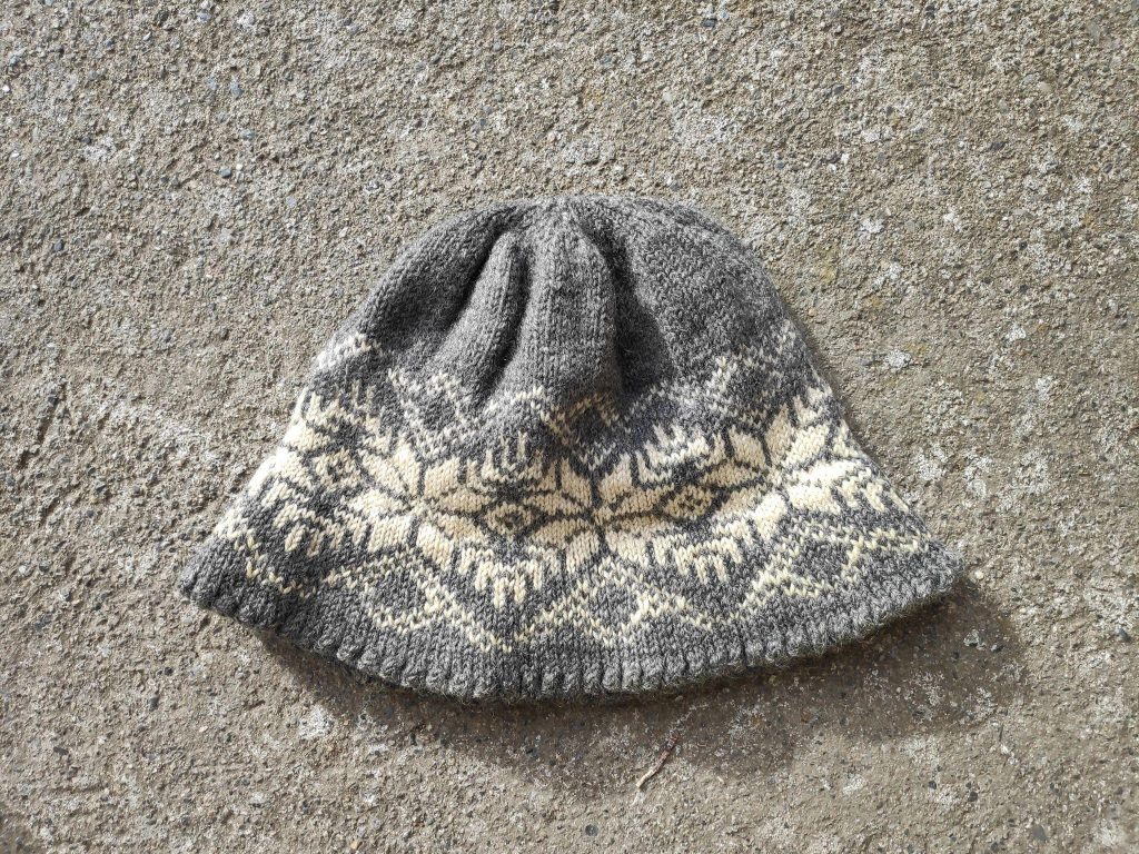
As my more intimate friends know, I faced taboos about wearing assorted colours in my childhood. It might be easier to list those I was allowed to wear: blue, grey and brown, with white shirts and undergarments. I had ample yellow rainwear, since it was visible. In strictness order, I was forbidden to wear: green, black, purple, red and orange, In general, these sanctions were not applied to tartans.
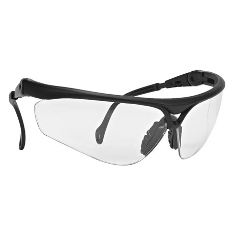
Since I live in Inderøy I attempt to support local companies: Husby Optics (founded 1854-10-04 – 170 years ago, last week) for eye wear, Thunderbird Design, for most of my clothing needs, and Kornelia smykker og design, for jewellry.
Lately, I have begun to question if I really am a normcore person. Wikipedia tells us: Normcore wearers are people who do not wish to distinguish themselves from others by their clothing. This does not mean that they are unfashionable people who wear whatever is easiest, but rather that they consciously choose clothes that are functional and undistinguished. The “normcore” trend has been interpreted as a reaction to ever-changing fashion trends, as normcore clothes are generally seen as timeless and unaffected by trends. Normcore clothes are unisex and are usually casual items such as hoodies, T-shirts, polo shirts, short-sleeved buttoned shirts, sweatpants, chinos, jeans, shorts, and sneakers; items such as suit jackets, ties, blouses, boots, and dress shoes are avoided.
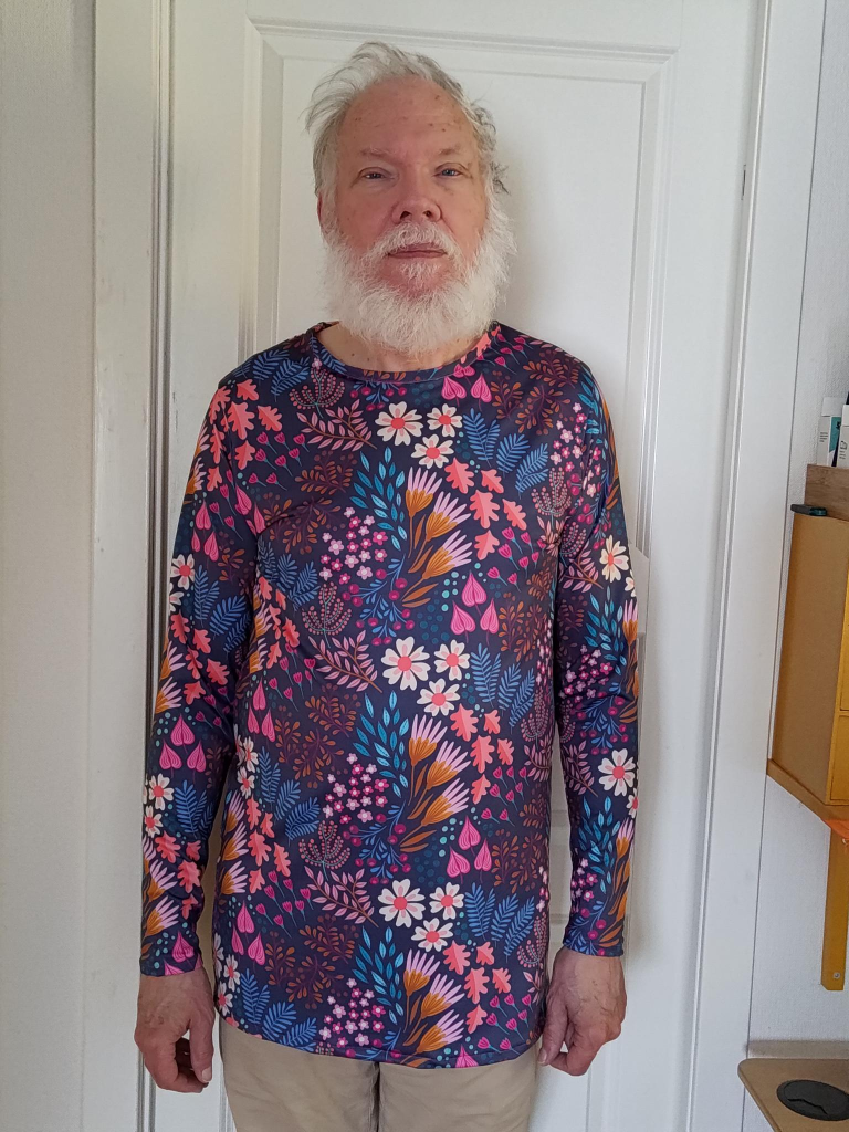
On that list I only wear chinos regularly, but I also wear long-sleeved buttoned shirts (with two pockets). That said, I have several suits that have spent my retirement years hanging in a closet. My favourite is made of Donegal tweed, tailored by Kevin and Howlin, Nassau Street, Dublin, some years before the new millennium. I have no objections to being buried in it, along with a shirt recently made by Trish, but without a tie, I don’t know if dead people wear shoes in their coffins, but I have a pair of bright green Allbirds that will do nicely, if required. Yes, burial clothes are a person’s last opportunity to make a fashion statement. Select the garments wisely!