A fence constructed out of split pales, at Vangshylla, Norway. Constructed by Jörg Mentzen. This is an example of appropriate design.
Good Design can be summarized in three words: Weniger, aber besser = Less, but better! Personally, I prefer the term, appropriate design. However, good design seems to be more common. Regardless, people can interpret such a phrase in different ways, so here are ten points to promote a better understanding of it. Good/ appropriate design:
is innovative – The possibilities for progression are not, by any means, exhausted. Technological development is always offering new opportunities for original designs. But imaginative design always develops in tandem with improving technology, and can never be an end in itself.
makes a product useful – A product is bought to be used. It has to satisfy not only functional, but also psychological and aesthetic criteria. Good design emphasizes the usefulness of a product whilst disregarding anything that could detract from it.
is aesthetic – The aesthetic quality of a product is integral to its usefulness because products are used every day and have an effect on people and their well-being. Only well-executed objects can be beautiful.
makes a product understandable – It clarifies the product’s structure. Better still, it can make the product clearly express its function by making use of the user’s intuition. At best, it is self-explanatory.
is unobtrusive – Products fulfilling a purpose are like tools. They are neither decorative objects nor works of art. Their design should therefore be both neutral and restrained, to leave room for the user’s self-expression.
is honest – It does not make a product appear more innovative, powerful or valuable than it really is. It does not attempt to manipulate the consumer with promises that cannot be kept.
is long-lasting – It avoids being fashionable and therefore never appears antiquated. Unlike fashionable design, it lasts many years – even in today’s throwaway society.
is thorough down to the last detail – Nothing must be arbitrary or left to chance. Care and accuracy in the design process show respect towards the consumer.
is environmentally friendly – Design makes an important contribution to the preservation of the environment. It conserves resources and minimizes physical and visual pollution throughout the lifecycle of the product.
is as little design as possible – Less is more. Simple as possible but not simpler. Good design elevates the essential functions of a product.
The ten principles, listed above, were developed in the 1970s, by Dieter Rams, born 1932-05-20. His ninetieth birthday was celebrated only eight days before the publication of this post, two days before World Goth Day #14, and the 100th anniversary of the birth of Otl Aicher. Yes, Dieter Rams was mentioned in that post. However, even I was able to appreciate that publishing three posts in a week was excessive, so this post on Rams had to wait! However, most of it was actually written before both of the others.
Like many people, Rams’ trajectory through life was not straight. In terms of career, he started his working life, like his influential grandfather, as a carpenter. Part of a carpenter’s training involves learning to deal with product that can be difficult to work with – wood. Some people feel that disobedient wooden components, need to be beaten into submission. Others learn that beating is not the correct approach, but that there are a few simple techniques that can persuade wood to perform as wanted. Trees have branches, that impact wood’s shape, texture and strength. Today, most wood is cut with saws, producing large quantities of both wood and sawdust. Many industrial processes depend on sawdust, an inferior product with mass but lacking strength. Despite that, I envisage a time in the future, where this waste will be reduced, as it becomes more economical to use laser cutters, if only because this would produce more of a stronger product.
Before saws became commonplace, other techniques had to be used. One approach is to split, rather than cut, wood. Locally, one of my neighbours, Jörg Mentzen, has recently installed a fence with split pales. Here the fence effectively keeps dogs and children on one side, and larger wildlife on the other. Smaller animals, such as snails, squirrels and birds, are allowed free passage. In terms of its production, there is very little waste. This fence is totally in the spirit of Dieter Rams.
Rams’ apprenticeship as a carpenter was interrupted in 1947, with studies in architecture and interior decoration at Wiesbaden School of Art. With his apprenticeship complete, he was able to return to school in 1948, finishing his studies in 1953. Of course, there are different ways of seeing these changes. Wikipedia, for example, wants to focus on his apprenticeship interrupting more academic studies.
After graduating, Rams began working for architect Otto Apel (1906 – 1966), in Frankfurt.
Rams is best known for his work at Braun. Max Braun (1890 – 1951) founded what later became an electrical appliance company in 1921. After his death, the company was taken over by his sons Erwin (1921-1992) and Artur (1925-2013). In 1967 they sold the company to The Gillette Company, which was subsequently taken over by Procter & Gamble in 2005.
In 1955, Rams started working for Braun as an architect and an interior designer. At some point, his role transitioned to that of industrial designer. In 1961, he became the chief design officer at Braun, a position he retained until 1995.
From 1957 Rams also worked as a furniture designer for the Otto Zapf (1931 – 2018) company, who joined with Danish entrepreneur Niels Vitsœ (1913 – 1995) in 1959 to form Vitsœ + Zapf. In 1969 this became Vitsœ. Rams designed the 606 Universal Shelving System, the 620 armchair and the 621 side table. They all show minimalist characteristics.
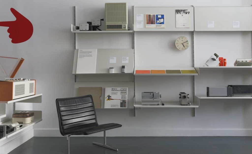
This collection belonging to the Vitsœ company, consists of Dieter Rams designs, many displayed on Vitsœ 606 Universal Shelving System units. In 2017, it went on display in New York, before being sent to the company’s new Royal Leamington Spa headquarters, in England. Other notable products shown here include a Vitsœ 620 chair, and a Braun SK 4/10 aka Snow White’s Coffin because of its white metal casing and transparent lid, a radio/ record player, designed by Dieter Rams and Hans Gugelot. Many of these pieces were originally collected by designer Tom Strong (1940 – ), who first came across Braun products when he was stationed in Germany with the US Army, in the 1960s. He donated these to Vitsœ. Photo: Vitsœ.
With respect to his house, Rams comments: “My house in Kronberg, bordering the Taunus woodlands, is part of a concentrated housing development that I had originally helped to plan. The house is built and furnished according to my own design and I have lived here with my wife since 1971. It goes without saying that we live with Vitsœ furniture systems. Firstly, because I have only ever designed furniture that I myself would like to have and secondly to get to know them during daily use to better recognise where they might be improved or developed further. In instances where the Vitsœ programme is not complete, I have selected furniture from other manufacturers that have been designed from a similar perspective, such as the bent wood 214 Thonet chairs around the table that we use for dining, or the Fritz Hansen stools at the breakfast bar between the kitchen and living area.”
The Rams’ house is described as an L-shaped bungalow, modest in size. A workshop is located below the main living area. Its only apparent extravagance is a small swimming pool. It is a listed property, meaning that the Hessen Office for the Preservation of Historical monuments, has decreed that the building is to be preserved in perpetuity, and cannot undergo significant changes. From my perspective, the house contains an excessive amount of white and cement, and too little wood. I find this surprising in a house designed by an architect, who first worked as a carpenter.
The house occupied by Dieter Rams and Ingeborg Kracht-Rams since 1971. Photo: Ingeborg Kracht-Rams.
Otl Aicher designed Waldi, the first official Olympic Games mascot, who featured prominently in Munich in 1972,
Today, we celebrate the 100th anniversary of the birth of Otto “Otl” Aicher, born in Ulm, Germany 1922-05-22 and who died 1991-09-01, in Rotis, Germany. In this weblog post, a chronology of events is presented, but with a focus on the 1972 Olympic Games in München = Munich.
Aicher opposed the Nazi movement, and refused to join the Hitler Youth. For this, he was arrested in 1937. This also resulted in his failing the abitur = college entrance examination in 1941, after which he was drafted into the German army. He deserted the army in 1945.
Following the end of World War II, he studied sculpture at the Academy of Fine Arts, in Munich, in 1946 – 1947. In 1948 he opened a graphic design practice in Ulm. This was moved to Munich in 1967, then to Rotis in the Allgäu, in 1972, where he continued working until his death.
In 1952, he married Inge Scholl (1917 – 1998). She was a peace activist most of her adult life. Along with other members of her family, she was active in WeißeRose = White Rose, a non-violent, intellectual resistance group in Nazi Germany. Her younger brother, Hans (1918 – 1943 ) and sister, Sophie ( 1921-1943) were both executed for their activities in the group, and her father, Robert Scholl (1891 – 1973) was imprisoned twice for his anti-Nazi activities. Her family also provided shelter to Aicher after he deserted from the German army. Among other books, she wrote, Students Against Tyranny: The Resistance of the White Rose, Munich, 1942–1943.
Hochschule für Gestaltung Ulm (HfG) = Ulm School of Design, was founded in 1953, by Aicher, Inge Scholl and Max Bill ( 1908 – 1994), a Swiss architect, painter, typeface designer, industrial designer, graphic designer, and the school’s first director. These three also developed the theoretical underpinnings of the school’s curriculum, which was heavily influenced by the Bauhaus. In 1958 Aicher was a visiting professor at Yale. In 1959 he held a similar position in Rio de Janeiro. In 1968, funding ceased for the HfG in Ulm and it had to close.
Otl Aicher collaborated with Dieter Rams (1932 – ) and Hans Gugelot (1920-1965) product designers at Braun, on product branding as well as on designing radios and record players, where all three were actively involved in developing Braun’s signature design aesthetic.
In 1969, Aicher worked with Lufthansa, developing the company’s corporate identity, including a redesign of its logo, a crane (Grus grus) originally designed by Otto Firle (1889-1966) in 1918 for Deutsche Luft-Reederei, another airline. Aicher wanted to replace the crane, but this was such an ingrained part of the Lufthansa identity that its Board of Directors would not allow it. The Lufthansa wordmark used a san-serif Helvetica typeface, developed by Max Miedinger (1910 – 1980) and Eduard Hoffmann (1892 – 1980) in 1957.
Otl Aicher’s redesign of the Lufthansa crane logo with Helvetica wordmark from 1969.
In 1967, Aicher was in charge of visual design for the 1972 Munich Olympic Games, that complemented Günther Behnisch’s (1922 – 2010) architectural design for the Olympic stadium. Aicher consulted with Masaru Katsumie (1909 – 1983), who was responsible for design at the 1964 Olympic Games in Tokyo. While Katsumie was entrenched in Japanese design, he promoted Western/ Modernist design, through the 1954 Gropius and the Bauhaus exhibition at the National Museum of Modern Art in Tokyo; his 1957 translation of Herbert Read’s (1893 – 1968) Art & Industry (1934), and by writing Guddo Dezain = Good Design (1957).
Otl Aicher in 1972
The Munich Olympic Games logo, Strahlenkranz = Halo, uses a garland to represent the sun as well as the five Olympic rings, merged in a spiral. Coordt von Mannstein (1937 – ) used mathematical calculations to rework Aicher’s design and to unify the garland and spiral elements in the final design.
The Munich Olympic Games halo logo, Strahlenkranz, designed by Otl Aicher.
Aicher designed the pictograms for the different sports, which are used worldwide today. Pictograms are important because they provide a visual interpretation of a sport, that is independent of language, so that athletes/ visitors to an Olympic village/ stadium could navigate the venues. Aicher’s pictograms use a series of grid systems and a specific bright colour palette, based on colours representative of the Alps. Mountains are represented in blue and white, while other elements use green, orange and silver. Red and black were not used. Colours identified services such as media, technical services, celebrity hospitality and public functions. Uniforms were colour-coordinated to these themes, so that Olympic staff of a particular department could be identified by their uniform colour. Otl Aicher’s pictograms can be found here.
For the Olympic designs, Aicher used Univers, a sans-serif typeface family designed by Adrian Frutiger (1928 – 2015) and released in 1957. Twenty-one sports posters were designed to advertise the sports at the games. These featured official design colours, the logo and “München 1972”. Posterization for the graphics on the posters involved separating the various tonal qualities from the images in a manual process and using the official Munich colours. The first of these posters was a poster of the Olympic stadium which became the official poster for these games.
For the first time in Olympic history, an official Olympic mascot was designed. This was Waldi, a dachschund.
Vancouver designers, Ben Hulse and Greg Durrell, are creating a comprehensive resource on Olympic Design, and have been engaged by the International Olympic Committee to create an Olympic Heritage Collection. Durrell notes that Munich is regarded as the best designed Games, with a really beautiful abstract logo. Elegance and simplicity have all but disappeared from Olympic logo design. More specifically, he states:”[I]t became very clear in the ’90s that as soon as [designers] get a computer, things just go crazy. There’s more colour, more texture, more elaborate shapes, more effects … I think we’re slowly starting to come off that a little bit, but it’s everywhere.”
Otl Aicher also developed the corporate image of media institutions, including ZDF, a German television channel, banks and reinsurers, including Westdeutsche Landesbank, Dresdner Bank, Sparkasse, Raiffeisenbank, and Bayerische Rück = reinsurance.
In 1972 Otl Aicher moved to Rotis in the Allgäu, where he founded the Rotis Institut für analoge Studien = The Rotis Institute for Analogue Studies, in 1984. Here, in 1988, he developed the Rotis typographical family. I find it interesting that before a rebranding in 2015, Scandinavian Airlines uses Rotis as the logotype, written in silver letters on aircraft bodies. Seattle’s Sound Transit, also uses it. Rotis was his last major design activity, before he was killed in an accident involving a motorbike, that fatally injured him while he was mowing his lawn.
The Rotis typeface, Otl Aicher’s last design activity, in 1988.
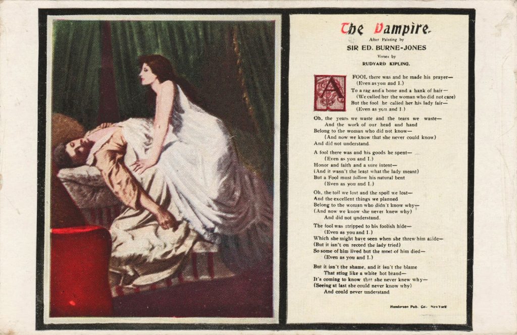
On the left, Philip Burne-Jones’s (1861 – 1926) painting, The Vampire (1897), that inspired Rudyard Kipling’s (1865 – 1936) poem, The Vampire (1897), on the right. The painting and the poem were exhibited side by side at tenth summer exhibition at the New Gallery, London in 1897-04. Rudyard Kipling and Philip Burne-Jones were cousins. The poem was also published in the Daily Mail on 1897-04-17, and in the New York Tribune 1897-05-09. Bram Stoker’s (1847 – 1912) Dracula, with numerous vampires, including Dracula himself, was published on 1897-05-26. The original painting was in monochrome. Despite the text (shown above), the painter is Philip, not Kipling’s Uncle Ned, Philip’s father Edward Burne-Jones (1833 – 1898). All works are now in the public domain.
This is the third consecutive year that a weblog post has been published for World Goth Day, potentially celebrated by tens of people, throughout the world! This year it arrives one day early 2022-05-21, with a focus on fashion. The two other weblog posts were: World Goth Day #12 which looked at some of the origins of the day, and #13 with a focus on music. Future efforts: #15 is planned to look at Gothic architecture from the mid-12th century to the 16th century; #16 will look at the historic origins of the Goths in Scandinavia and their dispersal southwords; #17 will examine will look at their relationship with Rome.
Goths as outsiders
More than seventy years of living, and years as a teacher, has taught me that people do not choose to become outsiders. Rather, social forces – outside of their control – largely determine it. They become victims, and the victim is left to deal with the consequences of their victimhood. One way of coping with their situation, is for these victims to visibly display their outsider status. This display takes many forms, but one prominent way is in terms of clothing.
A fashion statement cannot be made alone, it takes place inside a context. That context may be temporal, geographical or cultural, but often involves all three elements.
A. Insider
Haute Couture
Charles Fredrick Worth (1825 – 1895), from Bourne, Lincolnshire, England and his partner Otto Gustaf Bobergh (1821 – 1882), from Bernshammars bruk, Västmanlands county, Sweden, established Worth & Bobergh, in Paris, in 1858. This company is regarded as the first haute couture establishment, with Worth the first fashion designer, and Bobergh the business manager. Some of its innovations included transforming the salon into a meeting point when clients came for consultations and fittings; advanced client selection of colors, fabrics, and other details; replacement of fashion dolls with live models; sewing branded labels into clothes. By the end of Worth’s career, Worth & Bobergh employed 1 200 people and its impact on fashion taste was far-reaching.
Haute couture has a legally protected status, defined by the Chambre de commerce et d’industrie de Paris, an organization started in 1868. Rigorous rules were implemented in 1945, which required: made-to-order design for private clients, including at least one fitting; a workshop (atelier) located in Paris, employing at least fifteen full-time staff members; at least twenty full-time technical people, in at least one workshop (atelier); and the presentation of a collection of at least 50 original designs to the public in January and July of each year, with both day and evening garments.
Being an insider is not synonymous with being urban and rich. Sometimes, it can be associated with traditional values in a rural environment. In Norway, the first handicraft schools were established in 1870, becoming mechanisms for promoting Norwegian cultural values.
The Norwegian crafts association = Norges Husflidslag, was founded in 1910. Its purpose was, and still is, to strengthen Norwegian crafts. In 2017, the organization had 24,000 members, 360 local groups, 36 shops that are wholly or partly owned by county/ local groups. It is a member of the Norwegian Cultural Conservation Association. In 2014, the organization was accredited by UNESCO as the third Non-Governmental Organization (NGO) with expertise in intangible cultural heritage. As a member of the Study Association for Culture and Tradition, it joins other organizations that work with popular cultural expressions, including folk dance, theater, cultural heritage (including the preservation of the maritime environment) and local history.
After the end of World War II, crafts (and schools to teach them) came into focus as a means of increasing women’s contribution to farm income. The Ministry of Agriculture appointed a committee in 1946 to look more closely at craft training. This resulted in a proposal, to establish (mostly) publicly run handicraft schools in all counties. Courses were adapted to the needs and interests of young women, especially, and the schools offered both half-year and full-year programs of study. In 1955, the handicraft schools were transferred from the Ministry of Agriculture to the Ministry of Church and Education. In 1966, the Oslo Industrial School for Women = Den Kvindelige Industriskole i Kristiania, established in 1875, became a vocational teacher’s college, and changed its name to the State Teaching College for Crafts = Statens lærerskole i forming . Two other colleges for crafts were also established. These were essential for recruiting teachers for the handicraft schools.
By 1976, the teaching of handicrafts and aesthetics was now incorporated into the upper secondary school system. An introductory course with a focus on drawing, and aesthetics more generally, formed the basis for advanced courses in weaving, sewing and wood and metalworking. A third year course trained people to become activity therapists. While students used to be older, the schools gradually adapted to teaching younger people, most between 16 and 19 years of age.
Starting on 1980-08-20, Patricia, my wife, studied one year of weaving followed by one year of sewing, at such a school in Molde, while I took a half year introductory course, starting in 1981-01 followed by a year of wood and metal working. At the same time, we learned Norwegian. The school had 120 students, some in their late teens, many in their early twenties, but with some older people. I was one of two male students at the school. Attending this school gave me insights into traditional Norwegian cultural values, but also labeled me as an outsider.
This was not my first excursion into textiles, in 1978 Patricia and I both took a spinning course at the Deer Lake Art Centre, in Burnaby, adjacent to New Westminster, British Columbia. Later, I purchased one of the first electric spinning wheels made by Kevin Hansen on a visit to Port Townsend, Washington. Apart from a few minutes of experimentation, it remains unused.
This tuque, along with some mittens no longer in existence, were knit by me while taking the introductory course at the Husflidsskole in Molde, Norway, in 1981. Yes, I had to learn to knit in order to make it. Later in my teaching career, I would knit more complex garments during breaks both at a conventional secondary school, as well as a prison school. Most male teachers were expected to have at least some proficiency in knitting, if only because pregnant teachers often received a baby blanket consisting of squares knit by their colleagues.
Modesty
To gain insights into modest fashions, I started to read Hafsa Lodi (ca. 1988 – ), Modesty: A Fashion Paradox (2020), further described as a work that uncovers the causes, controversies and key players behind the global trend to conceal rather than reveal. Despite my attempt to suspend disbelief, as Samuel Taylor Coleridge (1772 – 1834) advised, and to read the work as the author intended, I found it difficult to understand the author’s perspective.
Her primary consideration is that garments conceal, although the extent of concealment varies. The minimal amount varies “by culture, class, ethnicity and generation” (p. 17) but usually means that the garment(s) cover the knees and shoulders. Some want to extend these to covering ankles, elbows to wrists. So far, so good.
However, the fashion she was advocating was not modest in my interpretation of the word, which would include characteristics such as sustainable, durable, comfortable and moderately priced. Instead, the garments she promotes are prized for their designer label and extravagance. She even uses the term luxury modest wear. They may have concealed some skin, but revealed a pretentious origin in haute couture.
Within her world, these garments may be modest. Dubai, and other countries in the Middle East, have the least economic equality of anywhere in the world. Thus, there are some people who can enjoy a luxurious life, because they subject others to a life of servitude and drudgery. It is also the area of the world where patriarchy excels.
Admittedly, having matured in the 1960s, my sense of modesty is tempered by that eras fashion trends. There are modest, and not so modest, mini-garments. In the debate about the inventor of the miniskirt, I am inclined to accept the judgement of Marit Allen (1941 – 2007), half-Norwegian fashion journalist and costume designer, who credits John Bates = Jean Varon (1938 – ) with its conception, and execution in 1965 in outfits for Diana Rigg (1938 – 2020) for her role as Emma Peel in The Avengers. His work included not just skirts and dresses, but Op-Art mini-coats. I have discussed Rigg and Bates in a previous weblog post. I find most of these garments modest! Both André Courrèges (1923 – 2016) and Mary Quant (1930 – ) have been designated the inventor of the miniskirt, by others. I will acknowledge Courrèges role in promoting/ introducing jeans for women.
While there is an attempt to create a gender divide, especially with respect to the use of trousers, there has been fluidity in the use of garments throughout the millennia. An introduction to insights into this topic, can be found in one Wikipedia article on Trousers as Women’s Clothing. Divided skirts were used in the late-nineteenth century for horse- and bicycle-riding. These were rebranded as culottes in the mid-20th century. These have increasingly replaced skirts in many situations. One of the first being that skirts worn by female medical personnel were incompatible with the wake produced by helicopters.
B. Outsider
In Fear and Clothing: Unbuckling American Style (2015), Cintra Wilson (1967 – ) advises: Your closet is a laboratory in which you may invent astonishingly powerful voodoo. It may be used as a tool to direct yourself toward your own ideal destiny. It’s geomancy—portable feng-shui, right on your body. Style is one of the most remarkably fast, proactive, and gratifying ways to change your mind, change your mood and—as a surprising result—change your circumstances. It is one of the most direct ways of exploiting the Socratic adage “Be as you wish to seem,” or, more slangily, “Fake it till you Make it.”
Most outsiders lack the resources to purchase bespoke/ haute couture clothing, or to make their own traditional clothing. Many are a product of a cycle of poverty, forcing them into unskilled jobs at an early age. Many have also suffered various types of abuse, making participation at school or in the labour market difficult.
Lingerie
In 1913, Yva Richard, transformed himself from Paris photographer, to the proprietor of a lingerie boutique, run either by himself or, more likely, his wife Nativa Richard. Their unique creations became increasingly daring/ avant-garde/ erotic, and by the late 1920s, they had develop a successful international mail-order business, based on a catalogue of photographs taken by Yva, frequently modelled by Nativa. It lasted until 1939. Léon Vidal, a tailor and owner a chain of erotic bookshops, was encouraged by the success of Yva Richards, to open a competing boutique, Diana Slip. It, too, lasted until the start of World War 2. Numerous not safe for work (NSFW) and some more socially acceptable photographs of their creations can be found using a search engine.
Vampire
If there is one element that unites the young goths that I have met at secondary schools and in prison, it is their fascination with vampires. The vamp(ire) has become a symbol of an extreme outsider. The first poems with a vampire in English, was Robert Southey’s (1774 – 1443), Thalaba the Destroyer (1801). This was followed by Samuel Taylor Coleridge (1772 – 1834), Christabel (written 1797 – 1801, published 1816). There are shorter references to this theme in George Gordon Byron (1788 – 1824) in The Giaour (1813). The first modern vampire prose work in English was John William Polidori’s (1795 – 1821), The Vampyre (1819). At this point, the representation of vampires in literature explodes.
The height of vampiremania is reached in 1897. Philip Burne-Jones’s (1861 – 1926) paints, The Vampire (1897). This inspires Rudyard Kipling’s (1865 – 1936) to write his poem, The Vampire (1897). Then Bram Stoker’s (1847 – 1912) Dracula (1897) appears, and the world has never been the same again.
Fast forward to the present and vampires are still with us. On Goodreads, I encountered a list with 1 669 (at the time of writing) best vampire books! At the top of the list is Stephen King’s (1947 – ) second published novel, Salem’s Lot (1975). This work is expected to reappear soon as a film with the same name, directed by Gary Dauberman (ca. 1977 – ). Of course, there are numerous other films and television series that have vampires as an essential plot element.
Black
As a sign of their outsider status, people often opt to dress provocatively. Karl Spracklen and Beverley Spracklen, The Evolution of Goth Culture: The Origins and Deeds of the New Goths (2018) describe this provocation, and fundamental characteristic of Goth fashions in one word – black (Chapter 11: Goth as Fashion Choice). Many of the Goths I met teaching were consumers of Gothic Beauty, from 2000, and/ or Dark Beauty Fashion Magazine, which appeared from about 2010 to 2020. These offered a slightly broader colour pallet.
According to Cintra Wilson in an article You just can’t kill it (2008), this blackness has its origins in the Victorian cult of mourning. Thus Steampunk and related fashions with origins from this time period are embodied into the dress code.
Beyond this darkness there was a fascination with hair, typically dyed. The mohawk represents one of the most admired, if less frequently used, hair styles. It involves a narrow, central strip of upright hair running from the forehead to the nape, with the sides of the head bald. Variations include: the nohawk, a shaved strip from the forehead to the nape of the neck, with hair on either side of that strip; the Eurohawk, where the sides are not shaved, but with shorter hair than on the central strip; and, the fauxhawk, a hairpiece in the form of a mohawk.
Boots
Yet, as a sign of their outsider status, some people often opt to dress protectively. Perhaps, the best display of this is characterized by Doc Martens boots, made at Wollaston in Northamptonshire, England. These boots originated with Klaus Märtens, a doctor in the German army who had injured his ankle towards the end of World War II. Standard-issue army boots were too uncomfortable, so he designed improved boots, using soft leather and air-padded soles made from tires. In partnership with Herbert Funckt in 1947, footwear based on these improvements were made at a German factory, and sold primarily (80%) to older (40+) women. In 1959, British shoe manufacturer R. Griggs Group bought patent rights to manufacture the shoes in Britain. Here they the name to Dr. Martens, slightly re-shaped the heel, added yellow stitching, and trademarked the soles as AirWair. It took until the late 1970s for the brand to become synonymous with youth subcultures, including Goths.
Sewing
In a house filled with books, my estimate is that about 100 of them are related to textiles, in some form or other. Topics include: spinning, weaving, fashion design, pattern making, sewing, knitting and other forms of manipulating yarn. Then there are binders and boxes filled with patterns. Some of these works are older than the residents in the house. One was purchased a week before this comment was written.
I have tried to go through these to find one suitable book that will provide sufficient insight for beginners to learn to sew clothing. This book is by Alison Smith, The Sewing Book: Over 300 Step-By-Step Techniques (2018). It costs about US$ 21 in hardback. This can be followed by her Sew Your Own Wardrobe (2021). It costs about US$30 in hardback. Once basic skills are developed, additional insights can be developed, for example, using Claire Shaeffer, Couture Sewing Techniques (revised edition, 2011). It is about 250 pages in length, shows the history of couture fashion, and is available in both paperback and digital versions for about US$ 17. All prices are at the time of writing.
An electric sewing machine is a necessity for any normal person wanting to make garments. There is no need to purchase the most expensive models. They offer a lot of features that will probably go unused. The most important characteristic is that it has capabilities for making button holes. Our household has a Janome Decor Computer 3050, which costs about US$ 700.
Goth Day
This weblog post was published on 2021-05-21, one day prior to World Goth Day #14.
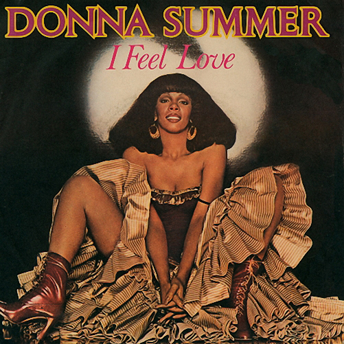
Possibly the most common photograph of Donna Summer used to promote her 1977 recording of I feel love. This photograph, without this text, but with track listings, participating musicians and other recording details, originally occupied the reverse of the I Remember Yesterday album sleeve. It has repeatedly been used in other contexts.
This post is being published just prior to the 10th anniversary of the death of Donna Summer, born LaDonna Gaines on 1948-12-31 in Boston, Massachusetts, and who died 2012-05-17 in Naples, Florida. It focuses on one track, I feel love (1977), but attempts to put this track into context. It was written by Summer, Giorgio Moroder (1940 – ) and Pete Bellotte (1943 – ). These two men produced much of Summer’s work throughout the 1970s at their recording studio, Musicland, in Munich, Germany.
At that time, disco, formerly discothèque, music was in vogue. Discothèques emerged in World War II Paris, as the playing of phonograph records at dance halls substituted for live musicians, increasingly unavailable due to the war. By the 1970s, this music had become formulaic, relying on a four-on-the-floor beat = a uniform 4/4 time, where a bass drum is struck on every beat, and a syncopated = off the main beat, baseline. In contrast with other popular genres, there was less emphasis on a lead guitar, and more emphasis on electronic keyboards, horns and strings. Musicland was particularly noted for its early use of synthesizers.
Starting in the 1950s, popular recorded music often involved a band of, typically, four musicians of which one was a lead singer, potentially the same person as the lead guitarist, and a single audio/ sound/ recording engineer working at a mixing console with the result fed into a multi-track tape recorder.
One significant step beyond this emerged in 1964, when Phil Spector (1939 – 2021) developed a wall of sound, which involved the use of multiple instruments to provide a richer sound, on the recordings. This was then edited down into a monophonic track. Yes, many musicians of the 1960s, were opposed to stereophonic recordings, claiming that it transferred too much audio control to the listener! In live performances, a wall of Marshall stacks, cabinets containing tube amplifiers and 4 x 300 mm speakers, became its own wall of rich sounds. Admittedly, these stacks in many cases violated norms/ laws/ regulations about noise, and may have contributed to the later hearing loss of people attending.
In the 1970s, disco intensified this layered approach, making separate recordings of the elements that would make up the final track. There were more musicians, and more recording staff involved in the process. It was often seen as a reaction to rock music which, in the 1960s, had risen to a dominating position.
I feel love, is the final track of Summer’s fifth album, I Remember Yesterday (1977), that provides 35m19s of music. That is, in most areas where the album was released. Some sources state that there were exceptions. The first track, the same as the album title, was intended to represent dance music from the 1940s. The second, Love’s Unkind, was inspired by the 1950s. The third, Back in Love, Again, mirrored the sound of the 1960s. The fourth track was a repeat of the first. On the reverse side, there were two disco songs, representing the 1970s, then a ballad. The album ends with a futuristic, I Feel Love.
Many people have argued that for Moroder and Bellotte, a song and a sound from tomorrow meant synthesizers and rhythm machines. Yet, that might be a simplification. There were many other workers on the track included: Robbie Wedel, with a background in electronics and composer Eberhard Schoener (1938 – ), both operated a Moog synth. At the time these were physically large, and fitted with large numbers of patch cables, that connected oscillators, voltage control units, triggers and an arpeggiator = sound generator.
A common approach to writing a song, is to perform it first on a keyboard with the composer also singing the lyrics, possibly just inside her/ his head. From that a more elaborate studio arrangement could be developed: in rock music using the band itself; in disco using studio musicians.
I Feel Love followed a different approach. Moroder and Bellotte worked initially on the song’s bassline. Wedel and engineer Jürgen Koppers (1941 – 2006) lay down a reference pulse put on track 16, of a 16-track tape recorder, that was used to synchronize the tracks as they were developed. This produced an exact timing reference. Only after this was done was the melody developed, resulting in the song sung by Donna Summer. She developed lyrics, and a melody that would complement the existing work on the track. I Feel Love is generally regarded as a difficult song to sing. This approach to developing music was later adopted by others working in the disco, EDM = electronic dance music, and techno genres.
One further notable characteristic of the song is the effective use of signal delays. The original bassline signal proceeds through the left speaker channel on time, but is almost imperceptibly delayed going through the right speaker. This required stereophonic sound, and listeners reacted positively to this.
Another innovation by Wedel was to make sound clips on the Moog, that create sounds resembling/ imitating a hi-hat or a snare drum. Unfortunately, not all the percussion effects could be produced by the Moog. It was difficult to produce the sound of a kick drum. Thus, a human, Keith Forsey (1948 – ), known for his precise timekeeping, was used to produce much of the percussion sounds. It was anything but a drum solo. Rather, each drum in the kit was recorded separately to produce a totally clean sound, preventing the bleeding of sounds that could potentially corrupt other sounds. Forsey has commented that this is an unnatural, counter-intuitive, frustrating way of playing: “Your body has to dance if you want the people to dance.”
I will end by stating that the original version of I Feel Love is not my favourite. I am more attracted to assorted other remixes. Patrick Cowley (1950 – 1982) has produced several remixes. Here is one that is 15 minutes long. Cowley is also notable for his Hi-NRG dance music compositions. These days, I am more attracted to the version of Belgian Moreno J(urgen), this one. In both cases the voice of Donna Summer still dominates.
For further insights into I Feel Love, people may want to begin with this article in Wikipedia.
Note: Upcoming weblog posts: on Saturday, 2022-05-21 there will be a post about World Goth Day #14, appearing one day before the event. Then, on Sunday, 2022-05-22 there will be a post about Otl Aicher (1922 – 2012), on the centenary of his birth. Both at 12:00 CEST (Central European Summer Time) = 10:00 UTC (Coordinated Universal Time, successor to Greenwich Mean Time).
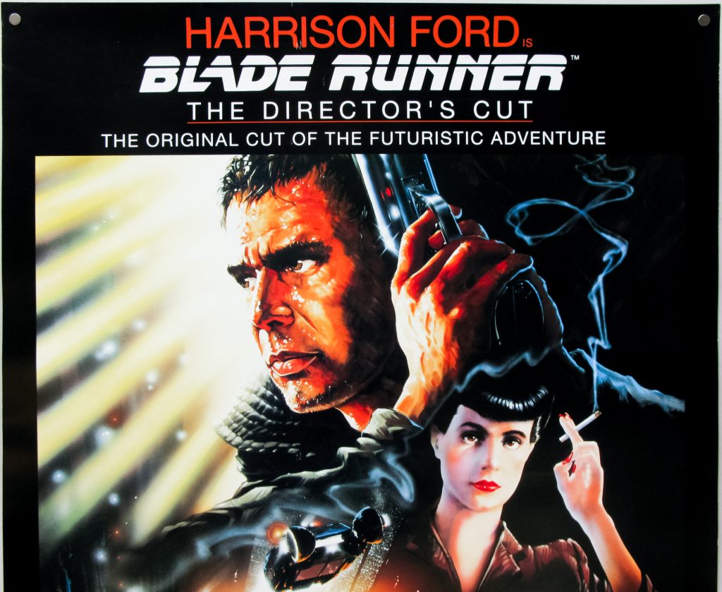
Poster for Blade Runner, the Director’s Cut (2007) depicting Los Angeles, after a nuclear attack in 2019. Here Deckard (protrayed by Harrison Ford) and Rachel (portrayed by Sean Young) are shown.
Part 1: For living humans
One of my fictional heroes is Angus MacGyver, portrayed by Richard Dean Anderson (1950 – ). I appreciate his non-violent problem solving that saturates the television series, that originally ran from 1985 to 1992, with specials beyond that. I have not watched any episodes of the 2016 restart. That appreciation, and my pacifist stance more generally, is undoubtedly related to viewing World War II, as the last major hot war, with the ideological aftermath resulting in a cold war. However, like many people, my values are being challenged with the Ukrainian reality of a Russian invasion.
In 1998, I attended a three-day seminar about violence in film. Each day, two separate movies were introduced, and we were asked to watch, reflect on and discuss these. Thus, in total, we examined six different films. None of these resembled anything like MacGyver, a fact I found disappointing. Rather, there was a focus on gratuitous violence, brutal acts lacking discernable literary, artistic, political or scientific value, according to one definition. While films from several different genres were presented, the organizers of the seminar were obviously very keen about science fiction.
I am not particularly interested in reading fantasy or science fiction. The outer edge of my comfort zone is found in magic realism. Part of the reason is that I have little interest in visiting other planets, or other times, when I have explored so little of this beautiful planet, in this modern, accessible age. However, there are some few science fiction films that attract me.
This weblog post builds on one of the films shown at this seminar. Three of the other ones were: A Clockwork Orange (1971), directed by Stanley Kubrick (1928 – 1999); Terminator 2: Judgment Day (1991), directed by James Cameron (1954 – ); and, The Eel (うなぎ, Unagi, 1997) directed by Shōhei Imamura (1926 – 2006). The other two films are forgotten. One of the main presenters at the seminar was Norwegian novelist, children’s book writer, screenwriter and film critic, Erlend Loe (1969 – ).
Twenty-four years after this seminar, Putin’s War is raging in Europe. Violence is no longer of theoretical interest. Many wonder how people can use art and other pastimes to address their concerns about war. One could ask which artistic genres are more/ most effective at suppressing violence, at the same time that they stop dictators from usurping the rights of others. Among the more popular of these flavours are: film, music, painting, theatre and writing fiction. Not everyone has elevated gaming into an art form, but it is also included, as have physical representations in the form of 3D models and costumes.
People approach culture in different ways. In this weblog post, variations on a single work will be used as an example. That work is Philip Kindred Dick’s (1928 – 1982) novel, Do Androids Dream of Electric Sheep? (1968), set in San Francisco in 1992 or, in later editions of the book, 2021. It takes place after a nuclear war. Dick’s inspiration for writing this novel was Fear (1940), a psychological thriller/ horror short story, written by L. Ron Hubbard (1911 – 1986).
A. Written materials
The first cultural flavour looked at here involves written materials. The advantage of reading a novel or short story is that it invites readers to co-create using their imagination. One disadvantage, is that this co-creation involves abstract thinking. Another is that many people have dyslexia, and related conditions, that prevent their enjoyment of this approach.
Rather than just reading, a more productive approach is to reflect on the work in question, and to produce a new work based on it. This could be another novel or short story, but it could, just as easily, be a filmscript, a theatrical play, or a poem.
B. Audio
There are many people who prefer to listen to audio books/ podcasts, instead of reading. Hearing disabilities can also prevent people from using this approach. Searching for information about relevant versions of the novel on the internet, the first link I came across was a free audiobook. One advantage of an audio format, is that it allows both sound effects as well as music to be part of a product. Once again, it is possible for the average person to create their own audio products, if only for family and friends.
C. Film
Ridley Scott’s (1937 – ) dystopian, science fiction film, Blade Runner (1982) is the work being focused on in this weblog post. It was also one of the films focused on at the seminar on violence in film, in 1998. For me, it is especially appreciated for its inability to depict Los Angeles in 2019. In the film, flying cars (spinners) co-exist with pay phones. Even Chester Gould (1900 – 1985) was able to equip Dick Tracy with a personal device, the wrist radio, an icon that dates from 1946-01-13.
Seven different versions of Blade Runner have been released, many massaged primitively by Warner Bros, who were concerned about the film’s viability, when the initial release resulted in low attendance, and confused audiences. The Director’s Cut (2007) is regarded as the definitive edition.
The protagonist, Rick Deckard, portrayed by Harrison Ford (1942 – ), is a bounty hunter/ blade runner, adapt at killing escaped androids/ replicants. Deckard’s life, still portrayed by Ford, continues in the film sequel, Blade Runner 2049 (2017), directed by Canadian Denis Villeneuve (1967 – ). The events of the original film and its sequel involve two different time periods separated by 30 fictional years and 35 real years. It is uncertain if Deckard is human, or a variant of something that he is hunting. Dick, Ford and Villeneuve say human, Scott says replicant. Villeneuve also adds, that the question is more important than the answer.
Rachael (Tyrell) was a Nexus-7 replicant, portrayed by Sean Young (1959 – ) in the original Blade Runner. In Blade Runner 2049, she was portrayed by body double Loren Peta (? – ) with Sean Young’s facial features de-aged and overlaid using computer graphics.
Today, everyone can be a film maker using an ever present cell phone to record audio and video, there are many free and open source apps that can be used to edit content, and there are many mechanisms that can be used to deliver such productions to a waiting audience, including Odysee, PeerTube and YouTube. I almost wrote a reminder to people to film in landscape format, but then wondered if that was just yet another indication that I was raised in a different millennium. Younger people might also prefer to view films on their cell phones, and appreciate a portrait format.
D. Theatre
Theatrical presentations can be developed from scratch, from novels and other written works including screenplays. They can also be inspired by almost anything. Street theatre involves a dramatic performance in some form of outdoor public space. Typically, the audience is unaware of the event, before it erupts before them.
E. Games
Westwood Studios was started by Brett Sperry (ca. 1960 – ) and Louis Castle (ca. 1960 – ) in 1985 in Los Vegas, Nevada. Their 1997 point and click game of Blade Runner, is a sidequel = side sequel. Many gamers prefer to use the Japanese term, gaiden (外伝, = outside legends). In both cases it refers to an original story running parallel to an established plot in a film or novel, sometimes interacting with it.
Computer games are regarded as the most profitable of the various entertainment industries. While estimates of revenue vary, assorted source provide the following values, in billions of dollars in 2020: games: $ 180, film $ 100, professional sports $ 75, music $ 23.
F. Physical representations
One very satisfying moment in my teaching career occurred when an entire class of metalworking students told me they had taken over a 3D printer, and were going to use it for the next week to make the components of a 3D model of a 4 cylinder internal combustion engine. When it was completed and assembled even the least mentally endowed of the students understood, in detail, how an engine worked.
I have encouraged many of my fashion obsessed female students to make their own clothing. Some few have even followed that advice.
In terms of Blade Runner, the design and construction of vehicle (spinner) models would undoubtedly appeal to many young males. Yet, I suspect that the design and construction of clothing appropriate for Los Angeles in 2049, would have greater appeal to many young females.
Getting rather conventional clothing items, such as T-shirts, with artwork featuring Saint Javelin, a female icon carrying a modern shoulder anti-tank weapon.
G. Painting
There are many derivative works of art that can be found that are based on Blade Runner. Any search engine will provide a list of them.
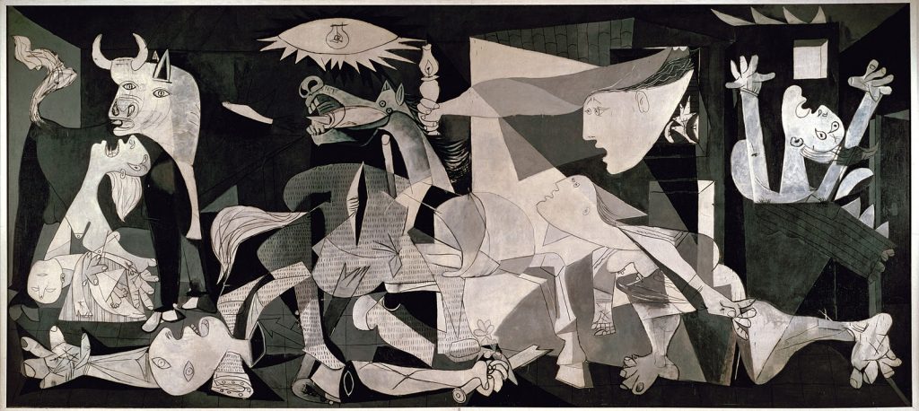
In my opinion, the one painting that best depicts the horrors of war is Pablo Picasso’s (1881 – 1973) Guernica (1937). It commemorates the 1937-04-26 bombing of the town of that name by the Nazi German Luftwaffe’s Condor Legion and the Fascist Italian Aviazione Legionaria, destroying the town and killing a disputed number of people, possibly up to 1 650.
Pablo Picasso’s Guernica (1937)
H. Other activities
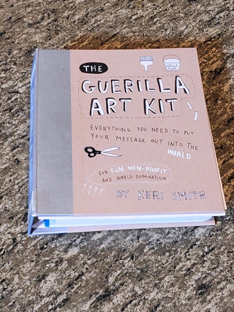
I would like to end this section by referring to Keri Smith (? – ), a Canadian conceptual artist. I know her best through one work, The Guerrilla Art Kit (2007). She has previously worked at Emily Carr University of Art and Design, in Vancouver. She is now on the advisory board of the Center for Artistic Activism, in New York city. Her main focus is on open works, a term invented by Umberto Eco (1932 – 2016), to describe pieces of art designed to be completed by the user. At 144 pages, The Guerrilla Art Kit, is sufficiently long. There is a section on etiquette, and another on tools. Much of it consists of 32 exercises, mostly fun yet provocative. Guerrilla gardening is one of my favourites, as is the portable idea dispenser.
Keri Smith, The Guerilla Art Kit (2007)
Part 2: For synthesizer fanchildren
One could argue, possibly even convincingly, that Part 2 is actually just flavour I. That is how it began, although flavours A to H were missing at the time. Re-reading the completed text, it was obvious that this section would appeal to about 1% of the intended audience, which would round off to about 0 readers. In addition, when written, it was based on the premise that a major manufacturer of synthesizers would make an inexpensive clone of the Yamaha CS-80. So far, this has not happened, and I have ended up buying an entirely different synthesizer.
Vangelis (born Evángelos Odysséas Papathanassíou, 1943 – 2022) composed the film score for the original Blade Runner film, largely using a Yamaha CS-80 analogue synthesizer. The Icelandic composer Jóhann Gunnar Jóhannsson (1969 – 2018) was hired to make the music for the sequel. To my ears it sounds similar to the original, but it was removed from the project by Villeneuve. Here is a sample of Jóhannsson’s theme for the film. He was replaced by Benjamin Wallfische (1979 – ) and Hans Zimmer (1959 – ). Here is a sample of a theme by Wallfische and Zimmer.
The Yamaha CS-80 analog synthesizer was made from 1977 to 1980. Initially, it cost US$ 6 900. Today, a used one can cost over US$ 100 000. It supported true 8-voice polyphony, meaning that it could play multiple independent melody lines simultaneously. It came with two independent synthesizer layers per voice, each with its own set of front panel controls, in addition to a number of hardwired preset voice settings and four parametric settings stores based on banks of sub-miniature potentiometers. This contrasted with one of its main competitors, the Sequential Prophet 5, that used programmable digital presets, to achieve equivalent results.
The CS-80 excelled in live performance. Its layered keyboard was both velocity-sensitive (like a piano’s) and pressure-sensitive (known as after-touch) but unlike most modern keyboards the aftertouch could be applied to individual voices rather than in common, and a ribbon controller allowing for polyphonic pitch-bends and glissandos. This can be heard on the Blade Runnersoundtrack by Vangelis, as well as the composer’s soundtrack for the film Chariots of Fire, and the bassline of Peter Howell’s interpretation of the 1980 theme tune to the BBC science fiction show Doctor Who.
Almost forty years ago, in a 1984 interview Vangelis described the CS-80 as: “The most important synthesizer in my career — and for me the best analogue synthesizer design there has ever been.”
The CS-80 is one of three instruments most frequently described as the pre-eminent polyphonic analog synthesizer. The other two are the Sequential Circuits Prophet-5, and Oberheim OB-X.
There are two plug-in instrument software emulations of the CS-80 for usage in digital audio workstation, music sequencer, and other software which supports the plug-in formats that these instruments were implemented and released in: the Arturia CS-80 V, released in 2003, and the Memorymoon ME80 released in 2009.
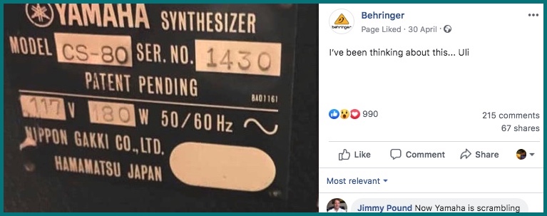
As previously noted, when this post was first being prepared, it was expected that Behringer would announce the production of an equivalent clone, the DS-80. It all began with a tweet on 2019-04-30. However, no product has appeared, yet. Indeed, there are comments that chip shortages are causing production delays and cancellations. This is especially affecting low-cost synths.
For those who prefer hardware synths, Studio Electronics announced their new Boomstar SE80 synthesizer in 2014, which includes a cloned filter section of the CS-80.
Since 2018, Deckard’s Dream Mk2 (DDRM2), an analogue polyphonic synthesizer clone of the CS-80, has been available in two versions, a standard build or as a kit from Black Corporation in Japan. Yes, the name, Deckard’s Dream, is taken from the protagonist in the Blade Runner films!
At the time of writing 2021-12-29, the price of the built version is US$ 3 749 including worldwide shipping. This is a rackmount synthesizer with CS-80 inspired architecture and features that supports polyphonic aftertouch using compatible third-party external keyboards.
A Black Corporation Deckard’s Dream Mk2 synthesizer suitable for installation in a rack. Photo: Black Corporation.
Black corporation informs potential buyers that the DDRM2 offers eight voices, each with two identical layered parts consisting of a 100% analog voltage controlled oscillator made with discrete waveshapers, analog lowpass and highpass filter (each with their own cutoff and resonance settings,) noise generator, unique multi-segment filter envelope, and VCA + ADSR envelope. Each layer also features its own independent programming section for musical instrument digital interface (MIDI) polyphonic expression (MPE) based velocity and polyphonic aftertouch control of its filter cutoff and amplifier settings.
DDRM2’s perfomance section features global pitch control with coarse & fine-tuning sliders, layer 2 detune slider, independent keyboard range control for each layer, mix balancing between layer 1 and layer 2, global filter cutoff and resonance offsets, and a global low frequency oscillator (LFO) to control both layers’ filter/pitch/amplifiers simultaneously.
DDRM2 also has a programming sections for global MPE-based control over LFO parameters + pitchbend, as well as global key tracking control over the filter and amplifier settings of both layers. There is a global portamento/glissando slider that operates on both layers simultaneously. As expected, DDRM2 has MIDI control, with an ability to store 128 presets per bank, across 10 banks.
If one is interested in impressing neighbours, then there is no substitute for the original Yamaha. The price of a used model is beyond the means of most mortals. If one is interested in making music, then there are numerous choices. One of these is a Yamaha Reface CS, a 37 key mini synth, based on the CS-80, launched in 2019. It costs about US$ 450. This is considerably cheaper than a DDRM2, which is also too expensive in relation to its value. Perhaps the cheapest hardware solution is an Arturia Microfreak connected to an outboard effects = FX unit like Bluesky. This can recreate all of the DDRM2 and CS sounds, for about US$ 300.
Other fanchildren will remind you that there is no need for a hardware synth, when a software synth will be able to provide the same level of utility.
Update: This post was updated 2022-05-19 at 21:30 to note the death of Vangelis, today.