
Otl Aicher designed Waldi, the first official Olympic Games mascot, who featured prominently in Munich in 1972,
Today, we celebrate the 100th anniversary of the birth of Otto “Otl” Aicher, born in Ulm, Germany 1922-05-22 and who died 1991-09-01, in Rotis, Germany. In this weblog post, a chronology of events is presented, but with a focus on the 1972 Olympic Games in München = Munich.
Aicher opposed the Nazi movement, and refused to join the Hitler Youth. For this, he was arrested in 1937. This also resulted in his failing the abitur = college entrance examination in 1941, after which he was drafted into the German army. He deserted the army in 1945.
Following the end of World War II, he studied sculpture at the Academy of Fine Arts, in Munich, in 1946 – 1947. In 1948 he opened a graphic design practice in Ulm. This was moved to Munich in 1967, then to Rotis in the Allgäu, in 1972, where he continued working until his death.
In 1952, he married Inge Scholl (1917 – 1998). She was a peace activist most of her adult life. Along with other members of her family, she was active in Weiße Rose = White Rose, a non-violent, intellectual resistance group in Nazi Germany. Her younger brother, Hans (1918 – 1943 ) and sister, Sophie ( 1921-1943) were both executed for their activities in the group, and her father, Robert Scholl (1891 – 1973) was imprisoned twice for his anti-Nazi activities. Her family also provided shelter to Aicher after he deserted from the German army. Among other books, she wrote, Students Against Tyranny: The Resistance of the White Rose, Munich, 1942–1943.
Hochschule für Gestaltung Ulm (HfG) = Ulm School of Design, was founded in 1953, by Aicher, Inge Scholl and Max Bill ( 1908 – 1994), a Swiss architect, painter, typeface designer, industrial designer, graphic designer, and the school’s first director. These three also developed the theoretical underpinnings of the school’s curriculum, which was heavily influenced by the Bauhaus. In 1958 Aicher was a visiting professor at Yale. In 1959 he held a similar position in Rio de Janeiro. In 1968, funding ceased for the HfG in Ulm and it had to close.
Otl Aicher collaborated with Dieter Rams (1932 – ) and Hans Gugelot (1920-1965) product designers at Braun, on product branding as well as on designing radios and record players, where all three were actively involved in developing Braun’s signature design aesthetic.
In 1969, Aicher worked with Lufthansa, developing the company’s corporate identity, including a redesign of its logo, a crane (Grus grus) originally designed by Otto Firle (1889-1966) in 1918 for Deutsche Luft-Reederei, another airline. Aicher wanted to replace the crane, but this was such an ingrained part of the Lufthansa identity that its Board of Directors would not allow it. The Lufthansa wordmark used a san-serif Helvetica typeface, developed by Max Miedinger (1910 – 1980) and Eduard Hoffmann (1892 – 1980) in 1957.
In 1967, Aicher was in charge of visual design for the 1972 Munich Olympic Games, that complemented Günther Behnisch’s (1922 – 2010) architectural design for the Olympic stadium. Aicher consulted with Masaru Katsumie (1909 – 1983), who was responsible for design at the 1964 Olympic Games in Tokyo. While Katsumie was entrenched in Japanese design, he promoted Western/ Modernist design, through the 1954 Gropius and the Bauhaus exhibition at the National Museum of Modern Art in Tokyo; his 1957 translation of Herbert Read’s (1893 – 1968) Art & Industry (1934), and by writing Guddo Dezain = Good Design (1957).

The Munich Olympic Games logo, Strahlenkranz = Halo, uses a garland to represent the sun as well as the five Olympic rings, merged in a spiral. Coordt von Mannstein (1937 – ) used mathematical calculations to rework Aicher’s design and to unify the garland and spiral elements in the final design.

Aicher designed the pictograms for the different sports, which are used worldwide today. Pictograms are important because they provide a visual interpretation of a sport, that is independent of language, so that athletes/ visitors to an Olympic village/ stadium could navigate the venues. Aicher’s pictograms use a series of grid systems and a specific bright colour palette, based on colours representative of the Alps. Mountains are represented in blue and white, while other elements use green, orange and silver. Red and black were not used. Colours identified services such as media, technical services, celebrity hospitality and public functions. Uniforms were colour-coordinated to these themes, so that Olympic staff of a particular department could be identified by their uniform colour. Otl Aicher’s pictograms can be found here.
For the Olympic designs, Aicher used Univers, a sans-serif typeface family designed by Adrian Frutiger (1928 – 2015) and released in 1957. Twenty-one sports posters were designed to advertise the sports at the games. These featured official design colours, the logo and “München 1972”. Posterization for the graphics on the posters involved separating the various tonal qualities from the images in a manual process and using the official Munich colours. The first of these posters was a poster of the Olympic stadium which became the official poster for these games.
For the first time in Olympic history, an official Olympic mascot was designed. This was Waldi, a dachschund.
Vancouver designers, Ben Hulse and Greg Durrell, are creating a comprehensive resource on Olympic Design, and have been engaged by the International Olympic Committee to create an Olympic Heritage Collection. Durrell notes that Munich is regarded as the best designed Games, with a really beautiful abstract logo. Elegance and simplicity have all but disappeared from Olympic logo design. More specifically, he states:”[I]t became very clear in the ’90s that as soon as [designers] get a computer, things just go crazy. There’s more colour, more texture, more elaborate shapes, more effects … I think we’re slowly starting to come off that a little bit, but it’s everywhere.”
Otl Aicher also developed the corporate image of media institutions, including ZDF, a German television channel, banks and reinsurers, including Westdeutsche Landesbank, Dresdner Bank, Sparkasse, Raiffeisenbank, and Bayerische Rück = reinsurance.
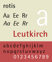
In 1972 Otl Aicher moved to Rotis in the Allgäu, where he founded the Rotis Institut für analoge Studien = The Rotis Institute for Analogue Studies, in 1984. Here, in 1988, he developed the Rotis typographical family. I find it interesting that before a rebranding in 2015, Scandinavian Airlines uses Rotis as the logotype, written in silver letters on aircraft bodies. Seattle’s Sound Transit, also uses it. Rotis was his last major design activity, before he was killed in an accident involving a motorbike, that fatally injured him while he was mowing his lawn.