Brooks Stevens (1911 – 1995)

The photographer, George Hunter (1921 – 2013) presumably in the background standing beside the Willys Station Wagon, described this photo as: “1949-07-00 Eileen O’Rourke and Rita Kennedy rest at the base of a sign for the Glynmill Inn, Corner Brook, Newfoundland and Labrador.” The reason for putting this expired copyright work here is precisely because of the Brooks Stevens designed all steel wagon, with its fake woody body, It is one of my favourite car designs, and the only American car I have attempted to buy. In the 1960s, it was beyond my meager budget. Alasdair and I stayed at the Glynmill Inn in 2024.

This weblog post is being published on the 30th anniversary of Brook Stevens’ death on 1995-01-04.

I did not start out admiring Brook Stevens. Instead, I admired a car, then found out that it had been designed by Stevens. In my opinion, Stevens was more of an industrial designer than a vehicle stylist. He was working with companies that could afford to use complex processes in large, well financed plants, as well as other companies that often had to outsource processes that larger companies would perform internally. He also had to know how the products he designed would be used. That said, not all of his designs were successful. The worst one was the Jeepster!

Stevens had a very severe case of polio at the age of eight. For a time he was unable to walk without help, but after a regimen of exercise (especially swimming) he regained almost full mobility. He always had a limp and suffered stiffness and pain in one half of his body. Towards the end of his life, more severe symptoms returned and he was eventually forced into a wheelchair. Stevens was encouraged by his father to draw while confined to bed. He studied architecture at Cornell University, at Ithaca, New York, from 1929 to 1933. Then, in 1934, he established a home-furnishings design firm in Milwaukee.

When he started working with vehicles in the mid-1940s, after the end of the second world war, he was working with unconventional products, including Harley-Davidson motorcycles in Milwaukee, Wisconsin, and Willy-Overland jeeps in Toledo, Ohio. He later worked with Studebaker, in South Bend, Indiana.

Stevens role at Willys was subordinate to Chief Engineer, Barney Roos (1888 – 1960). Roos had served as Studebaker’s head of engineering from 1926 to 1936, specializing in straight-eight engines. He later worked for the British Rootes Group in the design of Humber, Hillman and Sunbeam Talbot cars. Before World War II, he returned to the United States, where he co-designed the Willys MB.

The Willys MB and the Ford GPW, were both formally referred to as the U.S. Army truck, 1⁄4‑ton, 4×4, command reconnaissance. They were commonly known as the Willys Jeep, Jeep, or jeep. They were sometimes referred to by its Standard Army vehicle supply nr. G-503. Whatever they were called, they were highly successful American off-road capable, light military utility vehicles. 640 000 were built to a single standardized design, for Allied forces in World War II, from 1941 until 1945.

Much of the success of Willys jeep was its use of the L134 Go-Devil engine. This was probably the company’s greatest asset.

The engine started life as a less than impressive 36 kW 4-cylinder automobile engine. Roos increased its performance and durability beyond the Quartermaster Corps specifications of 115 Nm of torque at the rear axle. The extra power made it the engine of choice for the U.S. Army. It ended up as a 2.2 litre undersquare = 79.4 mm bore x 111.1 mm stroke engine with an L-head design with valves parallel with the cylinders. Initial power output was 45 kW at 4000 rpm and 142 Nm of torque at 2000 rpm. Compression = 6.48:1. In the Utility Wagon power was increased to 47 kW. This L134 engine was phased out by the F-head Willys Hurricane engine beginning in 1950.

An oversquare engine has a bore that is larger than its stroke. This allows larger valves and more space for air and fuel to enter and exit the cylinders, potentially leading to higher horsepower at higher RPMs due to the increased airflow. Undersquare engines with a longer stroke typically produces more torque at lower RPMs, which can improve its pulling power.

Stevens was influenced by he streamlined style of Stevens’ early work owes a great deal to New York designers who emerged in the 1920s, such as Walter Dorwin Teague (1883 – 1960), Norman Bel Geddes (1993 – 1958), Raymond Loewy (1893 – 1986) and Henry Dreyfuss (1904 – 1972). He was more especially influenced by European custom automobile designer, Alexis de Sakhnoffsky (1901 – 1964) born in Kyiv, Ukraine. Stevens owned a car, made by the Cord Automobile Company of Indiana, that Sakhnoffsky had customized. He met Sakhnoffsky in Chicago in 1934. He was impressed to learn that automotive design could pay over $300 a day. Stevens early car designs were sometimes quite reminiscent of Sakhnoffsky’s creations, that emphasized streamlining. For a short period in the 1950s Sakhnoffsky worked for Stevens as a staff designer.

Stevens had his office in Milwaukee because of its proximity to manufacturers. Allen-Bradley, Harley-Davidson, Cutler-Hammer, and Edmilton were among his early clients, that were all located in Milwaukee.

He worked more as a sales person, than a designer. He had a support staff of about twenty. After being hired to design/ redesign a product, he would usually make some quick sketches, showing the basic lines of the new design, with an emphasis on the product’s look and function. A staff designer would make renderings from these sketches, often using an airbrush or marker. Stevens would then meet with the client and decide which version was best. Next, a three-dimensional model, either at scale or in full size, would be made by an in-house model-maker. Initially sculpting clay was used, but in the 1960s the firm used cast fiberglass. Then, the model was painted/ embellished.

I share one trait with Stevens, a love of peanut butter. However, he was frustrated by jars that had a too narrow neck, so it was impossible to get all the peanut butter out of the jar’s shoulders. Stevens insisted on a wide mouth.

When Willys’ made their prototype jeep shortly after USA entered World War II, it was overweight compared to Army requirements, but the powerful engine and its heavier and more robust transmission, was a power train combination that proved to be beneficial in the long-run for use in cross-country travel.

Willys did not have their own facilities for automotive bodywork. Their sheet metal manufacturing processes were outsourced to appliance manufacturers. These fabricators were restricted in terms of the shapes they could produce. Body panels could not have an offset of more than about 150 mm. In sheet metal drawing, a die forms a shape from a flat sheet of metal, the blank. This material is forced to move and conform to the die. Pressure is applied to the blank and lubrication applied to the die or the blank. Wrinkles will occur in the part, if the blank moves too easily. The correction is more pressure or less lubrication to limit the flow of material and cause the material to stretch. Too much pressure will result in the part becoming too thin, leading to breakage. Drawing metal requires finding a balance between wrinkles and breaking to produce a useful part.

To be a successful automotive designer, Stevens had to understand many different production processes: conventional sheet metal drawing, deep drawing, piercing, ironing, necking, rolling and beading.

Confession: I have attempted to buy one American car in my life, a 1956 Willys Station Wagon (rear-wheel drive). Unfortunately, my savings were just too little to afford it. I have also been attracted to some American vehicles produced by: International Harvester, Rambler, Studebaker and Willys. The Big Three = General Motors/ Ford/ Chrysler? Not so much.

This vehicle was in production from 1947 as the Willys Station Wagon (model 463), using the same engine and transmission, and with clear styling influence from the CJ-2A Jeep. The CJ in the model description refers to civilian jeep. In 1948, a Jeep Utility Truck emerged. Both it, and the wagon were available in four-wheel drive. In this formation it was referred to as a Utility Wagon the ancestor of all sport utility vehicles. It was an all steel vehicle, with a fake woody body.

A Jeepster convertible, model designation VJ, was also available from 1948 to 1950, with rear-wheel drive only, and the 4-cylinder Go Devil Engine. VJ apparently doesn’t mean anything. Wikipedia tells us the Jeepster’s problems in the marketplace were due to its limited utility and practicality. It looks rugged and off-road capable, but is not. Appeal is limited due to the basic construction, poor all-weather protection, and the low performance when equipped with the I-4 engine. Even with an optional six-cylinder engine and offering the VJ3 version at a lower price, Jeepsters did not draw many new buyers. One specific factor turning potential buyers away, was the lack of roll-up door windows.

Brooks also designed Harley-Davidson motorcycles, especially the 1949 Hydra-Glide, one of his first, helping create the new suspension forks in the front, bucket headlight, and the streamlined design. All Harleys since, including models in production now, are based on Stevens’s body designs.

Stevens worked with branding. His most ambitious projects were an ongoing series of package and logo designs for Miller Brewing in the early 1950s. For 3M he developed a unified package design, that was applied to 35 000 different products, in 1965.

Stevens started working for Studebaker in 1961, when the company was already in a lot of trouble financially. The auto manufacturer closed its South Bend factory in December of 1963. Thus, the only Stevens designs that Studebaker produced were the 1962 and 1963 Larks and Hawks and the 1963 Wagonaire. He did create several prototypes for other cars, projecting designs for the company all the way out to 1968.

Stevens’ relationship with Outboard Marine Corporation (OMC) was always extremely strong, in part because he was a friend of Ralph Evinrude (1907 – 1986). Stevens’ staff designers, especially Gordon Kelly and John Bradley, executed hundreds of designs for OMC’s products: Evinrude and Johnson outboard motors, Lawn Boy mowers, Cushman scooters, carts and motorcycles.

Stevens acknowledged the fact that all of his designs were ephemeral. He envisioned good design as changing from year to year, to adapt to new technologies and new tastes. Planned obsolescence was
Good Design

A fence constructed out of split pales, at Vangshylla, Norway. Constructed by Jörg Mentzen. This is an example of appropriate design.

Good Design can be summarized in three words: Weniger, aber besser = Less, but better! Personally, I prefer the term, appropriate design. However, good design seems to be more common. Regardless, people can interpret such a phrase in different ways, so here are ten points to promote a better understanding of it. Good/ appropriate design:

  1. is innovative – The possibilities for progression are not, by any means, exhausted. Technological development is always offering new opportunities for original designs. But imaginative design always develops in tandem with improving technology, and can never be an end in itself.
  2. makes a product useful – A product is bought to be used. It has to satisfy not only functional, but also psychological and aesthetic criteria. Good design emphasizes the usefulness of a product whilst disregarding anything that could detract from it.
  3. is aesthetic – The aesthetic quality of a product is integral to its usefulness because products are used every day and have an effect on people and their well-being. Only well-executed objects can be beautiful.
  4. makes a product understandable – It clarifies the product’s structure. Better still, it can make the product clearly express its function by making use of the user’s intuition. At best, it is self-explanatory.
  5. is unobtrusive – Products fulfilling a purpose are like tools. They are neither decorative objects nor works of art. Their design should therefore be both neutral and restrained, to leave room for the user’s self-expression.
  6. is honest – It does not make a product appear more innovative, powerful or valuable than it really is. It does not attempt to manipulate the consumer with promises that cannot be kept.
  7. is long-lasting – It avoids being fashionable and therefore never appears antiquated. Unlike fashionable design, it lasts many years – even in today’s throwaway society.
  8. is thorough down to the last detail – Nothing must be arbitrary or left to chance. Care and accuracy in the design process show respect towards the consumer.
  9. is environmentally friendly – Design makes an important contribution to the preservation of the environment. It conserves resources and minimizes physical and visual pollution throughout the lifecycle of the product.
  10. is as little design as possible – Less is more. Simple as possible but not simpler. Good design elevates the essential functions of a product.

The ten principles, listed above, were developed in the 1970s, by Dieter Rams, born 1932-05-20. His ninetieth birthday was celebrated only eight days before the publication of this post, two days before World Goth Day #14, and the 100th anniversary of the birth of Otl Aicher. Yes, Dieter Rams was mentioned in that post. However, even I was able to appreciate that publishing three posts in a week was excessive, so this post on Rams had to wait! However, most of it was actually written before both of the others.

Like many people, Rams’ trajectory through life was not straight. In terms of career, he started his working life, like his influential grandfather, as a carpenter. Part of a carpenter’s training involves learning to deal with product that can be difficult to work with – wood. Some people feel that disobedient wooden components, need to be beaten into submission. Others learn that beating is not the correct approach, but that there are a few simple techniques that can persuade wood to perform as wanted. Trees have branches, that impact wood’s shape, texture and strength. Today, most wood is cut with saws, producing large quantities of both wood and sawdust. Many industrial processes depend on sawdust, an inferior product with mass but lacking strength. Despite that, I envisage a time in the future, where this waste will be reduced, as it becomes more economical to use laser cutters, if only because this would produce more of a stronger product.

Before saws became commonplace, other techniques had to be used. One approach is to split, rather than cut, wood. Locally, one of my neighbours, Jörg Mentzen, has recently installed a fence with split pales. Here the fence effectively keeps dogs and children on one side, and larger wildlife on the other. Smaller animals, such as snails, squirrels and birds, are allowed free passage. In terms of its production, there is very little waste. This fence is totally in the spirit of Dieter Rams.

Rams’ apprenticeship as a carpenter was interrupted in 1947, with studies in architecture and interior decoration at Wiesbaden School of Art. With his apprenticeship complete, he was able to return to school in 1948, finishing his studies in 1953. Of course, there are different ways of seeing these changes. Wikipedia, for example, wants to focus on his apprenticeship interrupting more academic studies.

After graduating, Rams began working for architect Otto Apel (1906 – 1966), in Frankfurt.

Rams is best known for his work at Braun. Max Braun (1890 – 1951) founded what later became an electrical appliance company in 1921. After his death, the company was taken over by his sons Erwin (1921-1992) and Artur (1925-2013). In 1967 they sold the company to The Gillette Company, which was subsequently taken over by Procter & Gamble in 2005.

In 1955, Rams started working for Braun as an architect and an interior designer. At some point, his role transitioned to that of industrial designer. In 1961, he became the chief design officer at Braun, a position he retained until 1995.

From 1957 Rams also worked as a furniture designer for the Otto Zapf (1931 – 2018) company, who joined with Danish entrepreneur Niels Vitsœ (1913 – 1995) in 1959 to form Vitsœ + Zapf. In 1969 this became Vitsœ. Rams designed the 606 Universal Shelving System, the 620 armchair and the 621 side table. They all show minimalist characteristics.

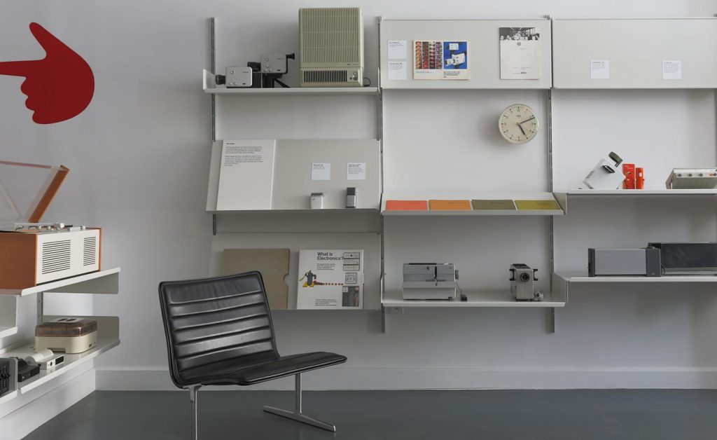
This collection belonging to the Vitsœ company, consists of Dieter Rams designs, many displayed on Vitsœ 606 Universal Shelving System units. In 2017, it went on display in New York, before being sent to the company’s new Royal Leamington Spa headquarters, in England. Other notable products shown here include a Vitsœ 620 chair, and a Braun SK 4/10 aka Snow White’s Coffin because of its white metal casing and transparent lid, a radio/ record player, designed by Dieter Rams and Hans Gugelot. Many of these pieces were originally collected by designer Tom Strong (1940 – ), who first came across Braun products when he was stationed in Germany with the US Army, in the 1960s. He donated these to Vitsœ. Photo: Vitsœ.

With respect to his house, Rams comments: “My house in Kronberg, bordering the Taunus woodlands, is part of a concentrated housing development that I had originally helped to plan. The house is built and furnished according to my own design and I have lived here with my wife since 1971. It goes without saying that we live with Vitsœ furniture systems. Firstly, because I have only ever designed furniture that I myself would like to have and secondly to get to know them during daily use to better recognise where they might be improved or developed further. In instances where the Vitsœ programme is not complete, I have selected furniture from other manufacturers that have been designed from a similar perspective, such as the bent wood 214 Thonet chairs around the table that we use for dining, or the Fritz Hansen stools at the breakfast bar between the kitchen and living area.”

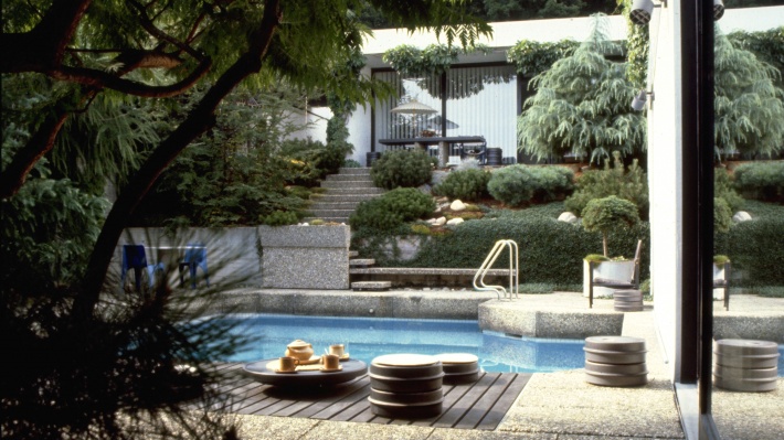
The Rams’ house is described as an L-shaped bungalow, modest in size. A workshop is located below the main living area. Its only apparent extravagance is a small swimming pool. It is a listed property, meaning that the Hessen Office for the Preservation of Historical monuments, has decreed that the building is to be preserved in perpetuity, and cannot undergo significant changes. From my perspective, the house contains an excessive amount of white and cement, and too little wood. I find this surprising in a house designed by an architect, who first worked as a carpenter.

The house occupied by Dieter Rams and Ingeborg Kracht-Rams since 1971. Photo: Ingeborg Kracht-Rams.

Otl Aicher (1922 – 1991)

Otl Aicher designed Waldi, the first official Olympic Games mascot, who featured prominently in Munich in 1972,

Today, we celebrate the 100th anniversary of the birth of Otto “Otl” Aicher, born in Ulm, Germany 1922-05-22 and who died 1991-09-01, in Rotis, Germany. In this weblog post, a chronology of events is presented, but with a focus on the 1972 Olympic Games in München = Munich.

Aicher opposed the Nazi movement, and refused to join the Hitler Youth. For this, he was arrested in 1937. This also resulted in his failing the abitur = college entrance examination in 1941, after which he was drafted into the German army. He deserted the army in 1945.

Following the end of World War II, he studied sculpture at the Academy of Fine Arts, in Munich, in 1946 – 1947. In 1948 he opened a graphic design practice in Ulm. This was moved to Munich in 1967, then to Rotis in the Allgäu, in 1972, where he continued working until his death.

In 1952, he married Inge Scholl (1917 – 1998). She was a peace activist most of her adult life. Along with other members of her family, she was active in Weiße Rose = White Rose, a non-violent, intellectual resistance group in Nazi Germany. Her younger brother, Hans (1918 – 1943 ) and sister, Sophie ( 1921-1943) were both executed for their activities in the group, and her father, Robert Scholl (1891 – 1973) was imprisoned twice for his anti-Nazi activities. Her family also provided shelter to Aicher after he deserted from the German army. Among other books, she wrote, Students Against Tyranny: The Resistance of the White Rose, Munich, 1942–1943.

Hochschule für Gestaltung Ulm (HfG) = Ulm School of Design, was founded in 1953, by Aicher, Inge Scholl and Max Bill ( 1908 – 1994), a Swiss architect, painter, typeface designer, industrial designer, graphic designer, and the school’s first director. These three also developed the theoretical underpinnings of the school’s curriculum, which was heavily influenced by the Bauhaus. In 1958 Aicher was a visiting professor at Yale. In 1959 he held a similar position in Rio de Janeiro. In 1968, funding ceased for the HfG in Ulm and it had to close.

Otl Aicher collaborated with Dieter Rams (1932 – ) and Hans Gugelot (1920-1965) product designers at Braun, on product branding as well as on designing radios and record players, where all three were actively involved in developing Braun’s signature design aesthetic.

In 1969, Aicher worked with Lufthansa, developing the company’s corporate identity, including a redesign of its logo, a crane (Grus grus) originally designed by Otto Firle (1889-1966) in 1918 for Deutsche Luft-Reederei, another airline. Aicher wanted to replace the crane, but this was such an ingrained part of the Lufthansa identity that its Board of Directors would not allow it. The Lufthansa wordmark used a san-serif Helvetica typeface, developed by Max Miedinger (1910 – 1980) and Eduard Hoffmann (1892 – 1980) in 1957.

Lufthansa logo, logotype
Otl Aicher’s redesign of the Lufthansa crane logo with Helvetica wordmark from 1969.

In 1967, Aicher was in charge of visual design for the 1972 Munich Olympic Games, that complemented Günther Behnisch’s (1922 – 2010) architectural design for the Olympic stadium. Aicher consulted with Masaru Katsumie (1909 – 1983), who was responsible for design at the 1964 Olympic Games in Tokyo. While Katsumie was entrenched in Japanese design, he promoted Western/ Modernist design, through the 1954 Gropius and the Bauhaus exhibition at the National Museum of Modern Art in Tokyo; his 1957 translation of Herbert Read’s (1893 – 1968) Art & Industry (1934), and by writing Guddo Dezain = Good Design (1957).

https://www.brandemia.org/wp-content/uploads/2013/01/Otl_Aicher_01.jpg
Otl Aicher in 1972

The Munich Olympic Games logo, Strahlenkranz = Halo, uses a garland to represent the sun as well as the five Olympic rings, merged in a spiral. Coordt von Mannstein (1937 – ) used mathematical calculations to rework Aicher’s design and to unify the garland and spiral elements in the final design.

Olimpiadi Monaco - Otl Aicher
The Munich Olympic Games halo logo, Strahlenkranz, designed by Otl Aicher.

Aicher designed the pictograms for the different sports, which are used worldwide today. Pictograms are important because they provide a visual interpretation of a sport, that is independent of language, so that athletes/ visitors to an Olympic village/ stadium could navigate the venues. Aicher’s pictograms use a series of grid systems and a specific bright colour palette, based on colours representative of the Alps. Mountains are represented in blue and white, while other elements use green, orange and silver. Red and black were not used. Colours identified services such as media, technical services, celebrity hospitality and public functions. Uniforms were colour-coordinated to these themes, so that Olympic staff of a particular department could be identified by their uniform colour. Otl Aicher’s pictograms can be found here.

For the Olympic designs, Aicher used Univers, a sans-serif typeface family designed by Adrian Frutiger (1928 – 2015) and released in 1957. Twenty-one sports posters were designed to advertise the sports at the games. These featured official design colours, the logo and “München 1972”. Posterization for the graphics on the posters involved separating the various tonal qualities from the images in a manual process and using the official Munich colours. The first of these posters was a poster of the Olympic stadium which became the official poster for these games.

For the first time in Olympic history, an official Olympic mascot was designed. This was Waldi, a dachschund.

Vancouver designers, Ben Hulse and Greg Durrell, are creating a comprehensive resource on Olympic Design, and have been engaged by the International Olympic Committee to create an Olympic Heritage Collection. Durrell notes that Munich is regarded as the best designed Games, with a really beautiful abstract logo. Elegance and simplicity have all but disappeared from Olympic logo design. More specifically, he states:”[I]t became very clear in the ’90s that as soon as [designers] get a computer, things just go crazy. There’s more colour, more texture, more elaborate shapes, more effects … I think we’re slowly starting to come off that a little bit, but it’s everywhere.”

Otl Aicher also developed the corporate image of media institutions, including ZDF, a German television channel, banks and reinsurers, including Westdeutsche Landesbank, Dresdner Bank, Sparkasse, Raiffeisenbank, and Bayerische Rück = reinsurance.

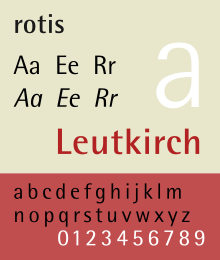
In 1972 Otl Aicher moved to Rotis in the Allgäu, where he founded the Rotis Institut für analoge Studien = The Rotis Institute for Analogue Studies, in 1984. Here, in 1988, he developed the Rotis typographical family. I find it interesting that before a rebranding in 2015, Scandinavian Airlines uses Rotis as the logotype, written in silver letters on aircraft bodies. Seattle’s Sound Transit, also uses it. Rotis was his last major design activity, before he was killed in an accident involving a motorbike, that fatally injured him while he was mowing his lawn.

Rotisng.svg
The Rotis typeface, Otl Aicher’s last design activity, in 1988.

Open Source Ventilator Project

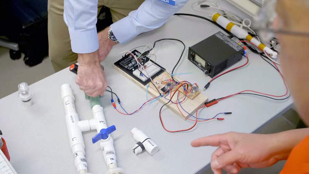
The University of Florida Health Open Source Ventilator (Photo: University of Florida)

The Center for Safety, Simulation and Advanced Learning Technologies at the University of Florida Health has developed open-source, open architecture ventilator engineering design specifications to address a predicted ventilator shortage worldwide due to the COVID-19 pandemic. It will also host open source contributions.

The above link directs people to a website that provides sufficient information to construct such a ventilator, although attention is also focused on the disclaimer at the bottom of the page.

Other news sources have also provided more readable information on the project.

It is claimed that hardware for the project is readily available at hardware stores. Parts were purchased at Home Depot. There are claims that the ventilator can be produced with $300 in parts, in addition to labour. I note that the controller is an Arduino based unit. The Arduino is a very simple controller board, that I have used in my teaching from 2008 – 2016.

If you (or someone you know) would like to work on this or similar health projects, please contact me at: brock@mclellan.no

MIT Emergency Ventilator Project

E-Vent, a team of volunteers, scientists, physicians and computer scientists at MIT revived a 10-year-old ventilator project. The result is an affordable and easily replicable, but primitive, ventilator design. The total parts cost is $400 to $500, . The E-Vent team plans to share their design online on their website so that manufacturers and companies can recreate the lifesaving device for hospitals around the world.

The device’s main part already exists in most American hospital inventories: an Ambu resuscitation bag. Usually, these are manually operated by emergency technicians or medical professionals to keep a patient breathing until they are hooked up to a ventilator. The E-Vent team adapted the Ambu bags by attaching it to an automated mechanism that replicates a human. This project appears to be more expensive, and less functional than the University of Florida project.

Construction: 2020 Season

The building/ construction season is starting at Cliff Cottage today, 2020-04-01. Today, equipment will be positioned. Tomorrow, 2020-04-02, if all goes well, the utility trailer will be taken out to purchase building supplies, so that these do not become a bottleneck. This date is chosen because it is the first day after we come out of quarantine.

This building activity means there will be less time to write weblog posts. Unless something changes, posts will be published only on the first day of each month, from April (this post) to September 2020.

The weblog season will begin again 2020-10-01, with a post that has already been written, titled Hipster. Other posts about computing equipment have also been written.

Knots

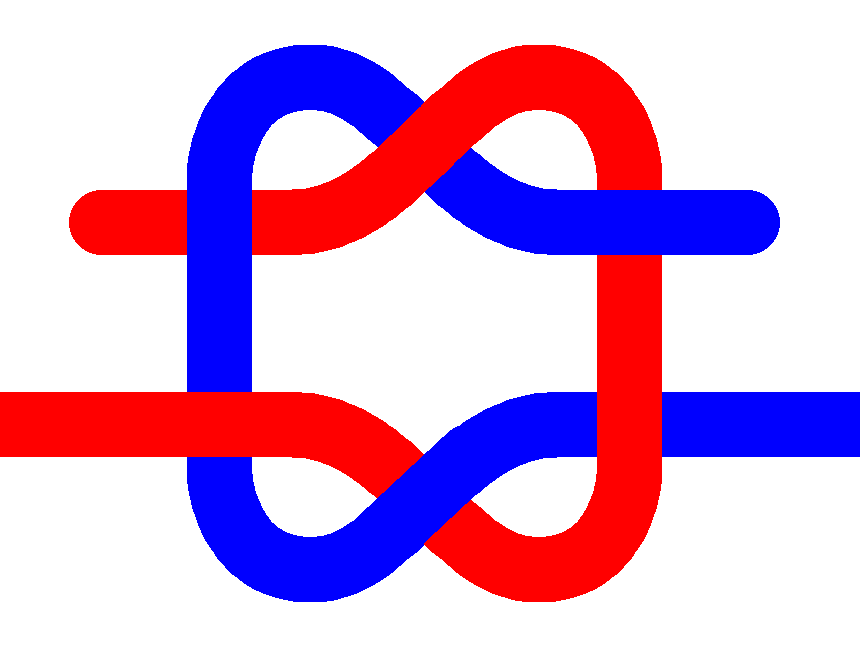
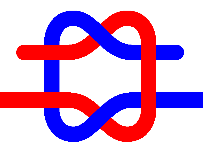
Mathematicians and engineers at MIT have developed a mathematical model that predicts knot stability. Key properties, include the number of crossings involved and the rope segments’ direction of twist as the knot is tightened, help compare the strength of different knots.

A Granny knot, famous for slipping (above), and a Reef knot (below). The Reef knot is at least 4 000 years old. Its name dates from at least 1794 and originates from its common use to reef sails. (Artwork: PAR on wikimedia)

With the new model any two knots – even those that are almost identical – can be compared and the model will determine which one is better.

Over centuries people have empirically known which knots are better for which purposes. The model explains why.

Researchers were able to identify characteristics that determine a knot’s stability (counting rules). A knot is stronger if it has more strand crossings and changes in the direction of rotation from one strand segment to another (twist fluctuations). If a fiber segment is rotated to the left at one crossing and to the right at a neighbouring crossing, twist fluctuations and opposing friction will occur as the knot is tightened. These add stability to the knot. If segments are rotated in the same direction at two neighbouring crossing, there is no twist fluctuation. The strand is more likely to rotate, slip, and produce a weaker knot.

Counting rules explain why a reef knot is stronger than a granny knot: The reef knot has a higher number of twist fluctuations, making it a more stable configuration.

For further information, please see the source article.

Tripp-Trapp

Two Tripp Trapp chairs: One 30 years old (left) and another that is new (right).
The owner’s name proudly engraved on the back of the new chair.

One of the great appeals of the Tripp Trapp chair is its use of wood, which offers its own warmth and aesthetics. So much better than plastic! On Thursday, 2019-06-13, we assembled our third – and probably last – Tripp Trapp chair. The other two chairs were purchased when our children were about six months old, in 1984 and 1989 respectively. They are now about 35 and 30 years old.

This iconic adjustable wooden chair for children was developed by a local (Norwegian) furniture designer in 1972 for a local (Norwegian) furniture manufacturer. When we bought the first chair, we were living in the same county (Møre og Romsdal) where the chair was made. Both the first two chairs were made by Norwegian workers in Norway. By purchasing the chairs, we felt we were supporting the local economy.

Fitting a globalized world, the company producing the chair is now owned by a Belgium investment company, itself fully owned by a South Korean investment company. The new chair was made in Romania. Today, I feel I am helping a foreign billionaire increase his wealth.

The name Tripp Trapp is derived from the game tripp-trapp-tresko (Norwegian) = Tic-tac-toe (American English) = noughts and crosses (British English).

Furniture design inspires myths. In the case of Tripp Trapp, it is that Peter Opsvik (1939 – ), the designer, couldn’t find a chair that could position his son at table height. Tripp Trapp was Opsvik’s response to that situation.

Years ago, we visited Opsvik’s Cylindra workshop in Sykkylven, to see his exhibition of sculptural furniture. They lacked the functionality of the Tripp Trapp, and seemed pretentious. I was not impressed. In fact, none of Opsvik’s other designs appeal to me.

The Furniture Museum, in the same village, Sykkylven, was much more interesting, for it put into perspective how and why the furniture industry developed. Two words explain it all: poverty and necessity.

The furniture manufacturer, Stokke AS started as Møller & Stokke, a partnership, in 1932 by Georg Stokke and Bjarne Møller. It was located near Ålesund, which became the locus of the Norwegian furniture industry. In 1944, it was converted to an aksjeselskap (AS) = limited liability company. Bjarne Møller sold his interest in the company in 1955, and the company changed its name to Stokke Fabrikker AS = Stokke Factories Ltd. Since 2014, the company has been owned by NXMH, an investment company based in Belgium, fully owned by NXC in South Korea. NXC is the largest shareholder in NEXON Corporation, a Korean video game publisher.

Tripp Trapp did not sell well in the beginning, but a news segment on Norwegian television in 1974 sparked interest. By 2016 Tripp Trapp had sold more than 10 million chairs.

The Norwegian Wikipedia article on the chair reports that it has been the subject of over 500 cases where other companies have made almost exact copies of the Tripp Trapp chair. One hundred and thirty of these cases have been tried in court, with Stokke winning most cases. The Supreme Court in Norway, along with other courts in Denmark and Germany, have stated that the Tripp Trapp design is an intellectual property. This means that royalties will have to be paid on the chair for the life of the designer, plus 70 years. Even if Opsvik died tomorrow, it means that this chair design will remain out of the public domain, until 2090.

Tripp Trapp has a distinctive design that is characterized by two boards (a seat and footrest) that can be placed at different heights so that the child can sit on the chair at the correct height to the table with feet firmly planted on the lower board. Since both boards are adjustable not only in height, but also depth, the chair can be adjusted to accommodate the child as s/he grows. The chair has a height of 790 mm, occupies a depth of 490 mm and has a width of 460 mm. It will support an adult weighing up to 110 kg.

All our Tripp Trapp chairs have been made from solid as well as laminated beech components. The chair is also available in natural and painted beech in numerous colour combinations, as well as in ash and oak. This last chair also had a name, Trish. engraved on its back.

The rationale behind purchasing this chair is that a dining room/ kitchen table has a fixed height, so that it is the chair that has to be adjustable. The reason the table is fixed, is that multiple people have to sit around it. In other circumstances, a table/ desk/ working surface just has to accommodate a single person. In this situation, the sitting height of the chair can be adjusted so that the user can have her/his feet comfortably on the floor. Then, a height-adjustable, sit-stand work surfaces can easily adjusted to accommodate user anatomy – elbow height especially – allowing for varied work postures, when sitting or standing.

In 2013, together with Danish furniture manufacturer Evomove, Opsvik launched a new chair he claims is described by consumers and test panels as the world’s best high chair, Nomi. Unfortunately, I am not sure that this chair is suitable for an adult. It is totally unappealing, regardless of its ergonomic and other claims.

The Nomi chair just doesn’t seem appropriate for an adult. The massive amount of plastic used in its construction, gives a vastly different aesthetic, compared to the Tripp Trapp chair. (Photo: Evomove)

At a price of almost NOK 1 900, (USD 200) in beech/ ash or NOK 2 100 in oak, for the basic model, the Tripp Trapp chair is not cheap. However, used chairs abound. There are currently 48 of them on offer in Trøndelag county on the most popular website, at an average price somewhere around NOK 500.

The most basic model of the Nomi chair is even more expensive at NOK 2 200. Its price is an outrageous USD 380 at Modern Natural Baby in Ferndale, Michigan. I could not find any Nomi chairs for sale, used.

A Timeline

We ordered the Tripp Trapp chair on 2019-06-04 at 16:45. This is acknowledged by Stokke in a separate email.

A message arrived saying that the chair had been sent, complete with engraving on 2019-05-05 at 17:20 (24 hours 35 minutes later). Oddly, Stokke was using UPS to send a parcel in Norway. This is the first time that I have ever had something from Norway sent by UPS.

A request for an evaluation of our purchasing experience arrived on the same date at 21:15 (3 hours 55 minutes later). What sort or evaluation are these people expecting? We had not yet received the product.

A reminder for this evaluation arrived on 2019-06-07 at 09:12 ( 35 hours 57 minutes later). Again, what are these people expecting? We still had not yet received the product.

An e-mail arrived saying that UPS has attempted to deliver the product on 2019-06-12 at 08:50 ( 6 days 15 hours 30 minutes after being sent). It is a very interesting email, since Trish was on scaffolding on our house painting, at this very moment, and there was no sign of any delivery vehicle anywhere.

Despite both Stokke and Bring as well as the Norwegian Post Office registering our telephone number and address to send out an SMS, no SMS or email was received to say the chair is ready to be picked up at our local postal pick-up point. Why did you ask for this information if you are not going to use it?

The chair was picked up at Co-op Extra in Straumen on 2019-06-12 at about 19:00.

A notice was received by snail mail saying that the chair could be picked up. This was delivered 2019-06-13 at about 9:00.

The chair was assembled 2019-06-13 at about 12:00. The instructions provided were adequate. Immediately after this, the chair was in use.

Bespoke Furniture

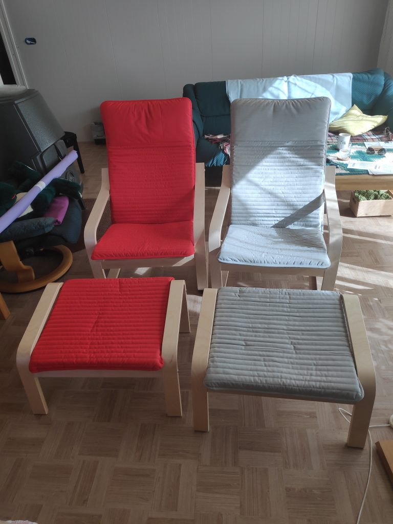
New, inexpensive Ikea Poäng chairs and footstools, that have not been able to create sustainable employment opportunities for anyone living locally, or anyone I know, personally.

Back in 1978, newly wed Patricia and Brock wanted to buy furniture for their New Westminster apartment. Despite Ikea opening its first store in Canada in 1976 in nearby Richmond, we decided not to buy two arm chairs and a three-seater sofa there or from any of the other assortment of furniture palaces, emporiums or warehouses to be found in Greater Vancouver. Instead, we found a small, custom furniture workshop on Hastings Street, in Vancouver, and a man who could make furniture to order, or at least to his fairly unique, minimalist design. The result was no more expensive than the equivalent to be found at Ikea.

In 2019, not so young Patricia and Brock are contemplating acquiring replacement furniture for their living room. They have only had their current sofa set for about eleven years, but it is showing its age. The set was about twenty years old, when it was purchased used for about 10% of its new price. We never actually owned new living room chairs or sofas in Norway, until May 2019, when on impulse we purchased two Poäng chairs, from Ikea in Trondheim. These chairs cost about NOK 800 (USD 93) each, while the footstools cost about NOK 500 (USD 58) each. Further information about the Poäng can be found here.

Our standard living room chair purchase is a used high-backed Siesta chair, and we would pay about NOK 500 for each of them. This chair was designed by Ingmar Relling in 1965. These are becoming harder to find, at least used, and people are wanting to sell them not so much as inexpensive seating, but as examples of exclusive mid twentieth century Scandinavian furniture. Of the four we have purchased in the past, two have been given away to people who had a pressing and immediate need for furniture, while the other two have been relocated to another room in our house. The new price of our version of Siesta chairs is NOK 14 900 (USD 1 700) each. Even the footstool costs NOK 6 250 (USD 700). See here.

One of the advantages of living in a well regulated society, is the ample availability of statistics. There is a population register that records the official addresses of everyone in the country. SSB (Statistisk sentralbyrå = Statistics Norway) is able to report that the population of Inderøy was 6 804 at the beginning of 2019. Incomes and deductible expenses are public knowledge, as are many other statistics about people and their spending habits.

From the collected statistical information and other data, SIFO (Statens Institutt for Forbruksforskning = State Institute for Consumer Research) annually constructs a reference budget, which uses empirical data to show how families spend their income. A standard family consisting of 4 people spends NOK 620 each month on furniture. Almost the entire furniture budget for a year would be needed to buy a single Siesta footstool. It takes almost three years of this family’s furniture budget to buy a single Siesta chair with footstool. In other words, this type of product is beyond the economic capacity of most families, at least if it is to be purchased new.

If we combine this information with the reference budget, showing spending on furniture at NOK 155 per person per month, it means that the municipal population is spending about NOK 1 054 620 a month, or slightly over NOK 12 million a year. This is not a huge amount, and probably explains why there are no furniture stores in Inderøy.

Both the Siesta and the Poäng chairs use laminated wood as the foundation of their design. These chairs are light weight, flexible and springy, and extremely comfortable. I suspect the Poäng chair is less robust than the Siesta chair. Peter Opsvik’s Tripp Trapp children’s chair is yet another example of one using laminated wood. While I would enjoy experimenting with laminated wood in my workshop, it requires more sophisticated equipment than I have at the moment, and time to experiment, at least initially. This is not quite the time, as other higher priority projects require my attention.

Instead, I will find the time in 2020 to make a simple, three seater sofa designed specifically to accommodate people who have short upper legs. Most contemporary sofas have an excessive seating depth, that make it uncomfortable for people with short upper legs to sit. In addition, it will also be designed to fit people with short lower legs. This will be done by making the height at front edge of the cushion lower. The budget for the three-seater sofa is NOK 4 000 (USD 465).

Other adjustments may also be necessary, so my first priority is to make an plywood seating mule, where all seating dimensions can be adjusted to find the most comfortable and appropriate seating for any given person. The budget for the seating mule is NOK 1 000 (USD 116).

An aside: My suspicion is that sofas are not designed for not so much for sitting, as for snoozing, and that this is the reason why the seating depth has increased.

Opinion 1. There is no reason why residents of Macomb, Michigan or Prince Rupert, British Columbia or Charlottenberg, Sweden or anywhere else should have to rely on (large) corporations to provide themselves and their families with furniture.

Opinion 2. There is no reason why underemployed residents anywhere should have to remain underemployed, when such a large percentage of their nearby population are regularly buying furniture, and enriching large corporations, with head offices far away, such as in Conshohocken, Pennsylvania (Ikea’s USA headquarters), Burlington, Ontario (Ikea’s Canada headquarters), Delft, Netherlands (Ikea’s World headquarters).

Ikea is a franchised brand and the owner of the brand is different from its operators, so there are several head officices. The Ikea brand name is owned by the company Inter Ikea Group, they are the franchisor of the Ikea concept and is located in Delft in The Netherlands. The various Ikea stores are operated by different retailers. Ingka Group operates about 330 of the 420 stores. It is located in Leiden in The Netherlands.

Opinion 3. To retain a larger proportion of income in a local community, that would otherwise go to is to large corporations, one can start a furniture workshop with separate facilities for wood and textile work, train people in the skills needed to make furniture for themselves and/or for others, and suitable furniture designs. It should also be a place where furniture can be refurbished.

Wicked Problems

The California water crisis is an emblematic wicked problem. My personal awareness of the problem began in the 1950s, with the North American Water and Power Alliance proposing to divert British Columbia water to California. For many, awareness came with Chinatown, Roman Polanski’s 1974 neo-noir film. Other people were much more directly affected – having to live their daily lives in a drought-ridden California, or becoming environmental refugees.

For passionate insight rather than raw emotion, the standard work is Marc Reisner’s (1948-2000) , Cadillac Desert, 1986. With the book being over 30 years old, B. Lynn Ingram and Frances Malamud-Roam have written a worthy follow-up, The West Without Water, 2013.

Two proposals for the massive transport of water from Canada to USA. (Illustration: Thomas Kierans, 2005)

Today’s weblog post is not about the California water crisis, as gruesome as it is for some, and could be for many more. It is about wicked problems. The essence of a wicked problem is that it is so complex, that it is impossible to understand all its implications. Any resolution will require a bespoke solution, which will only partially resolve disputes.

Wicked is a term used in operations research. Some practitioners  infrequently or never apply it, while others use it more extensively. Regardless, many hold it with reverence. Working with these ultimate problems has the potential to elevate or destroy one’s professional reputation. More importantly, resolution of a wicked problem may positively affect the lives of millions, in some cases – such as world poverty, billions of people.

Operations research as a subject area is, itself, often misunderstood. Part of the problem is that practitioners value precision to such a degree that they find it difficult to define words. Sometimes, one suspects, their motivation is to discourage or to impress  readers, rather than to clarify. In one common definition, the words advanced analytical methods appear. While most people may have a basic understanding of what method means, their understanding may be fuzzier when it comes to understanding the term analytical. Adding advanced onto that, just leaves people dumbfounded. A simpler approach is to define operations research as: the process of designing  solutions to complex problems.

Wicked problems arise when operations researchers feel out of their comfort zone, which is a very numerical place. Wicked problems usually involve several groups of people, stakeholders, who see a problem from many different, and sometimes opposing, perspectives. Challenges with wicked problems often begin with finding a suitable definition of a problem and end with finding a suitable stopping point for proposed solutions. By then other related problems are revealed or created of  because of complex interdependencies.

The term, wicked problem, originated with Horst Rittel (1930-1990) but was popularized by C. West Churchman (1913-2004), while both of them along with Melvin Webber (1920-2006) worked at The University of California, Berkeley. Churchman wanted operations research to take moral responsibility  “to inform the manager in what respect our ‘solutions’ have failed to tame his wicked problems” ( Churchman, C. West (December 1967). “Wicked Problems” Management Science  14 (4).) Tame problems are so simple, that they can be resolved using basic mathematical and other computational tools.

Rittel and Webber specified ten characteristics of wicked problems (Rittel, Horst W. J.; Webber, Melvin M. (1973). “Dilemmas in a General Theory of Planning” Policy Sciences. 4: 155–169)

  1. There is no definitive formulation of a wicked problem.
  2. Wicked problems have no stopping rule.
  3. Solutions to wicked problems are not true-or-false, but better or worse.
  4. There is no immediate and no ultimate test of a solution to a wicked problem.
  5. Every solution to a wicked problem is a “one-shot operation”; because there is no opportunity to learn by trial and error, every attempt counts significantly.
  6. Wicked problems do not have an enumerable (or an exhaustively describable) set of potential solutions, nor is there a well-described set of permissible operations that may be incorporated into the plan.
  7. Every wicked problem is essentially unique.
  8. Every wicked problem can be considered to be a symptom of another problem.
  9. The existence of a discrepancy representing a wicked problem can be explained in numerous ways. The choice of explanation determines the nature of the problem’s resolution.
  10. The social planner has no right to be wrong (i.e., planners are liable for the consequences of the actions they generate).

Over thirty years later, Jeffrey Conklin (?-) generalized the concept (Conklin, Jeffrey (2006). Dialogue mapping : building shared understanding of wicked problems. Chichester, England: Wiley):

  1. The problem is not understood until after the formulation of a solution.
  2. Wicked problems have no stopping rule.
  3. Solutions to wicked problems are not right or wrong.
  4. Every wicked problem is essentially novel and unique.
  5. Every solution to a wicked problem is a ‘one shot operation.’
  6. Wicked problems have no given alternative solutions.

A wicked problem is so interconnected with other problems that one can’t intervene somewhere without impacting something else. It involves incomplete or contradictory knowledge, a large number of people and opinions, a large economic burden either to live with it or to resolve it.

Strategies

Nancy Roberts (1943?-) identified three strategies to cope with wicked problems. See: Roberts, N. C. (2000). “Wicked Problems and Network Approaches to Resolution”. International Public Management Review. 1 (1)

Authoritative. These strategies limit problem-solving to an elite group of stakeholders, typically including experts and those with financial or political weight. This reduces problem complexity, as many competing points of view are eliminated at the start. The disadvantage is that authorities and experts charged with solving the problem may not have an appreciation of all the perspectives needed to tackle the problem.

Competitive. These strategies attempt to solve wicked problems by pitting opposing points of view against each other, requiring parties that hold these views to come up with their preferred solutions. The advantage of this approach is that different solutions can be weighed up against each other and the best one chosen. The disadvantage is that this adversarial approach creates a confrontational environment in which knowledge sharing is discouraged. Consequently, the parties involved may not have an incentive to come up with their best possible solution.

Collaborative. These strategies aim to engage all stakeholders in order to find the best possible solution for all stakeholders. Typically these approaches involve meetings in which issues and ideas are discussed and a common, agreed approach is formulated.

Before Roberts, the collaborative approach was the only one acknowledged, at least in public.

IBIS

On the surface, wicked problems have a simple answer, and its name is IBIS, Issue-Based Information Systems.  What distinguishes IBIS from other solutions, is that it views design as argumentation.  That is, the design process requires people to reflect on the problem, deliberate, and to argue for and against different perspectives. It is also instrumental. Yes, another big word, which in this case refers to something being goal oriented. (Hulme, Mike (2009). Why We Disagree about Climate Change: Understanding Controversy, Inaction and Opportunity. Cambridge University Press.)

Computer-based versions of IBIS are  available in Windows (up to version 8), Mac and Linux variants,   at:  http://compendiumld.open.ac.uk/download.html . While IBIS was conceived in 1968, it had to await for appropriate technology to become an effective tool. Using hypertext data-structures, the latest incarnation was  implemented by Douglas E. Noble (?-).

Social Media

Much social media discussion involves wicked problems, but without the poster understanding that they are dealing with such a comprehensive issue. Instead, much of the discussion may involve a very specific personal challenge, deliberately isolated from its context. From there responses are solicited, ranging from a like to a supportive comment. Yet, the response may be anything but positive. While the first poster’s position may be attacked, not infrequently there will personal attacks as well.

It is here that social media fails. It is very effective at allowing people to trumpet out problems, but does nothing to help people manage or resolve them. Where is the social media IBIS that will allow social media users to put their problems into perspective?

Social media users facing wicked problems need help to argue for their perspectives. This is very different from a vitriolic attack. They need help to structure a design problem, and to participate with others in a design solution, a process where they can reflect on that problem, deliberate and to argue for and against different perspectives, and come up with a solution that is better than the current situation.

Coming sooner or later: Russell L. Ackoff on Social Messes.

Construction Technology

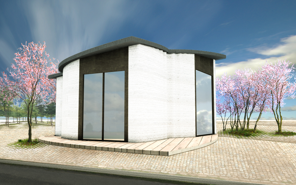
A 50 m2 office hotel in Copenhagen’s Nordhavn made with a 3D printer, 8m x 8m x 6m (Illustration: 3D Printhuset)

When I look at construction today (2018-07-03), fifty two years to the week after completing high school in 1966, and beginning work as a construction labourer at that very same location, Lester Pearson Senior Secondary School, the work looks surprisingly similar and the tools surprisingly familiar. Someone working in 1968 would have no problem working in 2018.

Pneumatic nailers have been in use since the 1950s, and can save a lot of time. They also give a superior join. Yet, this week, on a site some hundred meters from our residence, two builders were using conventional hammers to construct a cabin. The work was progressing slowly.

One of the main reasons I prefer to build, rather than to hire, is that too many builders are living in the past. Fortunately, I actually enjoy building construction. Yes, it can be tiring work. But it means that I never have to work out at a gym. Yes, it is necessary to take precautions to avoid physical injury, and to use personal protective clothing. Yes, at the end of the day, much of the work will be invisible, but that  isn’t too different from my previous work as a teacher.

Many of my first jobs involved working with wood. While still attending junior secondary school, I built a sabot sailboat out of two sheets of 1/4″ (6mm) plywood. Later, I worked clean-up on the weekends at Brownlee Industries, in Surrey. They processed alder into lumber and made glue-laminate products from it. Other summer jobs were with Bel-Par Industries in Surrey, where I worked as a cabinet-maker’s assistant.  This was undoubtedly the job in Canada that suited my personality best.

Somewhat later, I also working for Habitat Industries on Annacis Island, Delta. It was a pre-fabricated housing factory that has had other names, both before and since. It was named after the first United Nations Conference on Human Settlements, held in Vancouver in 1976. John Reagan’s designs were anything but modular boxes. He designed octangular, split level and mineshaft buildings. They involved post and beam as well as platform framing. Here, I worked in the factory, not just framing, but other tasks such as electrical and plumbing installation, as well as in the office, mostly related to scheduling and project planning.

Pre-fabrication saved on build time and labour costs by moving much of the work to a climate-controlled environment. Part of the challenge is that these parts have to be transported, which means that the building has to be sub-divided into transportable units, with a maximum length, height and width. Modules are not always the solution. One compromise is to use pre-cut materials for flooring and roofs, but to make and transport walls in sections. Modules can work for bathrooms, less so for kitchens.

In February 2012, I watched an inspiring TED Talk, Contour Crafting – Automated Construction, with Behrokh Khoshnevis at TEDxOjai. After this, I expected there to be a surge of interest 3D-printing of houses. I am still waiting, but understand progress has been made by Khoshvevis in China. Not so much on the North American continent or in Europe.

AMT-SPECAVIA of Yaroslavl, Russia started serial production of construction printers in 2015. Currently, seven models are available ranging from a small format for the printing of small architectural forms, to a much larger scale, that allows printing of buildings up to 3 stories high. A construction printer was delivered to 3DPrinthuset, in Copenhagen, Denmark in 2017. This 8m x 8m x 6m printer was used to construct a 50 m2 office-hotel.

This is referred to as a Building on Demand (BOD) project. Only its walls and part of its foundation are printed. The rest of the construction is traditional. A time-lapse video of the project is also available.

I don’t think I will have an opportunity to build and live in my own 3-D printed house. However, I am encouraging my children to consider the potential this technology offers. I would enjoy helping them.

Stylists

The new Nuno R1 autonomous delivery vehicle has arrived, and if all goes well, it will soon be making grocery deliveries from Kroger to a house near you. Not near me, unfortunately, as the distance to my closest Kroger store is measured in thousands of kilometers.

Nuro R1 Autonomous Delivery Vehicle (Photo: Nuro, 2018)

While the Nuro may have OK styling, its design is not great. Take the hinged (gull-wing?) door openings. They are much wider and thus heavier than necessary to provide full access to the storage areas. There is no reason for these doors to open as widely as the do. The vehicle rakes, unnecessarily, front and back. Why isn’t this area being used to house navigational equipment, instead of the centre of the vehicle, which could be designed to include more storage space?

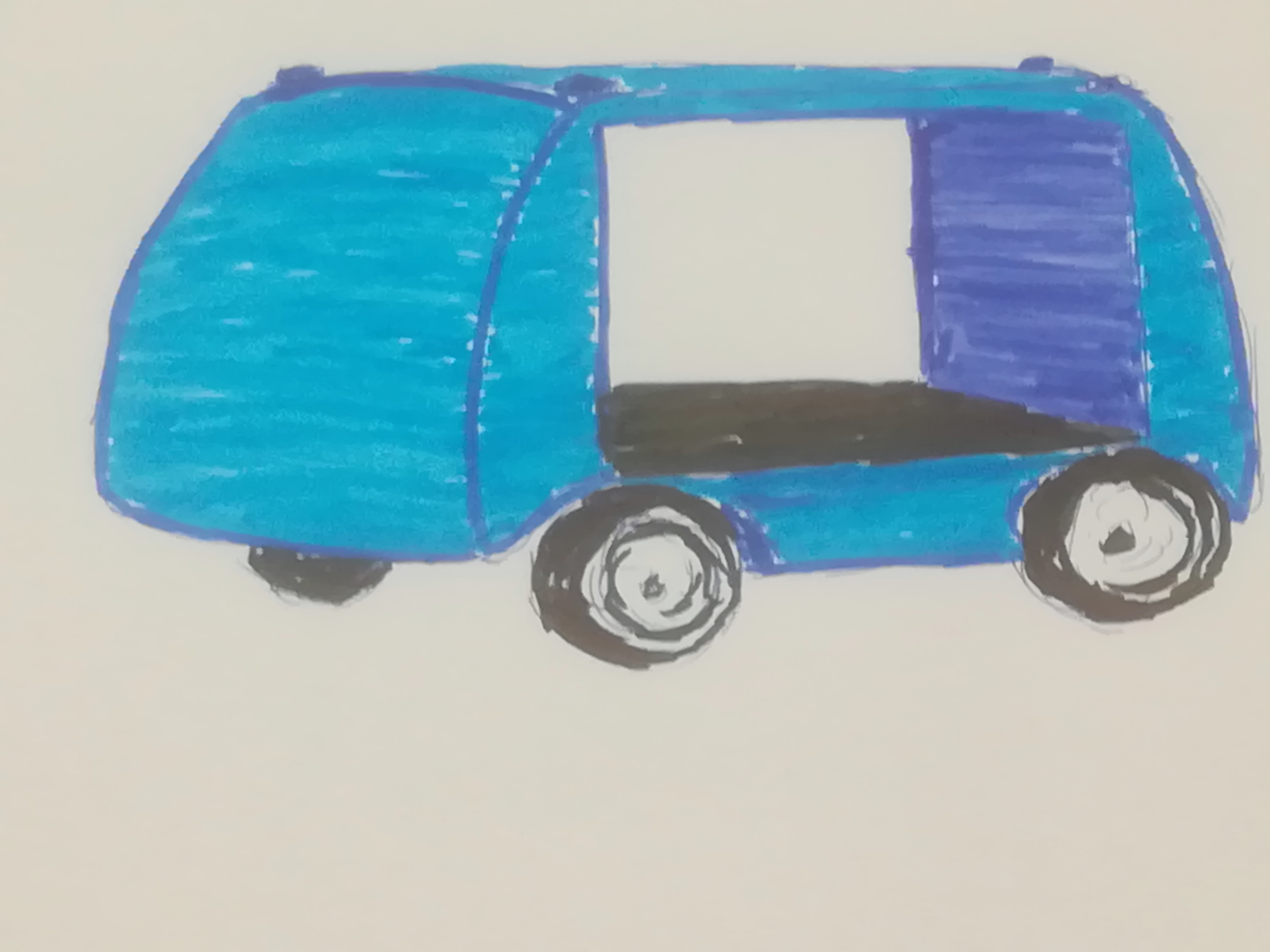
In contrast, here is my own attempt at a delivery vehicle design that does address some of these issues, although the purpose of this vehicle is transport of building materials, rather than groceries. Even the colour is an improvement on dull beige-brown.

Autonomous delivery vehicle for construction materials, with vehicular control mechanisms at body ends. Battery pack is located under floor.

There are too many stylists at work, masquerading as designers. In the 1950s,  stylists knew they were stylists.

1957 Ford Fairlane 500 Club Hardtop at weekly Garden Grove, California car show 2004-05-14. (Photo: Morven CC-BY-SA-3.0)

Nineteen Fifty Seven represented a high point for American car styling, but not for car design. This is seen particularly in low-end brands, such as Chevrolet, Ford and Plymouth. In contrast,  facelifted 1958 models are regarded with less esteem, although not quite as low as the 1959 models.

The 1957 Fords were all about styling, one that dramatically changed passenger car appearance the most since 1949. There were 20 different models, on two separate wheelbases. Body styles included two- and four-door sedans, hardtops, wagons, a convertible, a retractable hardtop and a sedan/pickup. These were all available in more colors and two-tone combinations than ever before. There were six engine options, five of them V-8s.

The challenge with making so many different products is that there is no place for design. I will not be buying a 1957 Ford, or any other heritage car. They are just too impractical – too low, too long, too extreme in styling language.

There is a similar situation in the world of fashion. Fortunately, in my world many of my outer clothes, especially shirts and socks, are bespoke. Material is selected specifically for each garment, sleeve length is cut perfectly, each shirt has two pockets, buttons are placed where I want them. Not every man, has a wife who has such abilities and interests. Without being too disparaging, I would say that I have one shirt design, that is then styled to meet specific requirements in each garment.

There may be a few more variations on designs for chinos and jeans, but most of these differ only in terms of their styling. I have learned to live with a particular off the rack style of chinos. They come in more or less standard design, with components that can be traced back to the 19th century. The original watch pocket has been repurposed many times. A Levi-Straus blog comments about many of these same components in jeans:   http://www.levistrauss.com/unzipped-blog/2014/04/17/those-oft-forgotten-pant-parts/