Art is a diverse range of human activities in creating visual, auditory or performing artifacts, expressing the author’s imaginative, conceptual idea, or technical skill, intended to be appreciated for their beauty or emotional power. (Wikipedia)
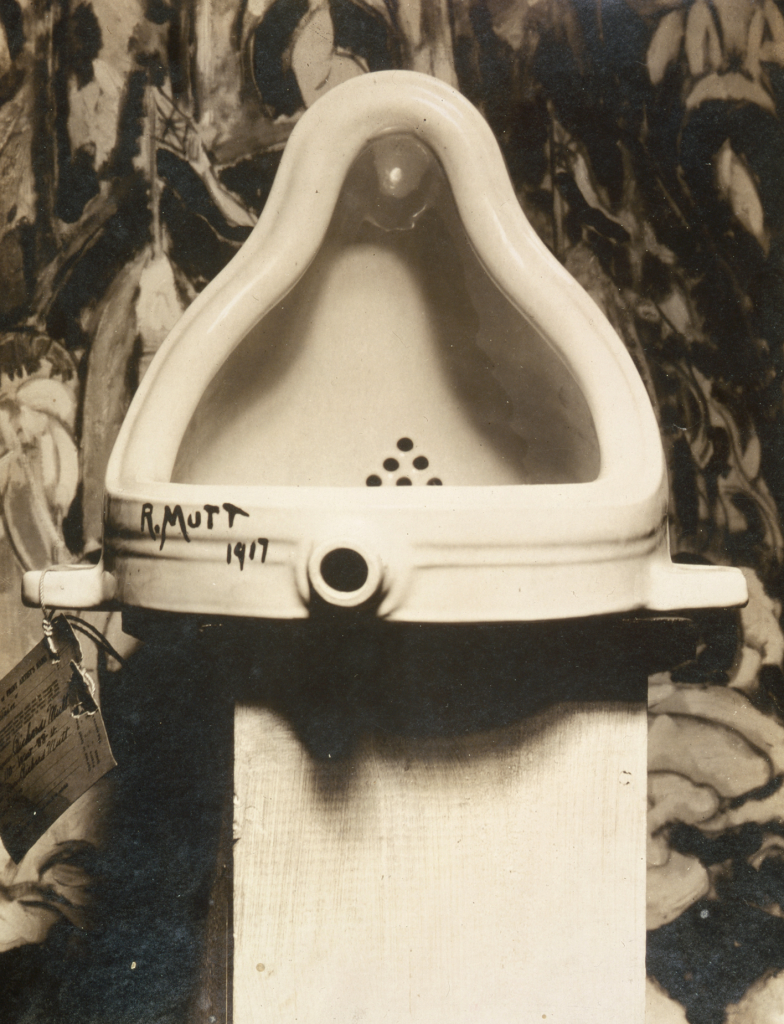
Fountain, found by R. Mutt = Marcel Duchamp (1887 – 1968) photograph by Alfred Stieglitz (1864 – 1946) at the 291 (Art Gallery) following the 1917 Society of Independent Artists exhibit, with entry tag visible. The backdrop is The Warriors by Marsden Hartley (1877 – 1943).
Industrial art began as the use of mechanical devices to create artworks. As such it is also known as mechanical art. I use it in a slightly different context to refer to industrially made objects that have an attractive appearance. Some people may enjoy watching this history of industrial design, to provide a conventional story of how it evolved.
For me, the most enlightening book about industrialism has been written by Terje Tvedt (1951 -) a professor of geography at the University of Bergen, Historiens Hjul og Vannets Makt: Da England og Europa Vant og Kina og Asia Tapte (2023). This could be translated as: The Wheel of History and the Power of Water: When England and Europe Won and China and Asia Lost. Tvedt has also written a book in Norwegian prior to that, Verdens historie: med fortiden som speil (2020), that I translate as World History: with the past as a mirror, which could have been published in English as Water and Society: Changing Perceptions of Societal and Historical Development (2021). I have not seen this English book, so there is some uncertainty.
In the 2023 book, the most important source of power was water, using a water wheel. England was able to develop this because it had stable rainfall, along with a relatively flat geography. These contributed to the use of canals to distribute industrially produced products. Later, steam became an increasingly important source of power. Now, it is electricity.
One starting point for industrial art is the Dada movement. Dada was an early 20th century art movement, arguably first at the Cabaret Voltaire in 1916 in Zürich, Switzerland, founded by Hugo Ball (1886 – 1927) and Emmy Hennings (1885 – 1948). Dada also emerged at about the same time in Berlin and New York, but later in Paris. It flourished until the mid 1920s.
Dada was primarily a reaction to the first World War, involving artists rejecting the aesthetics of modern capitalism. Instead they incorporated nonsense, irrationality and protest into their works. Performance art, was especially important, but gradually it incorporated visual, literary and sound media, including collage, sound poetry, cut-up writing and sculpture. There was a strong dislike of violence, war, nationalism and party politics.
There is a lot of speculation, but no consensus, on the origin of the name Dada. An unlikely story is that Richard Huelsenbeck (1892 – 1974) slid a paper knife randomly into a dictionary, where it landed on dada (French) = hobby horse.
Other unconventional art schools emerged at about the same time: Marcel Duchamp (1887 – 1968) around 1913 has been described as dada, avant-garde and post-impressionist. I attribute his work, Fountain (1917), photographed by Alfred Stieglitz (1864 – 1946), as one of the first pieces of industrial production, to be labelled a work of art.
Dada is important for its rejection of the correlation between words and their meaning. In much the same way, industrial art rejected the correlation of a work’s origin (as a utilitarian object) and its resurrection as a work of art.
Not all Dada movement members worked with industrial art, those who approached in other ways include: Jean Arp (1886 – 1966) known as a sculptor, painter and poet; Johannes Baader (1875 – 1955), an architect and metalworker, known as the Dada crowbar; Max Ernst (1891 – 1976), especially for frottage = pencil rubbings of textured objects and relief surfaces to create images; Elsa von Freytag-Loringhoven née Else Hildegard Plötz (1874 – 1927), especially for her anti-patriarchal activism; George Grosz, his de-Germanized name, born Georg Ehrenfried Groß (1893 – 1959), especially for his painting Eclipse of the Sun (1926), depicting headless government ministers who cannot think for themselves, but obey the commands of the capitalists and the military; Raoul Hausmann (1886 – 1971), who regarded destruction as an act of creation; John Heartfield born Helmut Herzfelt (1891 – 1968) who pioneered the use of photomontages, especially for making anti-Nazi and anti-fascist statements; Hannah Höch (1889 – 1978), especially known for co-inventing photo-montages, and for her dismantling of the fable of the New Woman: energetic, professional, androgynous, ready to take her place as man’s equal; Francis Picabia (1879–1953) avant-garde painter, writer, filmmaker, magazine publisher, poet and typographist; Man Ray = Emmanuel Radnitzky (1890 – 1976) an American in Paris, known for his photographs, especially photograms that he called rayograms = photographic images made without a camera by placing objects directly onto the surface of a light-sensitive material such as photographic paper and then exposing it to light; Hans Richter (1888 – 1976) painter, graphic artist, film producer and author of the book Dadaism (1965) about its history; Kurt Schwitters (1887 – 1948) especially noted for working as a draftsperson that influenced his later work, inspiring him to depict machines as metaphors of human activity; Sophie Taeuber-Arp (1889 – 1943) painter, sculptor, textile designer, furniture and interior designer, architect, and dancer;Tristan Tzara (1896–1963) essayist, performance artist, journalist, playwright, literary and art critic, composer and film director; and Beatrice Wood (1893 – 1998) ceramicist an sculptor.
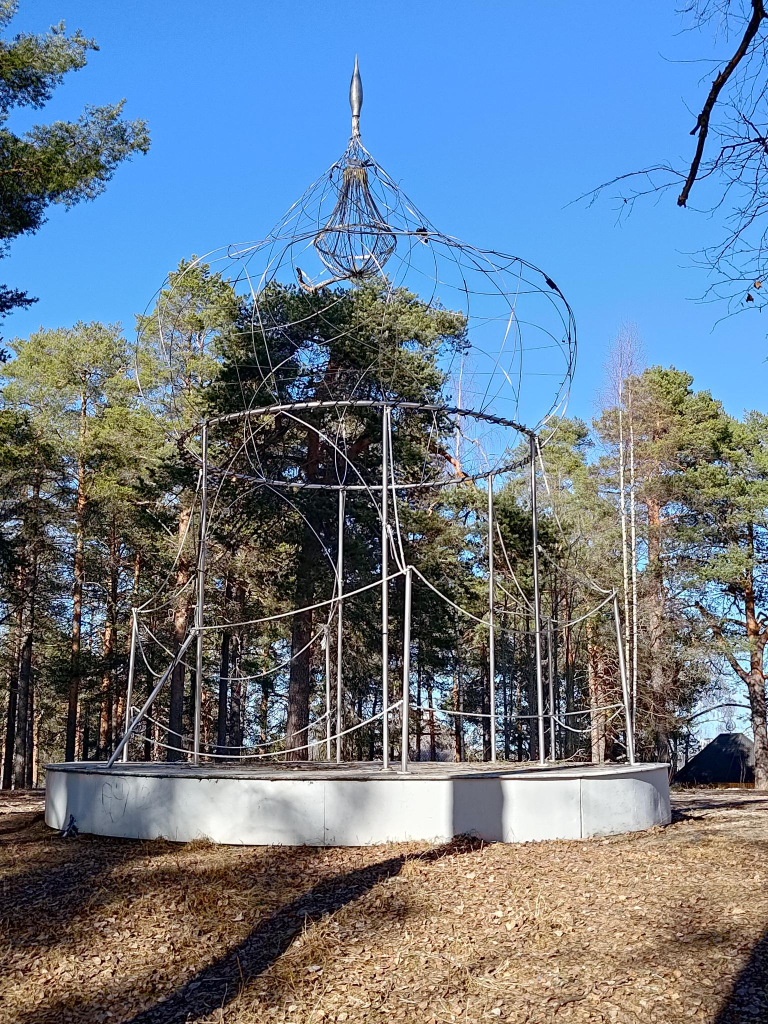
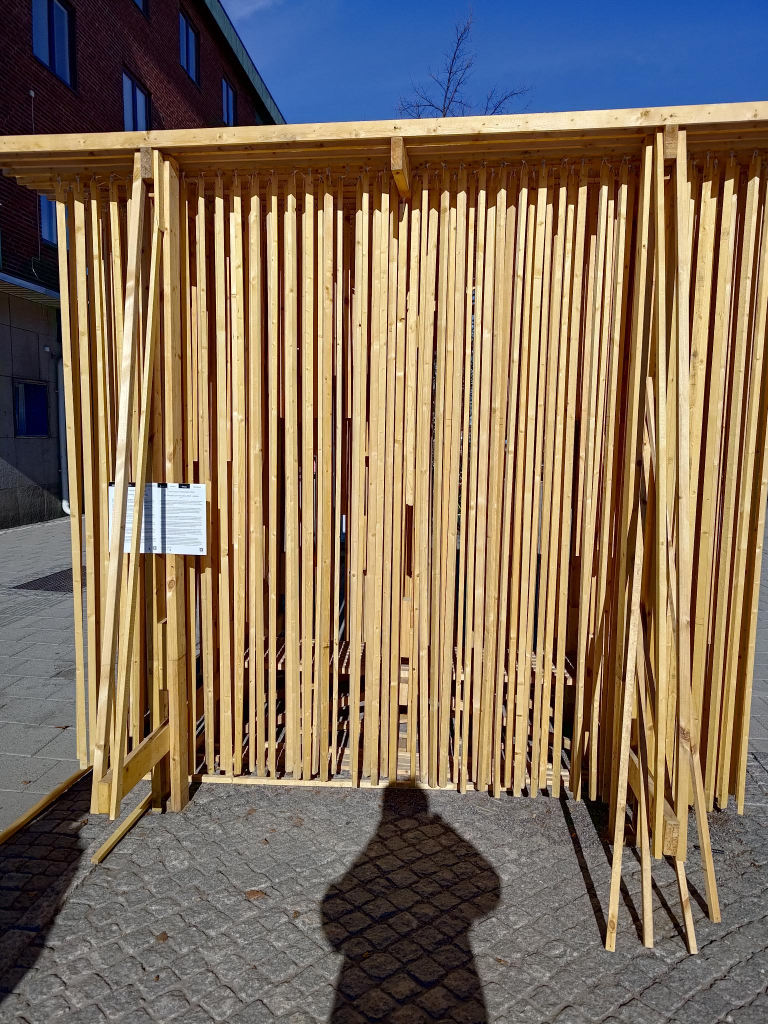
The key to industrial art is the process of creating new forms by working with industrial materials, those that are produced at mass scale for everyday use. Many are made of metal, such as bolts and pipes. Wood is more problematic, because it is closer to nature. Cardboard, however, is one or two steps further away. Many claim that crap materials are even better, because they have completed their use as an industrial material and are freed to become an art form.
Charles Harrison Townsend (1851 – 1928) described industrial art as the use of materials and objects combined together in a way that creates new meaning. Not everyone appreciates this approach. Nikolaus Pevsner (1902 – 1983) in Pioneers of Modern Design (1949) referred to Townsend as reckless. Alastair Service (1933 – ) in Edwardian Architecture (1977) called Townsend a rogue architect.
Although it is difficult to define, many people have tried to categorize and define industrial art. In 1947, Larry Lankton created the first definition of industrial art when he referred to it as “an expression of the machine age.” While there are many different ways to interpret the term industrial art, it is generally agreed upon that it tends to incorporate aspects of modernism, specifically cubism and constructivism. According to wikipedia, in cubism, subjects are analyzed, broken up, and reassembled in an abstract form. Instead of depicting objects from a single perspective, the artist depicts the subject from multiple perspectives to represent the subject in a greater context. Similarly, constructivism was an early twentieth-century art movement founded in 1915 by Vladimir Tatlin (1885 – 1953) and Alexander Rodchenko (1891 – 1956) that is abstract and austere. Constructivist art aimed to reflect modern industrial society and urban space by rejecting decorative stylization, in favour of the industrial assemblage of materials. Constructivists were in favour of art for propaganda and social purposes. They were associated with Soviet socialism, the Bolsheviks and the Russian avant-garde.
For some time after its beginning, industrial art remained mostly an underground movement which encompassed various forms and styles from all over the world. In 1952, the Museum of Modern Art featured many works from this movement in a show called “Machine Art.” This exhibition moved from New York City to Los Angeles and San Francisco before finally closing in 1953.
Artists began using industrial materials for their work as early as the late 1800s with artists such as Marcel Duchamp who used glass as part of his ready-mades.
Today, industrial art can refer to two separate things. First, it can refer to any form of visual art that is made with found objects rather than manufactured ones. This umbrella term was coined by William Morris (1834 – 1896), for a wide variety of forms of modern art. It is closely associated with the Arts and Crafts Movement because both movements were heavily influenced by medieval craft guilds.
Some people site the major difference between industrial art and traditional fine art is the former’s focus on utilitarian products. Industrial artists work in a wide variety of media including ceramics, glass, leather, metals and textiles. Their works can be large sometimes even monumental in scale.
Louis Comfort Tiffany (1848 – 1933) is often cited as an inspiration for the movement, especially his use of stained glass in lamps, vases and windows. His designs were typically functional, yet beautiful.
Industrial art was a result of industrialization and the changes it brought. Many people, especially factory workers were profoundly unhappy with their situation. This forced artists to think about new ways to represent the world.
Industrial art was created by both amateur and professional artists. One of the first industrial art objects was designed was the door handle. These often used human, animal and plant elements in their design.
Found (or repurposed) objects were those that had been transformed from their original function into something else, preferably with an artistic element. Here, the artwork differed more in terms of its use of materials, rather than by its structure. Discarded materials were especially useful. Some cited examples include arranging tin cans in geometric patterns and repainting old tools/ machines with bright colors.
At some point, people interested in industrial art will be encouraged to reflect on the relationship between 1) the arts and crafts movement, 2) art nouveau/ jugendstil and 3) art that is created to be used in industrial settings. The focus is on objects that are to be seen by the public, usually inside a factory or store. It also includes graphics created for use as advertising and packaging. This type of art grew out of the Arts and Crafts movement of the 19th century, which was an effort to bring beauty into manufacturing. Industrial design, as an attempt to create beautiful things for use in industry, took off after World War I when many people were seeking a substitute for the ornate designs of Art Nouveau. The style became especially popular in America during the 1920s due to two trends: the rise in popularity of machines, and an emphasis on modernism.
A second perspective on industrial art = factory art = machine art, is a form of modern art that utilizes industrial materials and processes. Here, the term industrial art was coined in 1912 by the critic and artist Elie Nadelman (1882 – 1946), a sculptor and collector of folk art, used the term to describe some works by Alexander Archipenko (1887 – 1964).
Anno 2025, Industrial art is not a term that is used. Instead, the focus is on industrial design creating products that people want and, sometimes even need. It’s not just about making an object look good. It has to be easy to use, safe for the environment, affordable and durable.
Treat this post as a manuscript for a play, with a Prologue and an Epilogue. At one time it was divided into three acts, but the divisions were messy, so it has reverted to a play with an indeterminate number of acts.
Characters (in alphabetical order). Yes, some of the characters are more important than others, and one has mostly been eliminated from the play. The characters are referred to by their first names, to introduce some intimacy to them. I am not certain this is how people in the 19th century treated each other. My 20th century mother said that her mother, Jane Andison née Briggs (1880 – 1972), referred to some of her women friends by Mrs, followed by a married surname. In Norway, everybody is on a first name basis with everybody. Even the Prime Minister Jonas Gahr Støre (1960 – ) is referred to as Jonas. Before him we had Erna (Solberg, 1961 – ). Her personal, but political website is erna.no .
Anne = Julia Sarah Anne Cobden-Sanderson née Cobden (1853 – 1926), a socialist, suffragette and vegetarian. She provided the money (£ 1 600) to start Doves Press.
Bill = William Morris (1834 – 1896), a textile designer, poet, artist, writer and socialist activist, married Jane in 1859.
Ed = Edward Philip Prince (1846 – 1923) an engraver and punchcutter. Wikipedia tells us: Punchcutting is a craft used in traditional typography to cut letter punches in steel as the first stage of making metal type. Steel punches in the shape of the letter would be used to stamp matrices into copper, which were locked into a mould shape to cast type. Cutting punches and casting type was the first step of traditional typesetting. The cutting of letter punches was a highly skilled craft requiring much patience and practice.
Ed2 = Edward Burne-Jones (1833 – 1898), a frequent illustrator of Kelmscott books, based many of his drawings for the wood engravings on his own previous paintings. He valued these works for their decorative value over their illustrative properties, and reviewed them by looking at them upside-down.
Emery = Emery Walker (1851 – 1933), an engraver, photographer and printer, active in many Arts & Crafts organizations including the Art Workers Guild, the Society for the Protection of Ancient Buildings and the Arts and Crafts Exhibition Society. He was also the most experienced person in this story, when it comes to printing.
Jane = Jane Morris née Burden (1839 – 1914) an embroiderer and artists’ model/ muse. She allegedly embodied the Pre-Raphaelite ideal of beauty, and in addition to her husband, was a model/ muse for Dante Gabriel Rossetti (1828 – 1882). She suggested that Tom take up the art of book binding.
John =John Carruthers (1836 – 1914), a railway/ railroad engineer and economic theorist from a Scottish literary family in Inverness, Scotland. He learned how to construct railways in Canada, then applied that art in USA, Russia, Mauritius and Egypt before being recruited by Julius Vogel, Premier of New Zealand, for the great Public Works policy of the 1870s which emphasized railway construction and immigration. John was made Engineer-in-Chief of the new Public Works Department, responsible for railway construction throughout New Zealand.
Tom = Thomas James Sanderson (1840 – 1922), an unemployed barrister, married Anne in 1882. They both took the surname Cobden-Sanderson.
Prologue
Where to begin writing about life as a play? Perhaps with a set/ stage, knowing when people will make their entrances and exits. The details can be filled in later. Sometimes, on a stage there is something visible, larger than life, a distraction that the actors focus upon. They hope future audiences will focus upon it too, when the dialogue gets boring, as each life unfolds. The actors hope this focus will not just change, but improve, with every act.
It is reckless when two people enter into a relationship with each other. Yet, it is done every day. Often it is called marriage where the participants are so consumed with love – a euphemism for sex – that they forget to scrutinize the contract papers, until it is too late. The participation of a third person often results in folly. In business matters this might be a better course of action, because the result of a disagreement, will not be painful head-bashing, but a 2-1 decision resulting in a majority and a minority. In the emotional life of people in the 21st century, this involves separation – divorce – remarriage, or perhaps even a life free of marital constraints.
Kelmscott
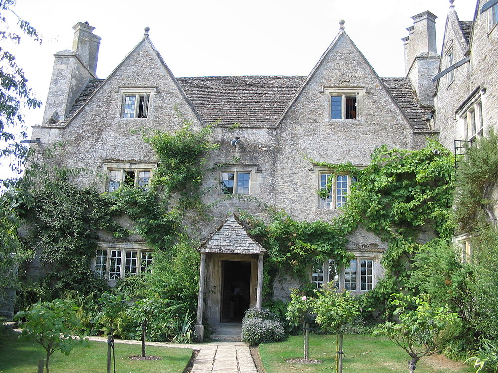
Kelmscott Manor is a Cotswold stone house, built about 1570, with a distinctive architecture and craftsmanship, integrated with its setting. In 1871, Bill bought it as a rural retreat, then used the same name for his London town house when he bought it in 1879. He then gave the same name to his printing venture when it was started in 1891.
Kelmscott Manor Photo: Boerkevitz, 2006-08-01Kelmscott House, previously known as The Retreat, originally owned by Francis Ronalds (1788 – 1873) then by George MacDonald (1824 –1905) who wrote At the Back of the North Wind (1871) and The Princess and the Goblin (1873), while living there. Bill and Anne lived there from 1878 to 1896. Photo: Bernard Burns, 2013-09-30.
In the late 1870s, Emery and Bill became friends. Both were socialists and lived near each other. Emery’s printing expertise and collection of 16th-century typefaces inspired Bill and Emery to become business partners, creating a printing business in 1891. It published 53 books in 66 volumes between its founding and 1898.
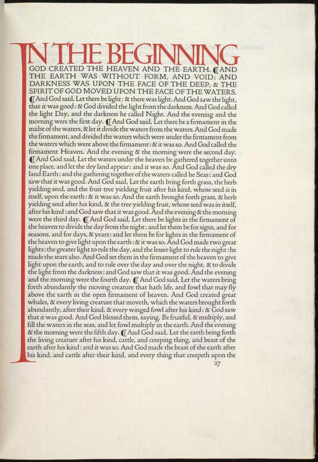
Most of the books published were unillustrated octavos, referring to the page size, from 5 by 8 inches to 6 by 9.5 inches (about 12.5 to 15 cm by 20 to 25 cm), of a book composed of printer’s sheets folded into 8 leaves, making 16 pages. Old-style types were used, with the type printed closer to the spine than the outside edge. This followed the custom of 15th-century printing. A hand press allowed the company to use wood-engraved initials and borders, and to produce a blacker type. The use of dampened handmade paper, creating indentations in the page. These indentations were an important part of the book’s design. Initially, books were sold untrimmed and unbound, assuming that buyers would rebind them. The press only started trimming pages after publishing Biblia innocentium in 1896.
For collectors, several copies of books were printed on vellum = animal skins/ membranes. Compared to paper, this is difficult to print on. Vellum is not parchment. Both use animal skins that have been de-greased and treated for use either in writing or printing or in binding. Neither parchment nor vellum is tanned, so they are not leather. Vellum is an inferior product, manufactured from the entire skin of the animal. It is not split. For this, Bill started using a thick, dark ink. The pressmen had difficulty working with it, so Bill went back to the ink he had used previously. Because of staining he then used a softer ink, that did not dry very quickly. Bill used red ink for titles and shoulder-notes. He experimented with other colors, but did not adopt them.
Emery influenced Bill’s opinions on book design: supporting a return to 15th-century aesthetics, decreasing spaces between words and after punctuation, reducing spaces between words and between lines. While the fifteenth-century books probably reduced spacing to conserve paper, Bill based his preference on the way the printed page looked. Bill said the margins closest to the binding must be the smallest, followed by the head, fore (outer) and tail margins. Medieval printing experts say the difference between the margins was usually less than 20%. Bill’s fore margins were large to accommodate the shoulder-notes recommended by Emery. The inner margins were so little that rebinding was difficult.
Fonts
After deciding to found the press, Bill collected many books printed in 15th century Europe, as well as books on printing and typography. To research typefaces, he bought examples of every fine type he could find.
Many want to attribute Golden Type to Bill. However, it was probably a joint effort between Bill and Emery, but with Bill taking the leading role. They probably started designing Golden Type in 1889. It was a Roman type inspired by a font used by Nicolas Jenson (c. 1420 – 1480) to publish Pliny’s Historicae naturalis, and a similar font that Jacobus Rubeus = Jacques le Rouge (1470 – 1550) used to publish Leonardus Brunus Aretinus’ Historiae Florentini populi. Emery’s company photographed the type at a large scale to help Bill see the shape of the letters. Bill said that designing Golden Type was the most troublesome task he had ever tried. Bill repeatedly traced the enlarged type, until he felt comfortable with his understanding of the design. After Bill drew the the type design freehand, Emery would photograph the drawings and reproduced them at the correct scale. Bill made modifications at every stage. Bill and Emery were at the leading edge of Victorian technology, pioneering photography and enlarged typefaces.
Punches
Ed cut the punches for the type in 1890. These are used to stamp the matrices used to cast metal type. Charles Reed (1819–81) and Sons = especially, Andrew Holmes Reed (1848–1892) and Talbot Baines Reed (1852 – 1893) carried out the casting. The font, in 14-point size, was completed in the winter of 1890–1891.
With Golden Type, Bill did not bother making an italic or bold version and did not include brackets or dashes. The thickness of the font went well with the wood-engravings it often accompanied. Some critics commented that its large size and width discouraged commercial application. For example, Stanley Morison (1889 – 1967) strongly disliked it and criticized its large capital letters. Bill designed three related typefaces: Golden Type, Troy and Chaucer. Troy was described as a semi-Gothic type designed […] with special regard to legibility made for the publication of the Historyes Of Troye in 1892. It was cut at 18 points by Ed. It was also used for The Tale of Beowulf in 1895. The Chaucer typeface was re-cut at 12 points for use in The Order of Chivalry (1893) and The Works of Geoffrey Chaucer (1343-1400). It was edited by Frederick Startridge Ellis (1830–1901), ornamented with pictures designed by Ed2, engraved on wood by William Harcourt Hooper (1834-1912). It was published in 1896.
Bill was influenced by books published by Shoeffer and Zainer. Peter Schöffer or Petrus Schoeffer (c. 1425 – c. 1503) was an early German printer, who studied in Paris and worked as a manuscript copyist starting in 1451, before apprenticing with Johannes Gutenberg. Zainer was active 1468 – 1478. he produced about 80 books including two German editions of the Bible and the first printed calendar. He came to Augsburg from Strassburg.
It should be noted that with the founding of the Kelmscott Press, Bill was increasingly ill and living largely as an invalid. He suffered from gout, and showed signs of epilepsy. In 1891-08, he took his daughter Jane Alice = Jenny on a tour of Northern France to visit the medieval churches and cathedrals. When they returned to England, Bill spent an increasing amount of time at Kelmscott Manor. He sought treatment from William Broadbent (1835 – 1907), a prominent doctor, who prescribed a holiday in Folkestone, a coastal town in Kent, on the English Channel.
Because of the use of wide fonts, the books themselves had to be wide too. Bill bought handmade paper from Joseph Batchelor (1831? – ?) and Son. He was obsessed with the aesthetics of early handmade paper. He used paper from the Ford Mill in Little Chart, Kent, England. The mill had been started in 1776, but was taken over by Batchelor in 1876. It was powered by a waterwheel until the end of the 1920s, when electrical power was used.
Bill had strict requirements for his paper. It had to be made of linen, made with a two piece frame consisting of a mould – essentially a screen that allowed water to leak through, and a more solid deckle. Large quantities of paper were needed for printing each book. Each piece of handmade paper had its own subtle character, that made Bill’s quest for consistency and perfection difficult to achieve. The mill used watermarks designed by Bill. In addition, the paper had to be produced in unusual sizes. Other publishers admired the paper, which lead to imitation. At Bill’s suggestion, Batchelor adopted the name Kelmscott Handmade, for the paper.
In the 1890s, photoengraving made it easy for entrepreneurs to copy Bill’s typefaces and sell pirated typefaces. When an American foundry offered to sell Bill’s typefaces in the United States, Bill refused. Joseph W. Phinney of the Dickinson Type Foundry in Boston sold a Jenson Old Style that was very similar to Golden Type. Satanick, an imitation Troy type, was available for purchase in 1896. Bill’s own typefounders, Charles Reed and Sons , started selling a Kelmscott Old Style type. Subsequently, Sydney Cockerell (1867 – 1962), the Kelmscott Press’s administrator, threatened legal action against these companies.
Decorations
Some of the Kelmscott books are heavily decorated, with motifs similar to Morris’s other designs for upholstery and wallpaper. In 1913, George Holbrook Jackson (1874-1948), journalist, publisher and Fabian socialist wrote: “The Kelmscott books look not only as if letter and decoration had grown one out of the other; they look as if they could go on growing.”
The title pages of Kelmscott books were usually decorated in a Victorian style. Bill initially designed woodblock initials that were too dark or too large for the pages they appeared on, but later became more proficient in proofing his capitals. The Kelmscott books varied greatly in ornaments. For example, The History of Godefrey of Boloyne is commonly regarded as over-decorated. However, the first few books published by Kelmscott were in the opposite direction, politely called sparsely decorated. Bill’s border and capital designs were similar to his wallpaper designs. Many regard them as inappropriate, not illustrative of their associated texts. Medieval texts had delicate illuminations covering their margins. However, the wood engravings Bill made were heavy. They created production problems. The use of the Chaucer typeface, required the hand press to be reinforced with steel because of the weight of the large ornaments. Bill preferred his wood engravers to replicate his designs exactly, even though this was at odds with John Ruskin’s (1819 – 1900) theory that craftsmen should have influence in the final aesthetic product they help produce. Kelmscott books did not have printing on the reverse side of woodblock pages until the Chaucer, despite this separation of text from illustration being precisely what Bill wanted to avoid in his book designs.
Printer’s marks
Bill designed three different printer’s marks for Kelmscott Press. One was a simple text mark in a rectangle used with octavos and small quartos. The Kelmscott mark with a large rectangle and leafy background was first published in The History of Godefrey of Bolyne and was used mostly for quartos. The last printer’s mark was only used in the Works of Geoffery Chaucer.
In July 1896, Morris went on a cruise to Norway with John, during which he visited Vadsø, one of the most northerly and easterly town in Norway, and Trondheim, 120 km south of Cliff Cottage. During the trip Bill’s physical condition deteriorated and he began experiencing hallucinations. Returning to Kelmscott House, he became a complete invalid, being visited by friends and family, before dying of tuberculosis on 1896-10-03.
Legacy
After the closing of the Kelmscott Press, leftover paper and the type fonts were given to the Chiswick Press. The Kelmscott types were sold to Cambridge University Press in 1940. Woodblocks were given to/ deposited in the British Museum. Presses and related equipment were sold to Essex House Press.
Thorstein Veblen (1857–1929), an American economist and sociologist, was a well-known critic of capitalism. In The Theory of the Leisure Class (1899), Veblen developed the concepts of conspicuous consumption and conspicuous leisure. He called Kelmscott’s books a conspicuous waste arguing that they were less convenient and more expensive than regular books, showing that the purchaser had time and money to waste.
Charles Robert Ashbee (1863 – 1942) was involved in book production and literary work, setting up Essex House Press as a Kelmscott Press imitation, and taking on many of the displaced printers and craftsmen. Between 1898 and 1910 the Essex House Press produced more than 70 titles (some sources state a total of 83). He used the same ink, paper, vellum and presses that Kelmscott used. He designed two type faces for Essex House, Endevour (1901) and Prayer Book (1903), both of which are based on Golden Type. William S. Peterson (1939 – ) called Ashbee’s typefaces “ugly and eccentric” but that the books “have a certain period charm”.
Tom worked as a binder in the Doves Bindery, which carried out the pigskin bindings for the Kelmscott Chaucer. Together with Emery, they founded Doves Press and used similar paper and vellum to Kelmscott. Tom disliked the decorative style of the Kelmscott books. Books from the Doves Press had only an occasional calligraphic initials. They created a font that copied those in Nicolas Jenson’s renaissance publications. Their 5-volume folio Bible remains an important landmark in the history of fine press, and their editions of Goethe inspired the formation of several fine presses in Germany. The most prominent of these were Bremer Press, Janus Presse, Kleukens Presse, Ernst Ludwig Presse, and Serpentis Presse.
It is difficult to assess the roles and interactions of the human participants who were responsible for that press. When I attempt to understand the past, I almost always have to refer to Leslie Poles Hartley (1895 – 1972) and a quotation from his most famous book, The Go-Between (1953): “The past is a foreign country; they do things differently there.”Dove Press refers to The Dove, a riverside pub, located in Hammersmith, London. Having avoided alcohol for half a century, I find it difficult to believe that anyone would name something after a pub. Then, I think back to the situation in London in the mid 19th century, and the belief that miasma = bad air, caused disease. John Snow (1813–1858) is important because of his work in tracing the source of the 1854 Broad Street (Soho, London) cholera outbreak, in which he identified the source as a specific public water pump. Yes, one must remember that water can be unhealthy, and beer can be a more appropriate choice, especially in times past.
The Vale Press, founded by Charles Ricketts (1866 – 1931) with Charles Shannon (1863 – 1937), based their types on 15th-century calligraphy. They published literary classics, which allowed them to focus on the design and layout of the works. Together, they also worked with theatrical costume design and production.
Esther Levi Pissarro nèe Bensusan (1870 – 1951) Pissarro née Bensusan founded the Eragny Press with her husband Lucien Pissarro (1863–1944). Thye produced books illustrated with colour wood-engravings. Esther created the wood engravings from Lucien’s designs. Eragny Press shared type with Vale for a time.
The Ashendene Press was a small private press founded by Charles Harald St John Hornby (1867–1946). It operated from 1895 to 1915 in Chelsea, London and was revived after World War I in 1920, but closed in 1935. It specialized in publishing poetry books and folio versions of classic literature.
In 1902, Elizabeth (1868 – 1940) and her sister Lily Yeats (1866 – 1949) joined Evelyn Gleeson (1855 – 1944) in establishing a craft studio at Dundrum, near Dublin, called Dun Emer. This specialized in printing and other crafts, with Elizabeth in charge of the printing press. Activities took place in Gleeson’s large house, in which a crafts group provided training and work for young women in: bookbinding, printing, weaving and embroidery. They could also live in the house. Bookbinding workshops were a later addition to the studio. Dun Emer was named after the Irish mythical Emer, a figure famous for her artistic skills and beauty. The title-page device of the Dun Emer Press was designed by Elinor Mary Darwin (née Monsell; 1879–1954) and shows Emer standing underneath a tree. The focus of the Press was on publishing literary work by Irish authors. Jack Butler Yeats (1871 – 1957) did much of the illustration work.
Epilogue
Today, using typefaces is easy. Everyone can set up their own press, especially if the product is digital. Even the McLellans did it. In the mid 1990s, we formed Fjellheim Institutt, named after the official name of our house, to produce Åndelig Dyder: En familiehåndbok = Spiritual virtues: a family handbook (literal translation), = The Virtues Guide, by Linda Kavelin Popov, Dan Popov and John Kavelin, in 1996 – a century after Kelmscott Press closed. The book was printed on paper, typically in small quantities, in Steinkjer. Its purpose was never to made a profit, but to ensure that Norwegian families could introduce ethical concepts to their children. We still have a few copies, that we give away when opportunities arise.
Even in the mid 1980s it was possible to obtain professional typesetting quality from a computer, as long as that computer was an Apple Macintosh, an Atari 1040ST or a Commodore Amiga. We owned an Amiga.
Today, it is not the computer that sets the limits, but the software. The first desktop publishing software we used was Aldus PageMaker 5.0, which was introduced in 1993. Aldus was founded by Paul Brainerd (1947 – ) and others in Seattle in 1984. It was acquired by Adobe Systems in 1994. The company was named after 15th-century Venetian printer Aldus Manutius. The program was replaced by InDesign in 2001.
Today Adobe does not sell stand alone copies of its software products, but forces people to work with its cloud environment, making it inherently unsafe. Perhaps the most accessible desktop publishing program is Scribus, a free and open source program, supported on at least 13 operating systems. It offers a vector drawing tool, supports multiple file types, and supports over 200 colors in its palette. It was also one of the world’s first software to support the PDF/X-3 format conversion.
Today, our publication efforts focus on our blogs.
Yes, Milou/ Snowy, Professor Calculus, Tintin and Captain Haddock, welcome Neil Armstrong (1930–2012) to the Moon in 1969. !
Explaining Comics = The 9th Art using Metalanguage
The comic stip is a cultural product and a means of expression. In the past century it has developed its conceptual and formal elements to the point of being considered art. One only has to take a look at Chris Ware’s (1967 – ) graphic novel Jimmy Corrigan, the smartest kid in the world (2000). It has exhibited in museums such as the Whitney Museum of America Art (2002) or the Museum of Contemporary Art, Chicago (2006). It demonstrates that not all comics are aimed at children. Interestingly, some people complain that comics are abandoning children, in favour of adult enthusiasts. This is regarded as a problem in Europe and North America, but not in Japan, since manga have genres for all ages and each of them evolves independently.
At this point, it is undeniable that the aesthetics of comics have influenced other cultural fields such as design, fashion or cinema. The work of the fashion designer Jean-Charles de Castelbajac (1949 – ), who was passionate about this genre, is an example of this. In the field of graphics, what are called stencils come from comics, according to some specialists in this medium. It goes without saying that a multitude of films today have comics as a reference, especially in the superhero genre. Superheroes who, as archetypes, play a role similar to that of mythological gods. They are popular myths.
We can therefore say that the aesthetics and content of comics has become a symbol of post-modern/ twenty-first century times. While there are more conservative positions determined to make distinctions between what they refer to as high culture and other cultural manifestations. In the case of comics, there are people of all ages and all perspectives who enjoy comics.
Some of the more interesting set of books in my library collection use 9th art metalanguage = comic strip books, to explain comics. Two were written by Will Eisner (1917 – 2005) who had popularized the term graphic novel. His first interesting, theoretical work was Comics and Sequential Art (1985/ revised 1990). It is based on a series of essays that appeared in The Spirit magazine, themselves based on Eisner’s experience teaching at the School of Visual Arts. The content is a series of demonstrations of principles and methods. The revised edition includes short sections on the print process and the use of computers. This was followed by Graphic Storytelling and Visual Narrative (1996).
Three other ones were written by Scott McCloud (1960 – ). These are: Understanding Comics: The Invisible Art (1993), that explores formal aspects of comics, the historical development of the medium, its fundamental vocabulary, and various ways in which these elements have been used. It also discusses more theoretical ideas about comics as an art form and medium of communication. Reinventing Comics: How Imagination and Technology Are Revolutionizing an Art Form (2000), which explains twelve revolutions that McCloud predicts are necessary for the comic book to survive as a medium: becoming literature, becoming art, enhancing creators’ rights, industry innovation, public perception, institutional scrutiny, gender balance, minority representation, diversity of genre, digital production, digital delivery and fully digital content. and Making Comics: Storytelling Secrets of Comics, Manga, and Graphic Novels (2006) details the processes behind storytelling, with an emphasis on character design with examples provided from the 9th arts history. Topics are reduced to a few principles. These include classifying cartoonists into four types, and identifying six basic emotions.
Tintin, an example of the 9th Art
With these five books in place, there is a need to examine a worthy example to follow, in a learning phase. The example shown below is Tintin by Herge = Georges Prosper Remi (1907 – 1983). In our household, considerable attention was paid to Tintin We have the complete works, admittedly in English, rather than French. Our family was not alone. Tintin comics have sold more than 240 million copies worldwide and has been translated to over 70 languages.
While Tintin has explored many countries in his comics, Herge hasn’t visited a single country in his lifetime. In Explorers on the Moon, Tintin explored the moon in 1954. This is 15 years before Neil Armstrong first landed on Moon.
Tintin’s dog Snowy has stolen many hearts and even made cameo appearances in ‘The Simpsons’ in the episode ‘Husbands and Knives’ and in ‘South Park’ in the episode ‘Imagination land Episode III’.
Tintin’s adventures were transformed into a movie titled ‘The Adventures of Tintin: Secret of the Unicorn’ in 2011, which was directed by Steven Spielberg, who bought the international movie rights to the character in the early 1980s.
The series ‘Tintin in Tibet’ was the most cerebral and emotional story of Herge, and the series was heavily influenced by his nervous breakdown.
Palle Huld (1912 – 2010) was a Danish film actor and writer. He won a journey around the world at the age of 15 in 1928 from a Danish newspaper. This reportedly inspired Hergé to create Tintin.
Milou = Snowy, Tintin’s pet dog, is modeled in part on a Fox Terrier at a café that Hergé used to frequent. It was also the nickname of Hergé’s first muse/ girlfriend, Marie-Louise Van Cutsem (1905 – 1974).
Haddock’s name was suggested by Germaine Kieckens (1906 – 1995; married 1932; divorced 1977) Hergé’s wife, who noted that haddock was a “sad English fish” over a fish dinner. Hergé then utilised the name for the English captain he’d just introduced. Haddock remained without a first name until the last completed story, Tintin and the Picaros (1976), when the name Archibald was used. There were several Haddocks who had served in the Royal Navy. Haddock uses strange/ difficult but innoffensive words that he hurls out as if they were very strong cusswords. This is due to the works initial publication in Catholic magazines.
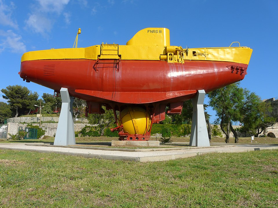
Professeur Tryphon Tournesol = Professor Tryphon Sunflower (literal translation) = Professor Cuthbert Calculus was inspired by Auguste Piccard (1884 – 1962), a Swiss physicist, inventor and explorer known for his record-breaking hydrogen balloon flights, with which he studied the Earth’s upper atmosphere and became the first person to enter the Stratosphere. My own person interest in Piccard relates to his invention of the first bathyscaphe, FNRS-2. The French Navy took over this vessel, and relaunched it as FNRS III in the 1950s. Today, it is located at the Naval Museum in Toulon, France.
The Bathyscaph FRNS-3 at the Tour Royal, Toulon, France. Photo: Esby 2008-06-11.
The Thompson twins were inspired by Herge’s father and uncle, who were twins.
Opera singer Bianca Castafiore was inspired by Herge’s paternal grandmother. Her favourite aria is from Faust (1859) composed by Charles Gounod (1818 – 1893).
One of the reasons Tintin appealed to our son, is that it gave him an opportunity to explore the world at an early age, from the safety of our house. Here are the details of the all of the works, in chronological order.
The following are the twenty-four canonical Tintin comic albums, with their English titles. Publication dates are for the original French-language versions. Note: In the original French versions, Tintin lives in Brussels. In the English translations, he lives in London. This created difficulties with the Black Island.
#01 Tintin au pays des Soviets = Tintin in the Land of the Soviets, set in Russia, serialized 1929-30, B&W album 1930, Colour album 2017. Hergé prevented this book from being republished until 1973.
After this, Hergé re-published in colour and in a fixed 62-page format.
#02 Tintin au Congo = Tintin in the Congo, set in Belgian Congo now the Democratic Republic of the Congo, serialized 1930-31, B&W album 1931, Colour album 1946.
#03 Tintin en Amérique = Tintin in America, set in Chicago, serialized 1931-32, B&W album 1932, Colour album 1945.
#04 Les Cigares du Pharaon = Cigars of the Pharaoh, set in Egypt, serialized 1932-34, B&W album 1934, Colour album 1955
#05 Le Lotus bleu = The Blue Lotus, set in China, serialized 1934-35, B&W album 1936, Colour album 1946
#06 L’Oreille cassée = The Broken Ear, set in fictional south American countries, serialized 1935-37, B&W album 1937, Colour album 1943
#07 L’Île noire = The Black Island, set in England, serialized 1937-38, B&W album 1938, Colour album 1943, 1966. Note: Before the reprint, multiple aircraft featured throughout the story were redrawn by Roger Leloup (1933 – ), who replaced the depiction of planes that were operational in the 1930s with those active in the 1960s, including: a Percival Prentice, a De Havilland Canada Chipmunk, a Cessna 150, a Tiger Moth, and a Hawker Siddeley Trident.
#08 Le Sceptre d’Ottokar = King Ottokar’s Sceptre, set in Syldavia, a fictional Eastern European country, serialized 1938-39, B&W album 1939, Colour album 1947
#09 Le Crabe aux pinces d’or = The Crab with the Golden Claws, set in the Sahara, serialized 1940-41, B&W album 1941, Colour album 1943
#10 L’Étoile mystérieuse =The Shooting Star, with plot similarities with La Chasse au météore = The Chase of the Golden Meteor (1908) written by Jules Verne (1928 – 1905), serialized 1941-42, Colour album 1942. Note: This was the first album to be originally published in colour. Often regarded as antisemitic.
#11 Le Secret de La Licorne = The Secret of the Unicorn, involves a riddle left by 17th century Francis Haddock, which leads them to the hidden treasure of the pirate Red Rackham. Serialized 1942-43, Colour album 1943. Books 11 to 15 formed a middle period for Hergé marked by war and changing collaborators.
#12 Le Trésor de Rackham le Rouge = Red Rackham’s Treasure, set in the West Indies, much of it aboard the Serius, a fishing trawler, serialized 1943, Colour album 1944
#13 Les 7 Boules de cristal = The Seven Crystal Balls, set in Peru, involving an archaeological expedition, serialized 1943-46, Colour album 1948. Note: often regarded as one of the best works in the series.
#14 Le Temple du Soleil = Prisoners of the Sun, serialized 1946-48, Colour album 1949
#15 Tintin au pays de l’or noir = Land of Black Gold, serialized 1939-40 (discontinued by Nazi occupational forces), 1948-50, Colour album 1951, 1971
#17 On a marché sur la Lune = Walking on the Moon (literal) = Explorers on the Moon, serialized 1952-53, Colour album 1954
#18 L’Affaire Tournesol = The Calculus Affair, serialized 1954-56, Colour album 1956
#19 Coke en stock = The Red Sea Sharks, serialized 1956-58, Colour album 1958
#20 Tintin au Tibet = Tintin in Tibet, serialized 1958-59, Colour album 1960
#21 Les Bijoux de la Castafiore = The Castafiore Emerald, serialized 1961-62, Colour album 1963
#22 Vol 714 pour Sydney = Flight 714 to Sydney, serialized 1966-67, Colour album 1968
#23 Tintin et les Picaros = Tintin and the Picaros serialized 1975-76, Colour album 1976
#24 Tintin et l’Alph-Art = Tintin and the Alph-Art serialized 1986, Colour album 2004. Hergé’s unfinished book, published posthumously.
The following are double albums with a continuing story: Cigars of the Pharaoh (no. 4) & The Blue Lotus (no. 5); The Secret of the Unicorn (no. 11) & Red Rackham’s Treasure (no. 12); The Seven Crystal Balls (no. 13) & Prisoners of the Sun (no. 14); Destination Moon (no. 16) & Explorers on the Moon (no. 17).
Other characteristics
The English-language Adventures of Tintin books were originally published with handwritten lettering created by cartographer Neil Hyslop (1924 – 2015). Given versions of Hergé’s artwork with blank panels, he would write his English script on a clear cellophane-like material, to fit within the original speech bubble. In the early 2000s, Tintin’s English publishers Egmont discontinued this, because Casterman and Moulinsart decided to replace localised hand-lettering with a single computerised font.
In September 2017, French philosopher Vincent Cespede (1973 – ) suggested that Tintin was a girl. However, he accepted that it was his perspective and was fake news. However, this post will end by naming everyone’s favourite Swedish environmental activist, paying close attention to the second of her many names: Greta Tintin Eleonora Ernman Thunberg (2003 – ). So perhaps Cespede was closer to the truth than he imagined.
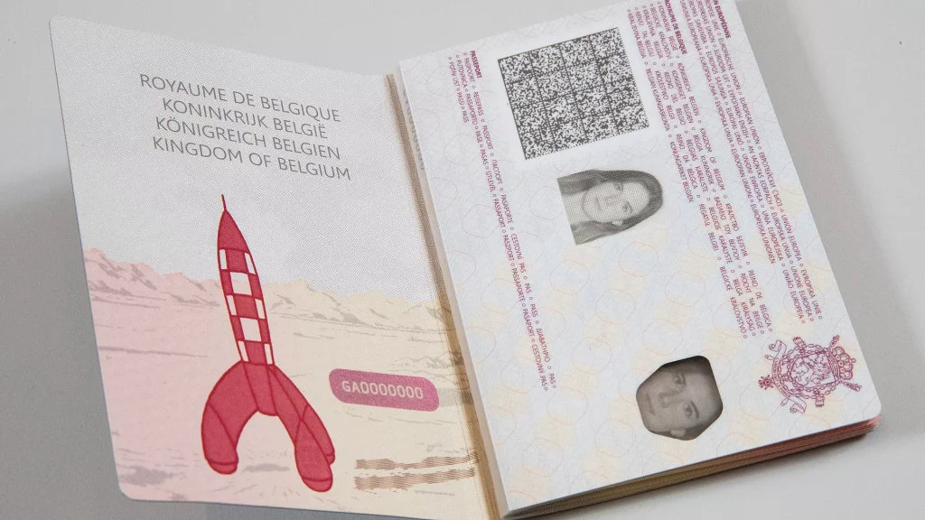
A New Belgian Passport, featuring an illustration of Tintin’s Moon Rocket.
This weblog post began when my son, Alasdair, posted some illustrations of the new Belgian passports, originating with Belgian comics. Following this, I read that comics were the ninth art. Immediately, I wondered what the eight earlier arts were, and if there was anything after the ninth art.
Here is the official list of arts in numerical order: 1. Architecture; 2. Sculpture; 3. Painting; 4. Music; 5. Dance; 6. Poetry; 7. Film; 8. Television; 9. Comics.
The list was devised by Claude Beylie (1932 – 2001), a French film critic. The term was used in an article he wrote for the magazine, Lettres et Medecins in 1964. He built that list up from some earlier writings by an Italian film theoretician, Ricciotto Canudo (1877 – 1923).
Of course the lingua franca/ bridge language of comics is French. This may surprise Americans, but it is the Belgians that represent the gold standard when it comes to the 9th art. Unfortunately, my French is not good enough to understand nuances in the wording of une bande dessinée. I think a literal translation would be: a band drawn, referring to: a comic strip (figuratively). But I don’t understand the limits of the words. Is a graphic novel, with its many illustrations and accompanying text on a grid part of this drawn band? When I ask Google for a translation, it replies roman graphique. If I use cartoon, it replies un dessin animé, which seems more like animation.
The article I was reading asked about radio, and its placement on the list. The article provided a definitive answer. Radio was not on the list, and never could be put on it. The future did not seem to be bright for games, computer or otherwise. They were not on the list either.
A series of articles written for the Spirou Journal recounting the history of comics popularized the phrase, the 9th art. Maurice De Bevere (1923 – 2001) wrote that series. He is better known under his pen name, Morris, with which he created western gun slinger, Lucky Luke. Pause here to reflect on Luke’s occupational title. He is not a rancher, implying ownership of land, nor is he a ranch employee, a cowboy, transporting herds of cattle, nor is he in law enforcement with a recognizable title like sheriff, marshal or even deputy. None of the other titles found in the wild west seem to apply either: bartender, blacksmith, gambler, shopkeeper or even wagoneer with a mule team, transporting borax across a desert. His gender eliminates a couple of occupations reserved for women making a living in the wild west, of which for proprietary’s sake only school teacher will be mentioned.
Here I will attempt to use neuvième or 9ème/ ninth or 9th art as a standard term. It will be difficult, because the previous sentence was added while editing a final draft of this text, necessitating up to numerous changes. Of course I have a relationship with the 9th art from my childhood. In general it was, they were not allowed, although I remember being with our neighbours, the Cimolini family at the Hotel Vancouver, when Primo (1912 – 1976) bought me a Classic Comic.
Comics, as a descriptive term, has its limitations. It implies something with humour, The weekend supplement that came on Saturday mornings with the Vancouver Province, in the 1950s were referred to in our household as the funny papers, but few of them were funny. The difficulty seventy years later is remembering content details. Some names ring bells, but those bells may be misplaced. Here is my fantasy version of some of these works.
One of the strips I remember was The Katzenjammer Kids, created by Rudolph Dirks (1877 – 1968) in 1897. It was later drawn by Harold Knerr (1882 – 1949) from 1914 to 1949, by Doc Winner (1885 – 1956) from 1949 to 1956, and by Joe Musial (1905 – 1977) from 1956 to 1977. I had left home in 1972, so that is my cutoff date. It continued until 2006, making it the longest running strip in the US. I found this series overly violent. The twin brothers, Hans and Fritz, rebelled against authority, particularly in the form of their mother, Mama, who showed tough love with a rolling pin.
In contrast, but equally misunderstandable in its own way, were the teenagers found in Archie, originally drawn by Bob Montana (1920 – 1975). These comics appeared from 1941, and featured fictional teenagers Archie Andrews, Jughead Jones, Betty Cooper, Veronica Lodge, Reggie Mantle and others.
The British Andy Capp comic strip created by Reg Smythe (1917 – 1998) deserves a special mention because of its location, Hartlepool, in County Durham, in north-east England, the birthplace of my maternal grandfather! The title of the series is a pun on the local pronunciation of handicap, related more to horse racing rather than an infirmity. The surname Capp also signifies how Andy’s cap/ head gear always covers his eyes, restricting, at least metaphorically, his vision in life. My son, Alasdair, comments that he found the Norwegian version, published in Trønderavisa, impenetrable, because of its use of some distant dialect, not to mention British preoccupations with pigeon racing, snooker, pubs and cheating at poker.
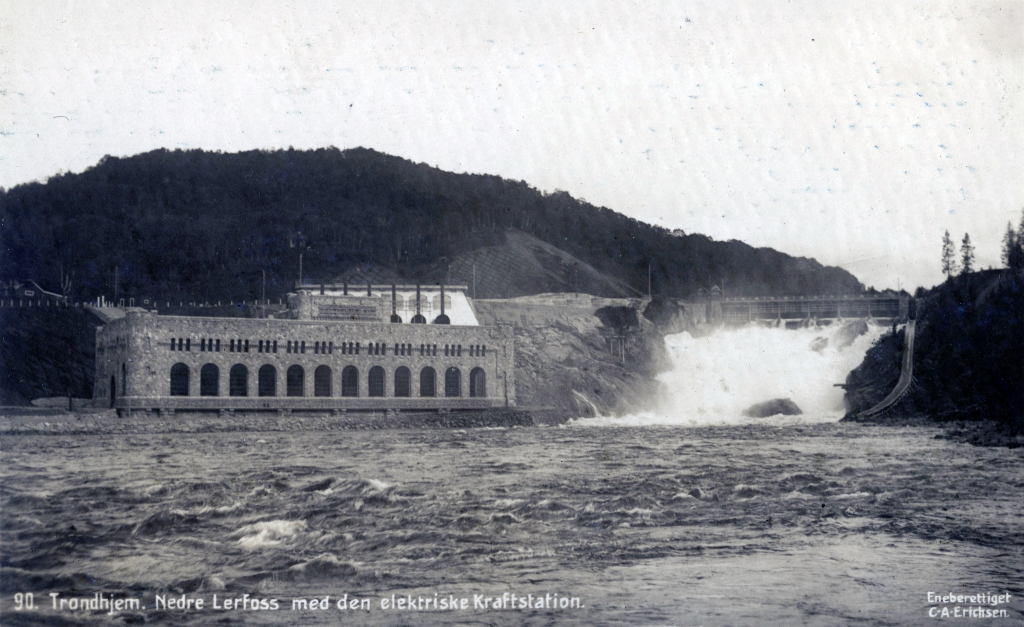
Hal Foster (1892 – 1982), was born in Halifax, Nova Scotia. He created Prince Valiant in the Days of King Arthur, in 1937. It is an epic adventure that told a continuous story stretching for more than 4 500 Sunday episodes (so far). Prince Valiant is the son of Aguar, exiled king of Thule who has taken refuge in the Fens during the days of King Arthur. Foster places this kingdom of Thule in Norway, near Trondheim. Some Norwegians imagine Aguar’s castle was a previous incarnation of the Leirfoss electrical power station, on the Nid river. The old spelling was Lerfoss. The fact that the power station was only build in 1910, is immaterial, if one’s mind can accept it as a repurposed castle. It is located 121 km south of Cliff Cottage. It is a recreational location that I enjoy, while visiting Trondheim.
Prince Valiant’s birthplace at Thule, near Trondheim, repurposed as a electrical power station in 1910. Today, the area has become a pleasant recreation site, along the banks of the Nid River.
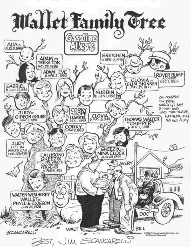
The strip I found most appealing was Gasoline Alley (1918 – present). Chicago Tribune publisher Robert McCormick (1880 – 1955) wanted a feature that would appeal to people learning how to take care of their cars. These were becoming increasingly available to a middle class public. Frank King (1883 – 1969) developed this strip in response. Bill Perry (1905 – 1995) took over in 1951 and continue to create the strips until about 1976. It is the longest running current strip. Except during the 1970s and 1980s the strip progresses in real time. Characters age and some die.
I am always attracted by the names of people in Gasoline Alley. Some of my real life relatives also have unusual names, such as cousins with the surname Pickup. However, Wallet is so unusual that I have never met anyone by that name. In the beginning, the most notable character was Walt Wallet. Joseph Patterson (1879 – 1946) was concerned that the strip as it was developing, had limited appeal to women. His solution was to have Walt Wallet, find Skeezix on his doorstep in 1921. After this, Walt could marry Phyllis Blossom in 1926. Skeezix subsequently grew up, and ran the Gasoline Alley garage. He married Nina Clock in 1944. Their children are Chipper (1945 – ), who ends up marrying Amy, and Clovia (1949 – ), who ends up with Slim Skinner. By this time, I had given up reading Gasoline Alley. Other intimate relationships can be discovered looking at the illustration, below.
Are comics art? Unfortunately, referring to the topic as the 9th art, already answers that question positively, hence the wording. Some will answer with an emphatic yes. The more enthusiastic will regard the question as naive. Yet, unfortunately, the answer is not so clear. Some argue that combining words with artwork is the essence of modern expression, providing narrative and visual richness, use a direct yet spontaneous language. It integrates literature with painting and cinema. Others, view its limitations, popular among children, youth and less mature adults. Mature people do not use comics.
Many readers see the 9th art as a springboard to other more serious, mature types of literature. What relationship do people have with: Alfred E. Neuman, Ariel, Asterix, Bugs Bunny, the Little Mermaid, Snow White, Tintin or Wonder Woman? Are any of them more mature than the others.
George Herriman (1880 – 1944) was an American cartoonist best known for Krazy Kat (1913–1944) that was more influential than popular. Krazy Kat was notable for its poetic, dialect-heavy dialogue, its fantasy laden, but shifting backgrounds and its experimental page layouts. In it, Ignatz Mouse pelts Krazy with bricks, interpreted by Krazy as symbols of love. Later, a love triangle developed between Krazy, Ignatz, and Offisa Pupp. Pupp’s mission was to prevent Ignatz from throwing bricks at Krazy. These efforts were impeded because Krazy wanted to be struck by these bricks.
More importantly, Gilbert Seldes (1893 – 1970) wrote The Krazy Kat Who Walks by Himself appearing in The Seven Lively Arts (1924). It is the earliest example of an art critic giving serious attention to a comic strip. The Comics Journal placed Krazy Kat first on its list of the greatest comics of the 20th century. Herriman’s work has been a primary influence on cartoonists such as Elzie C. Segar (1894 – 1938), Will Eisner (1917 – 2005), Charles M. Schulz (1922 – 2000), Robert Crumb (1943 – ), Art Spiegelman (1948 – ), Bill Watterson (1958 – ), and Chris Ware (1967 – ).
My mind temporarily focuses on Snow White. The Brothers Grimm, Jacob (1785 – 1863) and Wilhelm (1786 – 1859) provided the world with one version in fairytale #53, originally published in 1812 as Sneewittchen. Wikipedia lists: about 10 books, including Donald Barthelme’s (1931 – 1989) post-modernist novel (1967); 20 films including one featuring Betty Boop (1932) made by Max Fleischer (1883 – 1972) and Dave Fleischer (1894 – 1979) and another made in 1937 by Walt Disney (1901 – 1966); There is music, including a soundtrack from the Disney film, released as an album in 1938. Other uses of the term refer to a horse, an industrial design language used at apple, a 1970s government-infiltration and information-suppression effort by the Church of Scientology, a dwarf planet, a fictional hockey team, a brand of sugar, and the first name of a Swedish visual artist.
Sometimes, the 9th art only reaches its potential when it appears as an animation film. Wile E. Coyote and the Road Runner, being a good example. They first appeared in 1949 and were created by Chuck Jones (1912 – 2002). In these videos a devious and hungry coyote attempts to catch a roadrunner, but is always unsuccessful. He deploys complex schemes and devices that always backfire, injuring the coyote. Many of the devices used are from Acme Corporation.
Being born on Halloween, I have no problem with people dressing up as manga characters or superheroes. I appreciate many different varieties of punk from steampunk through dieselpunk and electropunk to cyberpunk, on a theoretical level. Unfortunately, I have not found an appropriate persona to match my personality, so I have no costume at this moment, although I will assure readers that any garments made will incorporate pink and purple fabric.
Comics are not the only art form that has had this problem. Let us recall that cinema, from its beginnings in 1895, was not considered an art. At best it was a momentary attraction. This has changed and it is now classified into genres to differentiate films on issues such as quality and audience. The same was true for comic strips, which gradually took their place in mass culture.
Comics emerged as entertainment that combined illustration and caricature with text in order to present a situation, express an idea or tell a story. Yet, as Wile E. Coyote shows, sequence is an essential ingredient. Will Einsner (1917-2005) called comics a sequential art. They have momentum.
The adult reader
Between 1960 and 1970, cultural studies emerged, which reflected new philosophies or ways of thinking regarding art. There was a change of mindset, allowing for an emergence of theorists of the ninth art. This meant that these works could no longer by regarded as a reading medium intended for children. Underground comics (1968-1979) introduced adult content. This trend can be found in the works produced in San Francisco by Robert Crumb (1943 – ), as well as Trina Robins (1938 – 2024) who produced the first all-woman comic book, It Ain’t Me, Babe. These works examined meanings power relationships, signs, discourses as well as social and cultural products.
To this consideration of the author as an artist and of the comic strip as an object of study is added a third factor, which is the emergence of the adult reader. Or, if you prefer, the public has grown up and expects its comics to be more sophisticated and complex. This is the audience that the Underground genre is aimed at.
Comics are therefore beginning to be taken as a starting point for social criticism or to show a reality. Thus, for example, we can cite the exercise of historical memory in the Paracuellos cycle by Carlos Giménez (1943 – 2020), the story of the Holocaust in Maus by Art Spiegelman (1949 – ) or the post-cyberpunk comic Transmetropolitan by Warren Ellis (1968 – ).
In the 1970s, graphic designers and writers such as Moebius = Jean Giraud (1938–2012), Enki Bidal (1951 – ) and Alejandro Jodorowsky (1929 – ) brought comics closer to erotic and social themes, thus renewing them in Europe to give them a more adult character and a higher quality. Authors such as Jean-Claude Forest (1930 – 1998) with Barbarella, Guido Grepax = Guido Grepas (1933-2003), author of Valentina, Eleuteri Serpieri (1944 – ) with Druuna and Milo Manara = Maurilio Manara (1945 – ) are further examples of an erotic genre.
But, in addition, Graphic Novels and Limited Series appear which, due to their characteristics, constitute another attempt to give dignity to comics, since they are conceived as works in which the same author writes and writes, or those who write and draw are renowned authors, without fixed periodicity – which makes it easier to build a more elaborate plot – and a better drawing printed on better quality paper. Comics from the 1980s such as Alan Moore’s Watchmen and V for Vendetta, Frank Miller’s The Dark Knight Returns or Neil Gaiman’s Black Orchid are examples of this type of comic.
Alan Moore (1953 – ) provides an example of a writer, not an graphic artist or illustrator. He has written several works, including Watchmen (1987) with artist Dave Gibbons (1949 – ) and colourist John Higgins (1949 – ). Here, contemporary anxieties are deconstructed while superheros are satirized to construct a political commentary. The work presents an alternate history in which superheroes emerge in the 1940s to 1960s, changing modern history. By 1985, USA is edging toward World War III with the Soviet Union. Freelance costumed vigilantes have been outlawed and most former superheroes are in retirement or working for the US government. The focus is on personal development and moral struggles. In 2009, a feature film, Watchmen, directed by Zack Snyder (1966 – )was released, along with an episodic video game, Watchmen: The End Is Nigh.
The 9th art was forced to consider: ideology, nationality, ethnicity, gender, society generally, as well as in terms of economics, politics, communication, sociology, cinema, anthropology, philosophy and semiotics and everything else that could be considered culture.
One of the most important theorists of comics is Umberto Eco (1932 – 2016), in Apocalípticos e integrados (1964) = Apocalypse Postponed, 1994, available in English in a partial translation. It reflects on mass culture by analyzing the following comics: Steve Canyon (1947 – 1988) by Milton Caniff (1907 – 1988), Superman (1938 – ) by Jerry Siegel (1914 – 1996) and Joe Shuster ( 1914 – 1992) from Toronto, and Peanuts (1950 – 2000) by Charles M. Schulz (1922 – 2000).
Terenci Moix (1942 – 2003) wrote a social history of the 9th art in Spanish: Los cómics, arte para el consumo y formas pop (1968). It has not been republished since. It is now regarded as cult book. Moix analyses this 9th art from a social and ideological point of view, considering them, along with films and songs, as suitable fodder for political, moral and religious manipulations by those in power. It must be remembered that Moix was living in a dictatorship under Francisco Franco (1892 – 1975). Particular attention should be paid to the works of post-war Spanish author/ illustrators including José Escobar (1908 – 1994) who created: Carpanta (1947 – ), a symbol of post-war Spain’s misery; Zipi y Zape = Zipi and Zape Zapatilla, two young, mischievous, energetic, football-obsessed twins who do poorly in school (1947 – 2000). José Peñarroya (1910 – 1975) created Gordito Relleno (1948), a single man, lacking a permanent job. His good intentions always ended in catastrophes. He is a frequent victim of scams and frauds of all kinds by heartless people. Moix’ analysis and demystification of Flash Gordon (1934 – 2003) created by Alex Raymond (1909 – 1956) and Li’l Abner (1934 – 1977), created by Al Capp (1909 – 1979) are also worthwhile.
Roman Gubern (1934 – ) in El lenguaje de los cómics (1972) wrote about the language of these works and their functions in society.
M. Thomas Inge (1936 – 2021) was an American professor of humanities who taught and wrote about Southern literature, especially William Faulkner (1897 – 1962) and culture, American humor and comic art (Dadism especially), film and animation and Asian literature.
It was then in the 1960s that comic strips began to build bridges with art thanks, among others, to artists such as Roy Lichtenstein, who made pop art the main motif of his works. That however is another topic to be explored at some later, unspecified date.
The 9th art will continue to be examined next week, looking especially at how some theorists have used the comic strip to explain comics. This will be followed by a more in depth examination of Tintin.
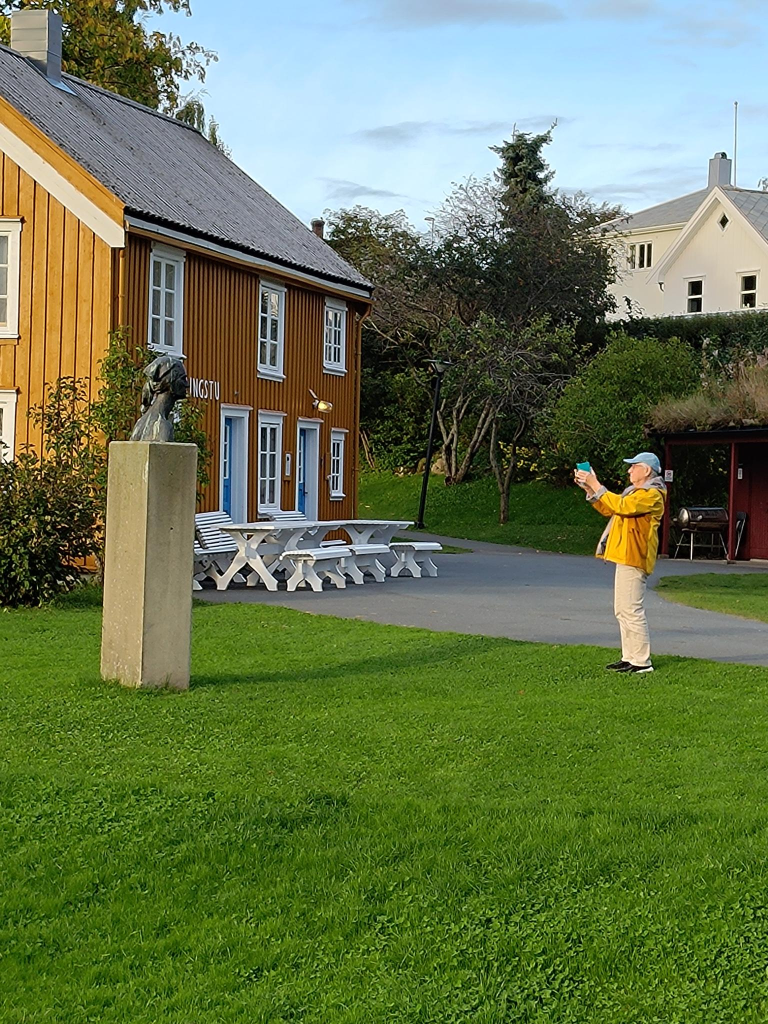
Sometimes my competitive spirit shows itself. Such was the case on Friday, 2024-09-20. Trish suggested that we go for a walk, then do our weekly grocery shopping. For once, I managed to suggest a place to walk that was acceptable to her: the sculpture trail in Straumen, mostly featuring the works of Nils Aas (1933 – 2004). Muustrøparken = the sculpture park, is named after Lorents D. Muus (1809–87). As Norwegians euphemistically say, Muus wore many different hats throughout his life. He was a merchant, banker, post office official and mayor.
On arrival, Trish began taking photos that told me she had decided to write a weblog post about it. When she admitted to me that she had taken a photo of the map in the park, I knew how that post would appear. Yes, it is amazing what one can imagine after knowing someone for just fifty years. That map would be at the top, followed by up to 20 photos of the artwork. Not so many words because, as everyone knows, each photo eliminates the need for 1 000 words. The works in the Nils Aas gallery and workshop would not be included, but some of the park environment (including buildings and the creek, natives call Granelva = the Gran river) would be.
… and so we return to that competitive spirit. Most of the photographs I took were found objects in the park. Some even had sculptural shapes.
Back at Cliff Cottage, I had begun to assemble these into a weblog post of my own. Then I thought it would be a good idea to check my emails, yet again. A column alert from Gloria, two replies from Art, then disaster …
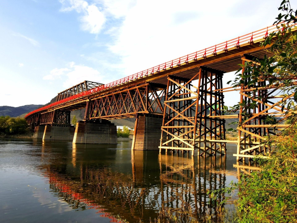
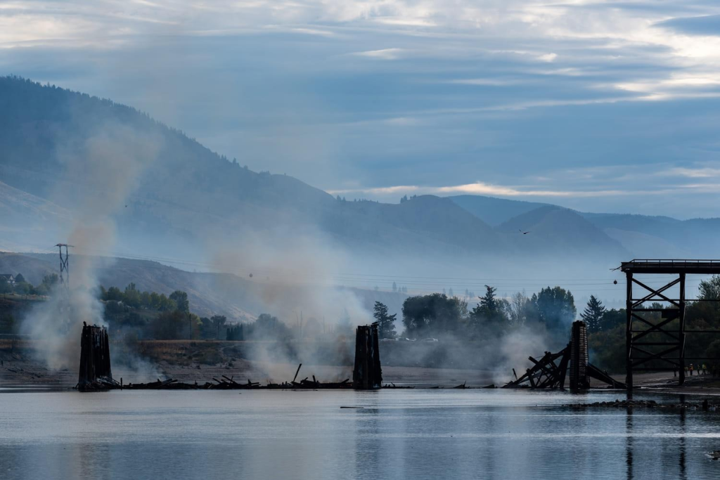
Trish had been using Chat on G-mail to communicate with her sister, Aileen. A message came in: The Red Bridge in Kamloops has burnt down. (timestamp 20:42). I know the bridge well, since my childhood. In the summer there were always children diving off it. On Signal, I posted a photo of it in happier days (timestamp 20:45). This was followed by a photo sent by Trish of its smoldering remains (timestamp 20:47). The red bridge exists no more. There was a fire on 2024-09-17 that was put out. Then on 2024-09-19 a different fire roared to life. Arson is suspected.
… and so unexpected events deflect the focus of one’s life. The bridge was built in 1936, so anyone remembering that location before the bridge, will probably have to be 93 or older to have it persist in their memory. Yes, there were two other bridges at the same location. The first from 1887, was flood damaged in 1909, and replaced in 1912. That second bridge was destroyed by fire caused by a spark from a passing steamer in 1934.
There was one photo I did not take in the park. I thought of taking it, but didn’t because I knew it would still be there the next time I visited. With the bridge fire in Kamloops, there is some urgency to take it now. I know where this photo will be used: Shrinking the Garage, a weblog post currently scheduled for publication 2025-10-29. It is more than a year away, and so I have time. One always has time, until one doesn’t.
An eager photographer in action, taking photographs of legitimate artwork.A potential sculpture hiding in the bushes. One of the park’s many wide eyed beggars, asking anyone passing by for a handout.Not everything in the park is a work of art, but many plants have aesthetic values.A camouflaged micro-hydro-electric-turbine that should be producing electricity, but isn’t!The park is a place for friends of different heights to meet, ranging from a shy, but tall pole vaulter, in the top left of the photo, to a short manhole (personhole) cover, in the foreground.Muusbrua = The Muus Bridge was built in 1816.
Vaasa is a city in Finland on the west coast, on the Gulf of Bothnia. Its population is almost 70 000. Vaasa is a bilingual municipality with Finnish and Swedish as its official languages. The population consists of: Finnish speakers = 65%; Swedish speakers = 23%; People with other mother tongues = 12%. Surrounding municipalities have a clear majority of Swedish speakers. Thus, Swedish maintains a strong position in Vaasa. This makes it the most significant cultural center for Swedish-Finns.
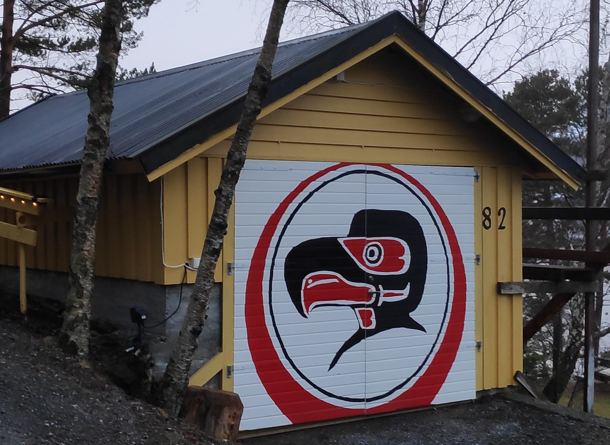
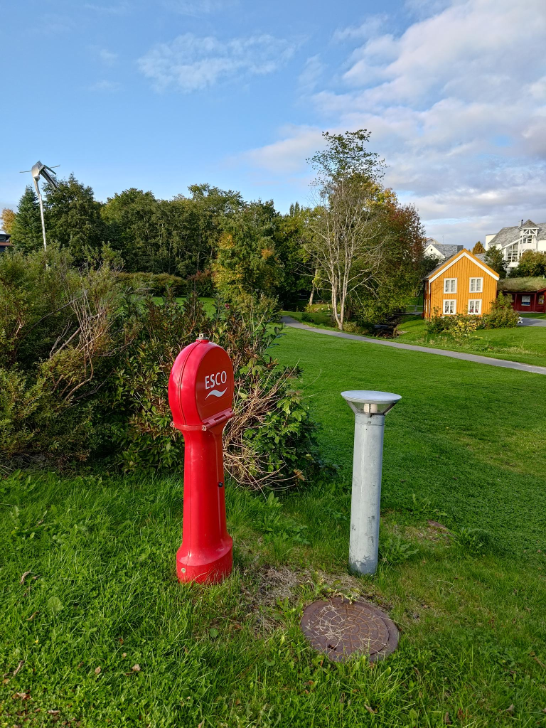
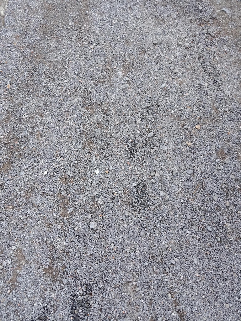
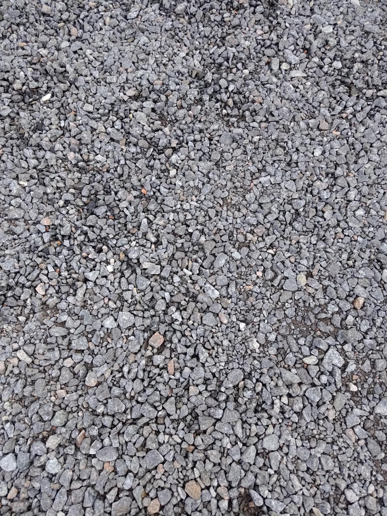
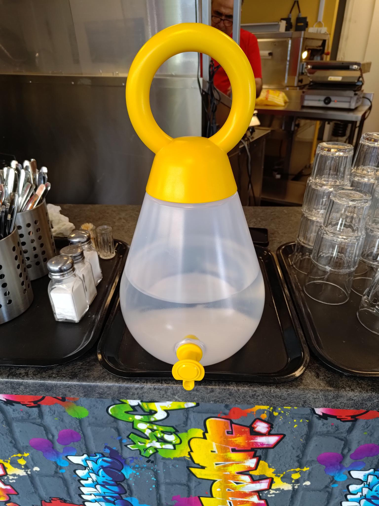
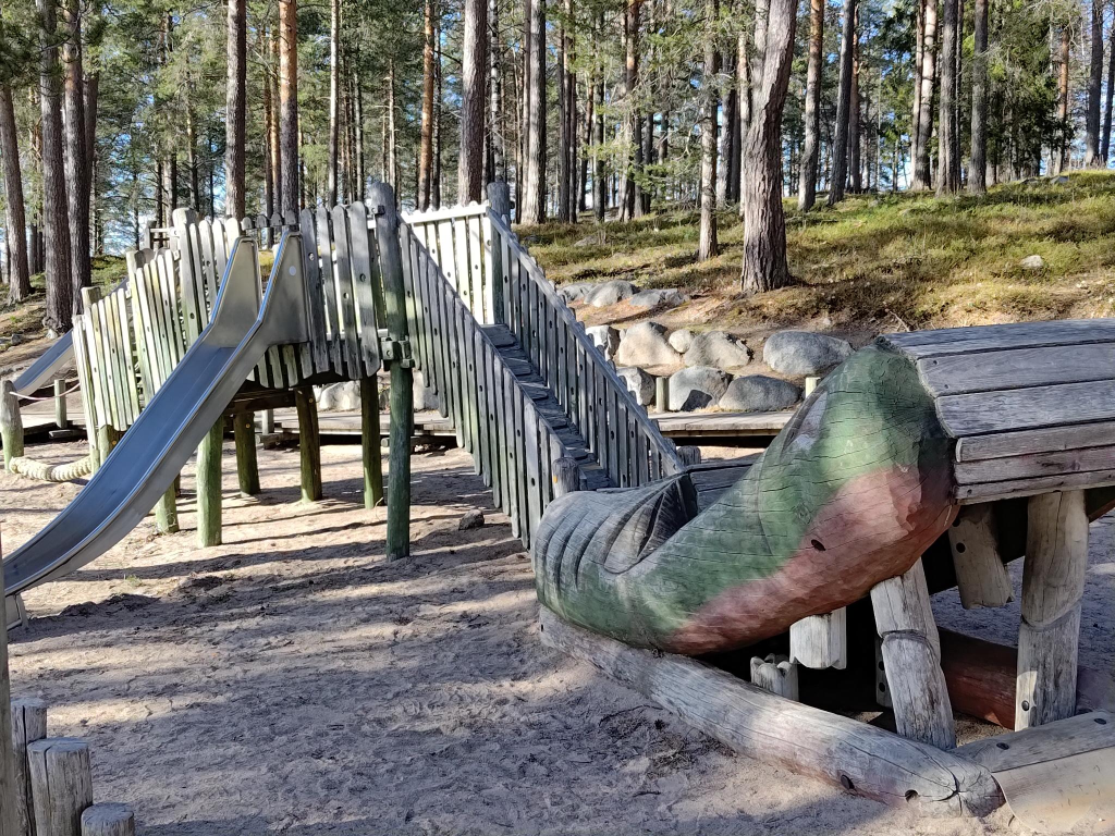
Industrial Art
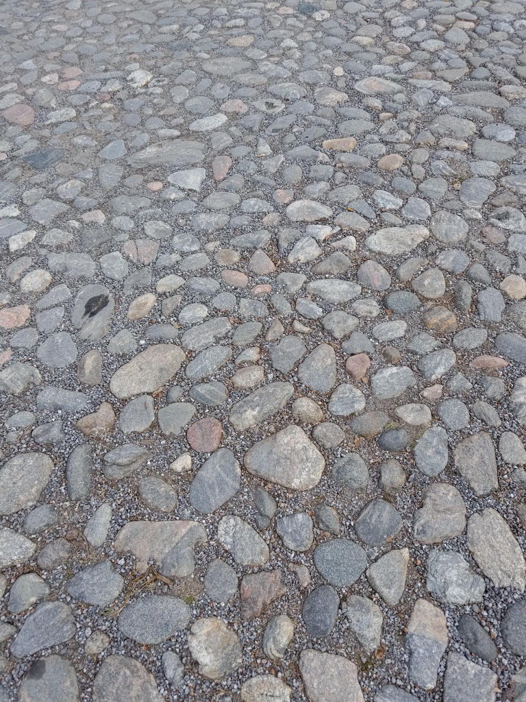
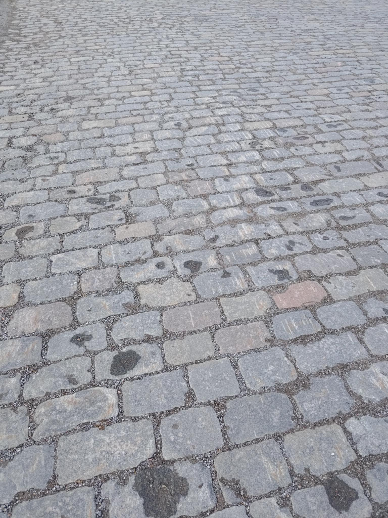
Industrial art means different things to different people. I use it in a general sense to refer to products made through industrial processes that result in something attractive, not necessarily beautiful. Textures produced by industrial processes are an example. Thus, in Vaasa, I decided to document the variety in textures found on the streets.
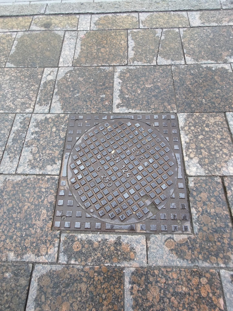
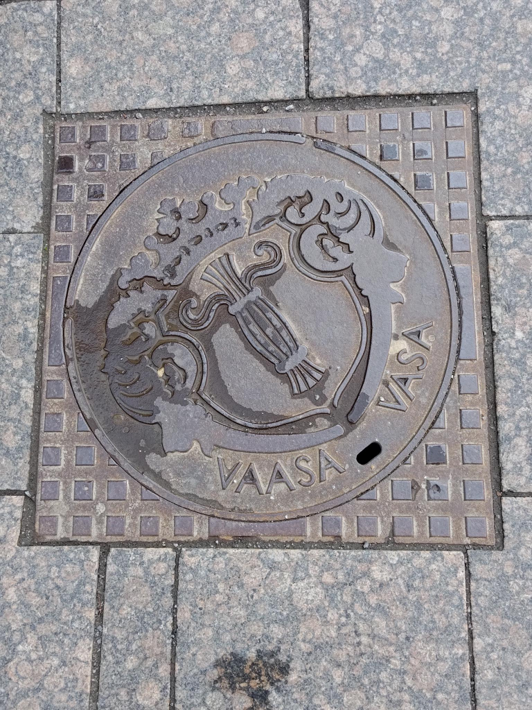
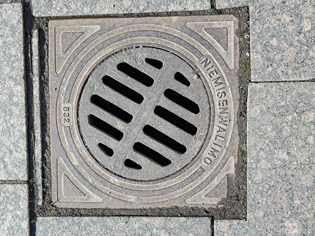
Maintenance hole = manhole covers are another example of industrial art. These are removable lids over the opening of maintenance holes, that are access points large enough for a person to pass through. They are designed to prevent anyone or anything from falling in, rainwater excepted, in some cases. I take photographs of them, but expand my collection by collecting photographs taken by others.
A weblog post on industrial art is being prepared, for publication on 2024-09-21.
Nieminen Valimo = Nieminen foundry, was founded in 1928 by Väino Nieminen (1879 – 1958), in Harjavalta, in south-west Finland. Its location is strategic for production: on sandy ground, next to the Kokemäki river. It is the only maintenance hole and cover foundry in Finland. It is now owned by the Norwegian Cappelen group.
Sculpture
Three statues are presented, along with a comment about a fourth work not included.
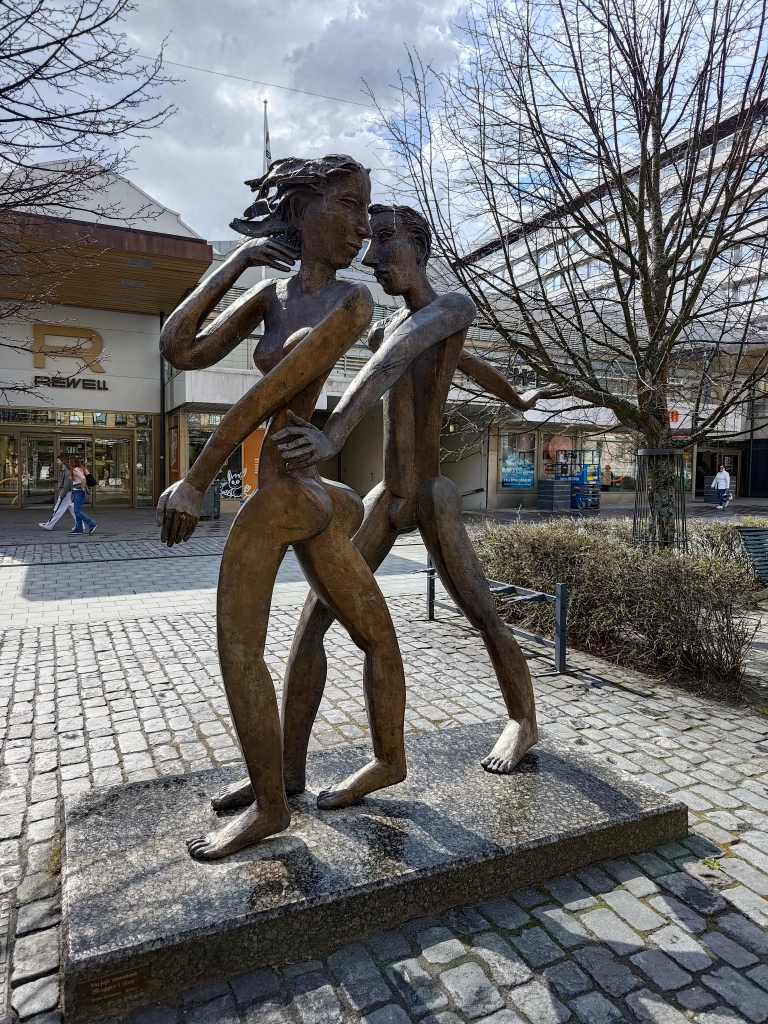
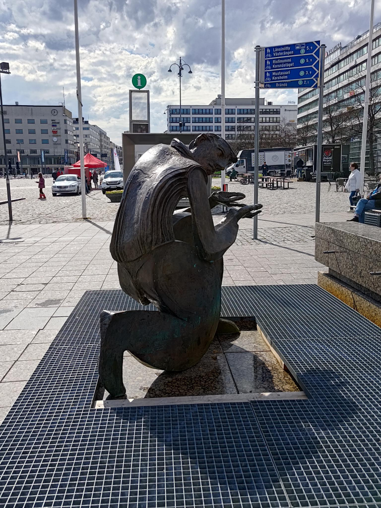
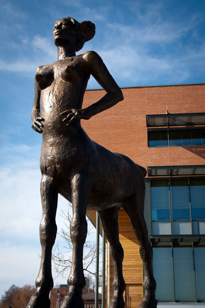
Street art is not always appropriately labelled, or even labelled at all. Such is the situation in Vaasa, with the following three works. It took time, measured in hours, to find the title of each work, its constructor/ sculptor along with birth and death dates (where appropriate) year it was made, and other details about each work. This is one reason encountering street art is so much fun.
Erkki Kannosto (1945 – ), Varjoja metsässä (Finnish) = Shadows in the Forest. Unveiled 2006.Erkki Kannosto, Syvä jano (Finnish) = Deep Thirst. Unveiled 2005.Hannu Leimu (1969 – ), Auringon Lapsi (Finnish) = Child of the Sun. Unveiled 2010.
Political comment 1: Centaurs are mythical creatures, part human and part horse. This composition has led many to treat them as liminal = intermediate beings, caught between two natures. Like all mammals, they come in both male and female = centaurette, varieties. I see Leimu’s work as being in direct opposition to the centaurettes appearing in Disney’s film Fantasia (1940). Originally, the animated centaurettes had displayed their breasts, but that was deemed too offensive for audiences, so these were quickly covered with garlands of flowers. Finnish sauna culture means that the human form, in both of its common varieties, is frequently seen and accepted as natural.
On two occasions, and for several minutes both times, I contemplated photographing Suomen Vapaudenpatsas (Finnish) = Finlands frihetsstaty (Swedish) =The Statue of Liberty, a monumental bronze sculpture. I decided against it, but would include an appropriate link. The height of the work with its pedestals is 14 m, the bronze statue at the top is 6 m. The sculpture was designed by Yrjö Liipola (1881 – 1971) and Jussi Mäntynen (1886 – 1978). It was unveiled in 1938.
Political Comment 2: I find the celebration of war distasteful, and this statue is a tribute to the Whites in the Finnish Civil War in 1918. This work is an adulation of one person, General Carl Gustaf Emil Mannerheim (1867 – 1951), who is displayed three times life size. The Red Guards, composed of industrial and agrarian workers, controlled the cities and industrial centres of southern Finland. The White Guards, composed of land owners and those in the middle and upper classes, controlled rural, central and northern Finland. The offensive part of this work is that is fails to unite the Red and White factions after the end of the war, but focuses on one side’s victory.
Oulu is located on the northwestern coast of Finland, at the mouth of the River Oulu. It is the largest Finnish city with a sub-arctic climate: cold and snowy winters; short and mild summers. The name Oulu derives from the Finnish dialectal word oulu, meaning floodwater, related to the southern Sami åulo = melted snow, åulot = thaw.
Oulu has a large population (215 000). It is also important as one of Europe’s living labs, where residents experiment with new technologies, such as near-field communication (NFC) tags and ubiquitous computing (ubi) screens on a community-wide scale, often involving thousands of users.
Street furniture
Yes, there are four of these units, all in a row: green, yellow, pink and blue. None of the stalls were in use, so it was not possible to know, with certainty, the intended use. One suspected use is a place for mooring/ hitching a bicycle.Some bicycle hitching posts were in use. At the far left of the photograph, one can see Tiernapojat = Star Boys sculpture. It is discussed at the end of this weblog post.It is suspected that these two components could provide seating, but only if some other components, including a back and seat, were installed.
Corporate Identity
Alasdair and I ate our second sushi dinner of the trip at Luckie Fun’s Sushi Buffet. I have managed to survive the first 75 years of my life without a tattoo, and have no intention of enduring one now. However, I find tattoo parlor names and signs interesting. I collect images of the signs.
Statues
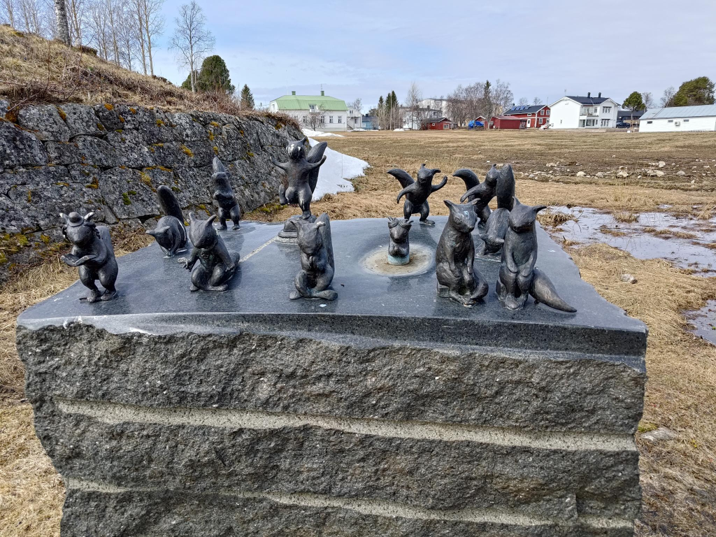
Kaarlo Mikkonen (1920 – 2001), Toripolliisi (Finnish) = The Bobby at the Market Place, Oulu. Unveiled in 1987. Photo: Tve4 (2006-05-26). The translated title is a bit too British for a north American. I would have preferred it to have the title: The policeman at the market place.Yes, an image of birds, possibly four herons. However, I have not been able to discover the artist, or time period for its construction, or even its title.Sanna Koivisto (1955 – ), Tiernapojat = Star Boys. Unveiled 2014, moved to its permanent location 2016.
Tiernapojat, or star boys, is a song play based mainly on the Gospel of Matthew. It tells about the journey of three wise men from the East to the baby Jesus and about King Herod, who orders his soldiers to kill all the little male children, hoping to then also kill the newborn Jesus, the King of the Jews. The performance is estimated to be a centuries-old tradition, but the first reliable written record of the Oulu tiernapoika tradition is from 1873. The song came to Oulu from Sweden.
Haparanda, Tornio and Kemi are three municipalities in Bothnia Bay, the northernmost part of the Gulf of Bothnia, which is in turn the northern part of the Baltic Sea.
During winter it is possible to get around the gulf with: ice skates, sleds, skis, snowmobiles as well as by car on the ice roads over the gulf to the larger islands. There are 4 001 islands, with an island defined as a landmass surrounded by water, larger than 20 m².
Freshwater rivers mean that the bay has brackish water with extremely low salinity levels (0.2-0.3 %). This can be compared with the world’s oceans where the salinity level is around 3.5 %. Most salt-dependent sea species cannot survive in the bay. Ringed seal, grey seal, cod, herring and salmon are found here, along with freshwater species such as the pike, whitefish and perch.
Further south is Merenkurkku (Finnish) = throat of the sea (literal translation) = Kvarken (Swedish) = Quark Ridge (English) a narrow region separating Bothnian Bay from the rest of the Bothnian Sea. Here, the distance from the Swedish mainland to the Finnish mainland is around 80 km. The maximum water depth is about 25 m. Land is rising at 8 to 10 mm a year. Within 2 000 years this will create the largest lake in Scandinavia to its north. There are 5 600 islands in Kvarken.
Summers are mild for a coastal location so far north, and winters are normally not extremely cold in spite of the relative proximity to the Arctic Circle. Trish and I first visited this area ca. 1979-12-10. Alasdair and I visited it almost forty-five years later on 2024-05-12.
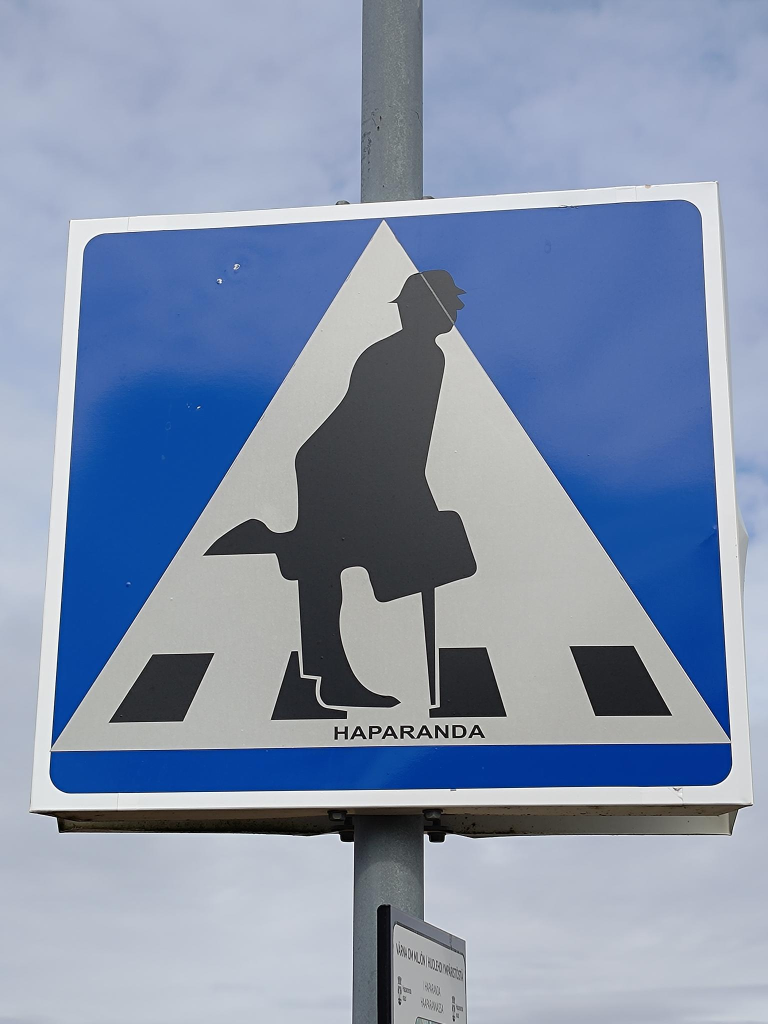
Haparanda 65°50′N 024°08′E
Haparanda, for historical reasons, is often still referred to as a city despite its small population, about 5 000 people in 4.43 km2. It is Sweden’s most easterly settlement.
Anna Jäämeri-Ruusuvuori (1943 – ) Separation. Unveiled 2005, 60 years since the end of world war II. A memorial to the approximately 80 000 Finnish children who were sent to Sweden during the war. The artist was herself one of the war children in Sweden. They were sent to Sweden to be spared the suffering that the war brought to Finland. Most war children returned to Finland after the war, but several thousand remained in Sweden.Bo Holmlund (1935 – 2013) Broar = Bridges. Located in the marketplace in Haparanda. It was erected in 1992 on Haparanda city’s 150th anniversary. Until the border was drawn in 1809, Sweden and Finland were a common country. After the Finnish war (1808 – 1809) between Sweden and Russia, Russia took over Finland. Bridges were broken and the countries went their separate ways. Sweden has had a relatively stable history, while Finland has suffered from both world wars and civil wars. Now it is a new time, the border is increasingly disappearing.Hanna Kanto (1981 – ) with Oday Shalan, Yazan Jbour, Mamoon Al, Diamond Eagle, Masoud Karimi. Strandad = Stranded (2016). The sculpture is made of old boats that have been used on the Torne River. It visualizes old traditions and contemporary events in the Torne Valley.Victoria Andersson (1971 – ) The Struve Triangle (2012). The Struve Geodetic Arc is a chain of survey triangulations stretching from Hammerfest in Norway to the Black Sea, through ten countries and 2,821.853 ± 0.012 km, which yielded the first accurate measurement of a meridian arc. The chain was established and used by the German-born Russian scientist Friedrich Georg Wilhelm von Struve (1793 – 1864) in the years 1816 to 1855 to establish the exact size and shape of the earth. The Struve Geodetic Arc was inscribed as a World Heritage site in 2005.Map of the Struve Geodetic Arc. The 34 red dots are places registered in the UNESCO World Heritage Site. Wilhelm Struve was appointed European Surveyor of the Year 2014 by the Council of European Geodetic Surveyors (CLGE). Image: Badock, Wikimedia commons.Along the Torne river one finds numerous unusual crosswalk signs (but no crosswalks). There is a person displayed, but walking does not seem to be appropriate. In the future, I intend to replace this sign with a composite that merges at least four signs. I will also attempt to find the person, or people responsible.Anja Örn (1972 – ) Transit: Brevduvor på bord = Transit: Homing pigeons on the table (2016). A small aerial lift (zipline) was built in 1916 over the river to transport mail, because during parts of the year the ice was too strong for boats and too weak or too split up for walking. This artwork celebrates the zipline. Note the culture vulture eying the pigeons from the background.Mats Wikström (1954 – ), Järnvägsbrons beskyddare = Protectors of the Railway Bridge (2012). These squirrels protect the bridge, and perform spiritual actions according to various religions.
Tornio 65°51′N 024°09′E
The delta of the Torne River has been inhabited since the end of the last ice age, 16 settlement sites have been found in the area, similar to those found in Vuollerim (c. 6 000 – 5 000 BC).
Tornio is unilingually Finnish with a negligible number of native Swedish speakers. Large numbers are bilingual, speaking Swedish as a second language, with an official target of universal working bilingualism for both border municipalities. Much of the economy is related to stainless steel products.
The Torne River Railway Bridge is 405 m long, and was built as a swing bridge in 1919. It was converted to a fixed structure in 1985. It is a dual gauge railway bridge between Haparanda, Sweden and Tornio, Finland; the bridge can be used by the 1524 mm broad gauge trains, usually Finnish using rails 1 and 3 counting from the left, as well the 1435 mm standard gauge trains, using rails 2 and 4. While we were visiting we could see the bridge being modified to increase its height. It will then be electrified together with the railway line from Laurila in Finland. The electric railway will be in operation by the end of 2024. The bridge is painted white from the Finnish (near) side to the international border, and is blue from there to the Swedish (far) side.Nina Sailo (1906 – 1988) The Aino statue (1959), Located in Aino park, is a belated representative of classic handicraft style. Unveiled in 1959. Alasdair is standing with his left foot (on the right of the photo) in Tornio, Finland, while his right foot (on the left) is in Haparanda, Sweden. There is no physical infrastructure at the border, showing just how free the movement is between countries. Niilo Savia (1898 – 1977) The Jaeger Monument. Unveiled in 1965. At Helsinki University, many Finnish students wanted Russia out of Finland. However, it had no army of its own. Finland pleaded with Sweden to train its troops, but Sweden used its neutrality, to deny this request. However, Germany as an opponent of Russia, agreed to train Finnish troops. The German government financed the journey of recruits to the Lockstedt training camp.Pekka Isorättyä (1980 – ) and Teija Isorättyä (1980 – ) Särkynyt Lyhty = A broken lantern, unveiled in 2013. It shows cult figures from Tornia, such as the priest of Kalkkimaa and the album cover of the band Terveet Kädet. The work uses local steel and steel objects collected from individuals and companies in the area.Pekka Isorättyä and Teija Isorättyä, Kojamo = Shed. It is a steel salmon statue commissioned for Tornio’s 400th anniversary in 2021.
Kemi
About 10 km south of Tornio is Kemi. It is a deepwater port for the north of Finland. Known for its ice and snow. Famous for its winter ice castles, rebuilt annually, and regarded as the largest in the world.
Kemi is world famous, at least in Finland, as the home of the snowman, with this concrete example living outside Kemi’s city hall. Part of the reason for this focus on snow people is that Rovaniemi, located 117 km further north and closer to the Arctic Circle in the northern interior of Finland, has become the home of Santa Claus, since 1985. The city hall was first completed in 1940, but expanded in 1965–1969. The building also serves as the water tower for Kemi.A Martin’s type anchor from the Russian cruiser Asia, left in Kemi in 1905, in front of Kemi’s City Hall. Height = 3 m, mass = 3 500 kg. It was unveiled in 1969 as a memorial to the city’s founding in 1869, by a regulation issued by Alexander II (1818 – 1881), giving it the rights of a staple town, which allowed overseas trade, the collection of tree/ merchant charges, property taxes, port, bridge and load charges, as well as port and weigh house taxes. In addition, the city had to build infrastructure for the port = a bonded warehouse, a weigh house, a storage warehouse. This privileged right was cancelled in 1995.
Luleå is considered the world’s largest brackish water archipelago with 1 312 islands, several rivers and vast forests.
The Luleå region has become the Node Pole, because of its northern location, and its role as a data traffic hub in Europe. The region offers stable, low-cost electricity that is 100% renewable. In addition, because the region is one of the coolest in Sweden. This means it is easier and cheaper to keep server centres cool! Sweden’s long political stability is cited as another long-term benefit of the location.
Cityscape
All of the cities in Sweden resemble each other. There seems to be an architectural standard for each type of structure, that lasts about a decade, before it is replaced.
Framework.Umeå University School of Architecture, The Waterfall that went silent (2023)Foodora Market, delivery unavailable.Taco Bar since 1983Drinking water: 20th centuryDrinking water: 21st centurySculpture, repurposed as grafitti
Kiruna, a short, practical name that could also be pronounced by Swedish-speaking inhabitants, means rock ptarmigan (Lagopus muta), a type of grouse, in Sámi and Finnish.
The area around Kiruna has been inhabited for at least 6 000 years. For centuries the presence of iron ore at Kiirunavaara and Luossavaara had been known by the local Sámi population. Despite finding large amounts of ore, no mining was started because of the remote location and harsh climate. Some ore was extracted in the 19th century.
In the 1880s plans were made to construct a railway from Narvik to Luleå. It was built by 1903. Mining started in the early years of the 20th century. It provides 80% of Europe’s iron ore.
In 2010-06 Kiruna municipal council decided that the town would be moved eastwards (to 67°51′1″N 20°18′2″E), in the direction of Tuolluvaara, because the Kirunavaara mine undermines the existing town centre. A denser city centre with a greater focus on sustainability, green and blue infrastructure, pedestrians and public transport rather than automobiles, is being constructed. We are using this last opportunity to stay in the old town.
In the old city, abandoned buildings have their windows covered up with original works of art. Some are by unidentified artists.
God Jul! = Merry Christmas! (Jul is pronounced exactly like Yule.)
Many works are by Kena Kriström (1953 – ), born in Östersund. She is especially noted for her ice sculptures in Jukkasjärvi, 20 km east of Kiruna.
Some works are by Carina Kero Esberg (1990 – ) originally from Kiruna, now living in Luleå.
Some parts of the old city have been taken over by wild animals!
Note: Today, we had to take a train replacement bus about 72 km = 1h 10m from Narvik to Björkliden. From there we took a real train about 104 km = 1h 30m to Kiruna. On the trip Alasdair used his Blue Square app. This used his Samsung phones GPS system to tell us the speed of the train. At one time it showed 99 km/h, at another 112 km/h. We also had to wait for iron ore trains to pass.