Treat this post as a manuscript for a play, with a Prologue and an Epilogue. At one time it was divided into three acts, but the divisions were messy, so it has reverted to a play with an indeterminate number of acts.
Characters (in alphabetical order). Yes, some of the characters are more important than others, and one has mostly been eliminated from the play. The characters are referred to by their first names, to introduce some intimacy to them. I am not certain this is how people in the 19th century treated each other. My 20th century mother said that her mother, Jane Andison née Briggs (1880 – 1972), referred to some of her women friends by Mrs, followed by a married surname. In Norway, everybody is on a first name basis with everybody. Even the Prime Minister Jonas Gahr Støre (1960 – ) is referred to as Jonas. Before him we had Erna (Solberg, 1961 – ). Her personal, but political website is erna.no .
Anne = Julia Sarah Anne Cobden-Sanderson née Cobden (1853 – 1926), a socialist, suffragette and vegetarian. She provided the money (£ 1 600) to start Doves Press.
Bill = William Morris (1834 – 1896), a textile designer, poet, artist, writer and socialist activist, married Jane in 1859.
Ed = Edward Philip Prince (1846 – 1923) an engraver and punchcutter. Wikipedia tells us: Punchcutting is a craft used in traditional typography to cut letter punches in steel as the first stage of making metal type. Steel punches in the shape of the letter would be used to stamp matrices into copper, which were locked into a mould shape to cast type. Cutting punches and casting type was the first step of traditional typesetting. The cutting of letter punches was a highly skilled craft requiring much patience and practice.
Ed2 = Edward Burne-Jones (1833 – 1898), a frequent illustrator of Kelmscott books, based many of his drawings for the wood engravings on his own previous paintings. He valued these works for their decorative value over their illustrative properties, and reviewed them by looking at them upside-down.
Emery = Emery Walker (1851 – 1933), an engraver, photographer and printer, active in many Arts & Crafts organizations including the Art Workers Guild, the Society for the Protection of Ancient Buildings and the Arts and Crafts Exhibition Society. He was also the most experienced person in this story, when it comes to printing.
Jane = Jane Morris née Burden (1839 – 1914) an embroiderer and artists’ model/ muse. She allegedly embodied the Pre-Raphaelite ideal of beauty, and in addition to her husband, was a model/ muse for Dante Gabriel Rossetti (1828 – 1882). She suggested that Tom take up the art of book binding.
John =John Carruthers (1836 – 1914), a railway/ railroad engineer and economic theorist from a Scottish literary family in Inverness, Scotland. He learned how to construct railways in Canada, then applied that art in USA, Russia, Mauritius and Egypt before being recruited by Julius Vogel, Premier of New Zealand, for the great Public Works policy of the 1870s which emphasized railway construction and immigration. John was made Engineer-in-Chief of the new Public Works Department, responsible for railway construction throughout New Zealand.
Tom = Thomas James Sanderson (1840 – 1922), an unemployed barrister, married Anne in 1882. They both took the surname Cobden-Sanderson.
Prologue
Where to begin writing about life as a play? Perhaps with a set/ stage, knowing when people will make their entrances and exits. The details can be filled in later. Sometimes, on a stage there is something visible, larger than life, a distraction that the actors focus upon. They hope future audiences will focus upon it too, when the dialogue gets boring, as each life unfolds. The actors hope this focus will not just change, but improve, with every act.
It is reckless when two people enter into a relationship with each other. Yet, it is done every day. Often it is called marriage where the participants are so consumed with love – a euphemism for sex – that they forget to scrutinize the contract papers, until it is too late. The participation of a third person often results in folly. In business matters this might be a better course of action, because the result of a disagreement, will not be painful head-bashing, but a 2-1 decision resulting in a majority and a minority. In the emotional life of people in the 21st century, this involves separation – divorce – remarriage, or perhaps even a life free of marital constraints.
Kelmscott
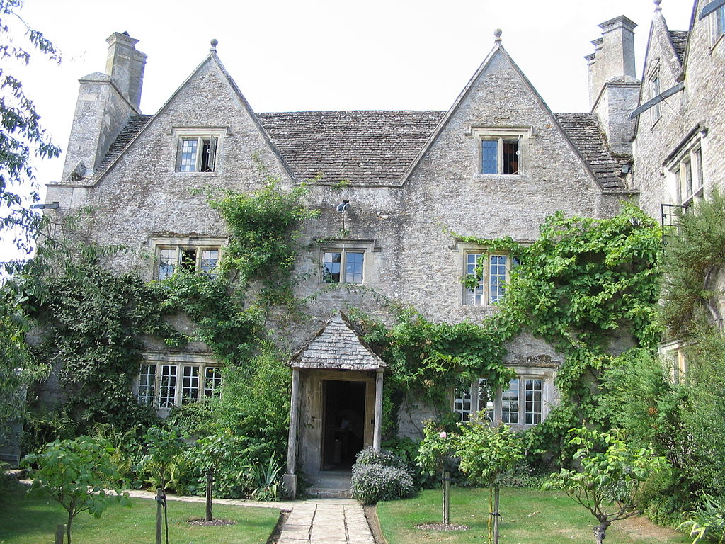
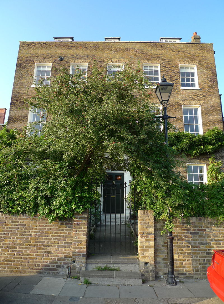
Kelmscott Manor is a Cotswold stone house, built about 1570, with a distinctive architecture and craftsmanship, integrated with its setting. In 1871, Bill bought it as a rural retreat, then used the same name for his London town house when he bought it in 1879. He then gave the same name to his printing venture when it was started in 1891.
In the late 1870s, Emery and Bill became friends. Both were socialists and lived near each other. Emery’s printing expertise and collection of 16th-century typefaces inspired Bill and Emery to become business partners, creating a printing business in 1891. It published 53 books in 66 volumes between its founding and 1898.
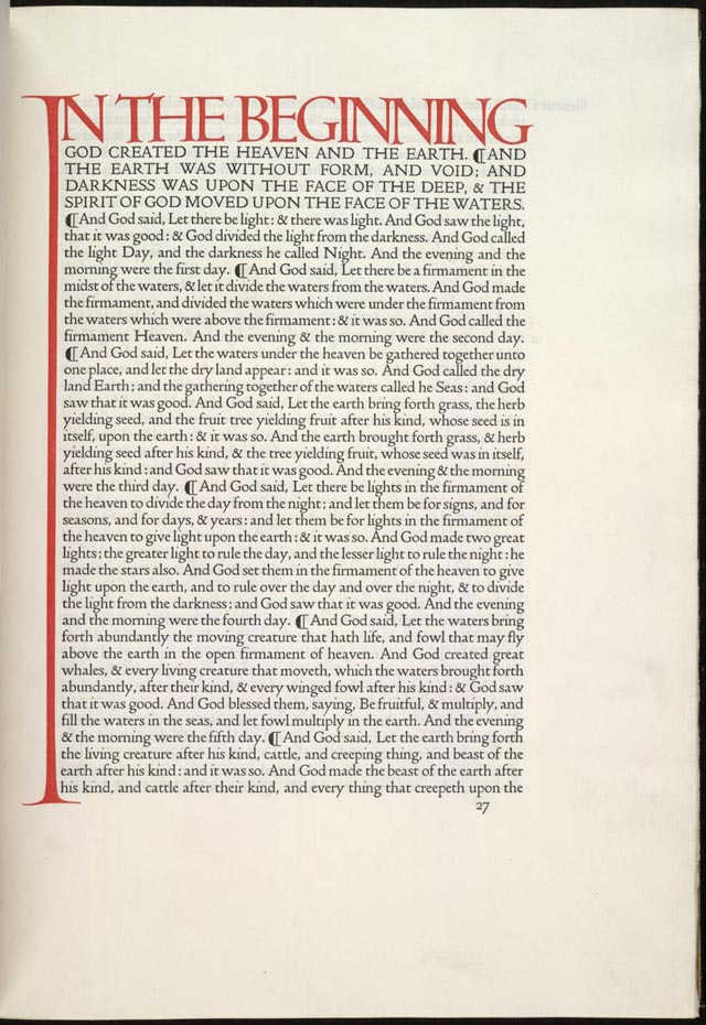
Most of the books published were unillustrated octavos, referring to the page size, from 5 by 8 inches to 6 by 9.5 inches (about 12.5 to 15 cm by 20 to 25 cm), of a book composed of printer’s sheets folded into 8 leaves, making 16 pages. Old-style types were used, with the type printed closer to the spine than the outside edge. This followed the custom of 15th-century printing. A hand press allowed the company to use wood-engraved initials and borders, and to produce a blacker type. The use of dampened handmade paper, creating indentations in the page. These indentations were an important part of the book’s design. Initially, books were sold untrimmed and unbound, assuming that buyers would rebind them. The press only started trimming pages after publishing Biblia innocentium in 1896.
For collectors, several copies of books were printed on vellum = animal skins/ membranes. Compared to paper, this is difficult to print on. Vellum is not parchment. Both use animal skins that have been de-greased and treated for use either in writing or printing or in binding. Neither parchment nor vellum is tanned, so they are not leather. Vellum is an inferior product, manufactured from the entire skin of the animal. It is not split. For this, Bill started using a thick, dark ink. The pressmen had difficulty working with it, so Bill went back to the ink he had used previously. Because of staining he then used a softer ink, that did not dry very quickly. Bill used red ink for titles and shoulder-notes. He experimented with other colors, but did not adopt them.
Emery influenced Bill’s opinions on book design: supporting a return to 15th-century aesthetics, decreasing spaces between words and after punctuation, reducing spaces between words and between lines. While the fifteenth-century books probably reduced spacing to conserve paper, Bill based his preference on the way the printed page looked. Bill said the margins closest to the binding must be the smallest, followed by the head, fore (outer) and tail margins. Medieval printing experts say the difference between the margins was usually less than 20%. Bill’s fore margins were large to accommodate the shoulder-notes recommended by Emery. The inner margins were so little that rebinding was difficult.
Fonts
After deciding to found the press, Bill collected many books printed in 15th century Europe, as well as books on printing and typography. To research typefaces, he bought examples of every fine type he could find.
Many want to attribute Golden Type to Bill. However, it was probably a joint effort between Bill and Emery, but with Bill taking the leading role. They probably started designing Golden Type in 1889. It was a Roman type inspired by a font used by Nicolas Jenson (c. 1420 – 1480) to publish Pliny’s Historicae naturalis, and a similar font that Jacobus Rubeus = Jacques le Rouge (1470 – 1550) used to publish Leonardus Brunus Aretinus’ Historiae Florentini populi. Emery’s company photographed the type at a large scale to help Bill see the shape of the letters. Bill said that designing Golden Type was the most troublesome task he had ever tried. Bill repeatedly traced the enlarged type, until he felt comfortable with his understanding of the design. After Bill drew the the type design freehand, Emery would photograph the drawings and reproduced them at the correct scale. Bill made modifications at every stage. Bill and Emery were at the leading edge of Victorian technology, pioneering photography and enlarged typefaces.
Punches
Ed cut the punches for the type in 1890. These are used to stamp the matrices used to cast metal type. Charles Reed (1819–81) and Sons = especially, Andrew Holmes Reed (1848–1892) and Talbot Baines Reed (1852 – 1893) carried out the casting. The font, in 14-point size, was completed in the winter of 1890–1891.
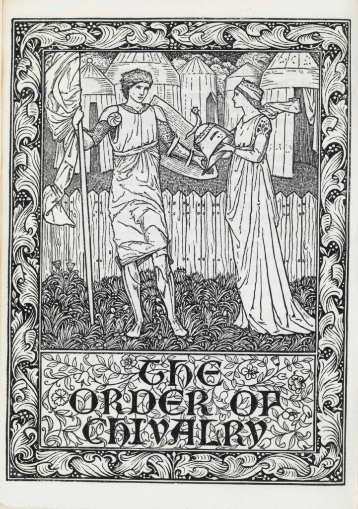
With Golden Type, Bill did not bother making an italic or bold version and did not include brackets or dashes. The thickness of the font went well with the wood-engravings it often accompanied. Some critics commented that its large size and width discouraged commercial application. For example, Stanley Morison (1889 – 1967) strongly disliked it and criticized its large capital letters. Bill designed three related typefaces: Golden Type, Troy and Chaucer. Troy was described as a semi-Gothic type designed […] with special regard to legibility made for the publication of the Historyes Of Troye in 1892. It was cut at 18 points by Ed. It was also used for The Tale of Beowulf in 1895. The Chaucer typeface was re-cut at 12 points for use in The Order of Chivalry (1893) and The Works of Geoffrey Chaucer (1343-1400). It was edited by Frederick Startridge Ellis (1830–1901), ornamented with pictures designed by Ed2, engraved on wood by William Harcourt Hooper (1834-1912). It was published in 1896.
Bill was influenced by books published by Shoeffer and Zainer. Peter Schöffer or Petrus Schoeffer (c. 1425 – c. 1503) was an early German printer, who studied in Paris and worked as a manuscript copyist starting in 1451, before apprenticing with Johannes Gutenberg. Zainer was active 1468 – 1478. he produced about 80 books including two German editions of the Bible and the first printed calendar. He came to Augsburg from Strassburg.
It should be noted that with the founding of the Kelmscott Press, Bill was increasingly ill and living largely as an invalid. He suffered from gout, and showed signs of epilepsy. In 1891-08, he took his daughter Jane Alice = Jenny on a tour of Northern France to visit the medieval churches and cathedrals. When they returned to England, Bill spent an increasing amount of time at Kelmscott Manor. He sought treatment from William Broadbent (1835 – 1907), a prominent doctor, who prescribed a holiday in Folkestone, a coastal town in Kent, on the English Channel.
Because of the use of wide fonts, the books themselves had to be wide too. Bill bought handmade paper from Joseph Batchelor (1831? – ?) and Son. He was obsessed with the aesthetics of early handmade paper. He used paper from the Ford Mill in Little Chart, Kent, England. The mill had been started in 1776, but was taken over by Batchelor in 1876. It was powered by a waterwheel until the end of the 1920s, when electrical power was used.
Bill had strict requirements for his paper. It had to be made of linen, made with a two piece frame consisting of a mould – essentially a screen that allowed water to leak through, and a more solid deckle. Large quantities of paper were needed for printing each book. Each piece of handmade paper had its own subtle character, that made Bill’s quest for consistency and perfection difficult to achieve. The mill used watermarks designed by Bill. In addition, the paper had to be produced in unusual sizes. Other publishers admired the paper, which lead to imitation. At Bill’s suggestion, Batchelor adopted the name Kelmscott Handmade, for the paper.
In the 1890s, photoengraving made it easy for entrepreneurs to copy Bill’s typefaces and sell pirated typefaces. When an American foundry offered to sell Bill’s typefaces in the United States, Bill refused. Joseph W. Phinney of the Dickinson Type Foundry in Boston sold a Jenson Old Style that was very similar to Golden Type. Satanick, an imitation Troy type, was available for purchase in 1896. Bill’s own typefounders, Charles Reed and Sons , started selling a Kelmscott Old Style type. Subsequently, Sydney Cockerell (1867 – 1962), the Kelmscott Press’s administrator, threatened legal action against these companies.
Decorations
Some of the Kelmscott books are heavily decorated, with motifs similar to Morris’s other designs for upholstery and wallpaper. In 1913, George Holbrook Jackson (1874-1948), journalist, publisher and Fabian socialist wrote: “The Kelmscott books look not only as if letter and decoration had grown one out of the other; they look as if they could go on growing.”
The title pages of Kelmscott books were usually decorated in a Victorian style. Bill initially designed woodblock initials that were too dark or too large for the pages they appeared on, but later became more proficient in proofing his capitals. The Kelmscott books varied greatly in ornaments. For example, The History of Godefrey of Boloyne is commonly regarded as over-decorated. However, the first few books published by Kelmscott were in the opposite direction, politely called sparsely decorated. Bill’s border and capital designs were similar to his wallpaper designs. Many regard them as inappropriate, not illustrative of their associated texts. Medieval texts had delicate illuminations covering their margins. However, the wood engravings Bill made were heavy. They created production problems. The use of the Chaucer typeface, required the hand press to be reinforced with steel because of the weight of the large ornaments. Bill preferred his wood engravers to replicate his designs exactly, even though this was at odds with John Ruskin’s (1819 – 1900) theory that craftsmen should have influence in the final aesthetic product they help produce. Kelmscott books did not have printing on the reverse side of woodblock pages until the Chaucer, despite this separation of text from illustration being precisely what Bill wanted to avoid in his book designs.
Printer’s marks
Bill designed three different printer’s marks for Kelmscott Press. One was a simple text mark in a rectangle used with octavos and small quartos. The Kelmscott mark with a large rectangle and leafy background was first published in The History of Godefrey of Bolyne and was used mostly for quartos. The last printer’s mark was only used in the Works of Geoffery Chaucer.
In July 1896, Morris went on a cruise to Norway with John, during which he visited Vadsø, one of the most northerly and easterly town in Norway, and Trondheim, 120 km south of Cliff Cottage. During the trip Bill’s physical condition deteriorated and he began experiencing hallucinations. Returning to Kelmscott House, he became a complete invalid, being visited by friends and family, before dying of tuberculosis on 1896-10-03.
Legacy
After the closing of the Kelmscott Press, leftover paper and the type fonts were given to the Chiswick Press. The Kelmscott types were sold to Cambridge University Press in 1940. Woodblocks were given to/ deposited in the British Museum. Presses and related equipment were sold to Essex House Press.
Thorstein Veblen (1857–1929), an American economist and sociologist, was a well-known critic of capitalism. In The Theory of the Leisure Class (1899), Veblen developed the concepts of conspicuous consumption and conspicuous leisure. He called Kelmscott’s books a conspicuous waste arguing that they were less convenient and more expensive than regular books, showing that the purchaser had time and money to waste.
Charles Robert Ashbee (1863 – 1942) was involved in book production and literary work, setting up Essex House Press as a Kelmscott Press imitation, and taking on many of the displaced printers and craftsmen. Between 1898 and 1910 the Essex House Press produced more than 70 titles (some sources state a total of 83). He used the same ink, paper, vellum and presses that Kelmscott used. He designed two type faces for Essex House, Endevour (1901) and Prayer Book (1903), both of which are based on Golden Type. William S. Peterson (1939 – ) called Ashbee’s typefaces “ugly and eccentric” but that the books “have a certain period charm”.
Tom worked as a binder in the Doves Bindery, which carried out the pigskin bindings for the Kelmscott Chaucer. Together with Emery, they founded Doves Press and used similar paper and vellum to Kelmscott. Tom disliked the decorative style of the Kelmscott books. Books from the Doves Press had only an occasional calligraphic initials. They created a font that copied those in Nicolas Jenson’s renaissance publications. Their 5-volume folio Bible remains an important landmark in the history of fine press, and their editions of Goethe inspired the formation of several fine presses in Germany. The most prominent of these were Bremer Press, Janus Presse, Kleukens Presse, Ernst Ludwig Presse, and Serpentis Presse.
It is difficult to assess the roles and interactions of the human participants who were responsible for that press. When I attempt to understand the past, I almost always have to refer to Leslie Poles Hartley (1895 – 1972) and a quotation from his most famous book, The Go-Between (1953): “The past is a foreign country; they do things differently there.” Dove Press refers to The Dove, a riverside pub, located in Hammersmith, London. Having avoided alcohol for half a century, I find it difficult to believe that anyone would name something after a pub. Then, I think back to the situation in London in the mid 19th century, and the belief that miasma = bad air, caused disease. John Snow (1813–1858) is important because of his work in tracing the source of the 1854 Broad Street (Soho, London) cholera outbreak, in which he identified the source as a specific public water pump. Yes, one must remember that water can be unhealthy, and beer can be a more appropriate choice, especially in times past.
The Vale Press, founded by Charles Ricketts (1866 – 1931) with Charles Shannon (1863 – 1937), based their types on 15th-century calligraphy. They published literary classics, which allowed them to focus on the design and layout of the works. Together, they also worked with theatrical costume design and production.
Esther Levi Pissarro nèe Bensusan (1870 – 1951) Pissarro née Bensusan founded the Eragny Press with her husband Lucien Pissarro (1863–1944). Thye produced books illustrated with colour wood-engravings. Esther created the wood engravings from Lucien’s designs. Eragny Press shared type with Vale for a time.
The Ashendene Press was a small private press founded by Charles Harald St John Hornby (1867–1946). It operated from 1895 to 1915 in Chelsea, London and was revived after World War I in 1920, but closed in 1935. It specialized in publishing poetry books and folio versions of classic literature.
In 1902, Elizabeth (1868 – 1940) and her sister Lily Yeats (1866 – 1949) joined Evelyn Gleeson (1855 – 1944) in establishing a craft studio at Dundrum, near Dublin, called Dun Emer. This specialized in printing and other crafts, with Elizabeth in charge of the printing press. Activities took place in Gleeson’s large house, in which a crafts group provided training and work for young women in: bookbinding, printing, weaving and embroidery. They could also live in the house. Bookbinding workshops were a later addition to the studio. Dun Emer was named after the Irish mythical Emer, a figure famous for her artistic skills and beauty. The title-page device of the Dun Emer Press was designed by Elinor Mary Darwin (née Monsell; 1879–1954) and shows Emer standing underneath a tree. The focus of the Press was on publishing literary work by Irish authors. Jack Butler Yeats (1871 – 1957) did much of the illustration work.
Epilogue
Today, using typefaces is easy. Everyone can set up their own press, especially if the product is digital. Even the McLellans did it. In the mid 1990s, we formed Fjellheim Institutt, named after the official name of our house, to produce Åndelig Dyder: En familiehåndbok = Spiritual virtues: a family handbook (literal translation), = The Virtues Guide, by Linda Kavelin Popov, Dan Popov and John Kavelin, in 1996 – a century after Kelmscott Press closed. The book was printed on paper, typically in small quantities, in Steinkjer. Its purpose was never to made a profit, but to ensure that Norwegian families could introduce ethical concepts to their children. We still have a few copies, that we give away when opportunities arise.
Even in the mid 1980s it was possible to obtain professional typesetting quality from a computer, as long as that computer was an Apple Macintosh, an Atari 1040ST or a Commodore Amiga. We owned an Amiga.
Today, it is not the computer that sets the limits, but the software. The first desktop publishing software we used was Aldus PageMaker 5.0, which was introduced in 1993. Aldus was founded by Paul Brainerd (1947 – ) and others in Seattle in 1984. It was acquired by Adobe Systems in 1994. The company was named after 15th-century Venetian printer Aldus Manutius. The program was replaced by InDesign in 2001.
Today Adobe does not sell stand alone copies of its software products, but forces people to work with its cloud environment, making it inherently unsafe. Perhaps the most accessible desktop publishing program is Scribus, a free and open source program, supported on at least 13 operating systems. It offers a vector drawing tool, supports multiple file types, and supports over 200 colors in its palette. It was also one of the world’s first software to support the PDF/X-3 format conversion.
Today, our publication efforts focus on our blogs.
