Good Design can be summarized in three words: Weniger, aber besser = Less, but better! Personally, I prefer the term, appropriate design. However, good design seems to be more common. Regardless, people can interpret such a phrase in different ways, so here are ten points to promote a better understanding of it. Good/ appropriate design:
- is innovative – The possibilities for progression are not, by any means, exhausted. Technological development is always offering new opportunities for original designs. But imaginative design always develops in tandem with improving technology, and can never be an end in itself.
- makes a product useful – A product is bought to be used. It has to satisfy not only functional, but also psychological and aesthetic criteria. Good design emphasizes the usefulness of a product whilst disregarding anything that could detract from it.
- is aesthetic – The aesthetic quality of a product is integral to its usefulness because products are used every day and have an effect on people and their well-being. Only well-executed objects can be beautiful.
- makes a product understandable – It clarifies the product’s structure. Better still, it can make the product clearly express its function by making use of the user’s intuition. At best, it is self-explanatory.
- is unobtrusive – Products fulfilling a purpose are like tools. They are neither decorative objects nor works of art. Their design should therefore be both neutral and restrained, to leave room for the user’s self-expression.
- is honest – It does not make a product appear more innovative, powerful or valuable than it really is. It does not attempt to manipulate the consumer with promises that cannot be kept.
- is long-lasting – It avoids being fashionable and therefore never appears antiquated. Unlike fashionable design, it lasts many years – even in today’s throwaway society.
- is thorough down to the last detail – Nothing must be arbitrary or left to chance. Care and accuracy in the design process show respect towards the consumer.
- is environmentally friendly – Design makes an important contribution to the preservation of the environment. It conserves resources and minimizes physical and visual pollution throughout the lifecycle of the product.
- is as little design as possible – Less is more. Simple as possible but not simpler. Good design elevates the essential functions of a product.
The ten principles, listed above, were developed in the 1970s, by Dieter Rams, born 1932-05-20. His ninetieth birthday was celebrated only eight days before the publication of this post, two days before World Goth Day #14, and the 100th anniversary of the birth of Otl Aicher. Yes, Dieter Rams was mentioned in that post. However, even I was able to appreciate that publishing three posts in a week was excessive, so this post on Rams had to wait! However, most of it was actually written before both of the others.
Like many people, Rams’ trajectory through life was not straight. In terms of career, he started his working life, like his influential grandfather, as a carpenter. Part of a carpenter’s training involves learning to deal with product that can be difficult to work with – wood. Some people feel that disobedient wooden components, need to be beaten into submission. Others learn that beating is not the correct approach, but that there are a few simple techniques that can persuade wood to perform as wanted. Trees have branches, that impact wood’s shape, texture and strength. Today, most wood is cut with saws, producing large quantities of both wood and sawdust. Many industrial processes depend on sawdust, an inferior product with mass but lacking strength. Despite that, I envisage a time in the future, where this waste will be reduced, as it becomes more economical to use laser cutters, if only because this would produce more of a stronger product.
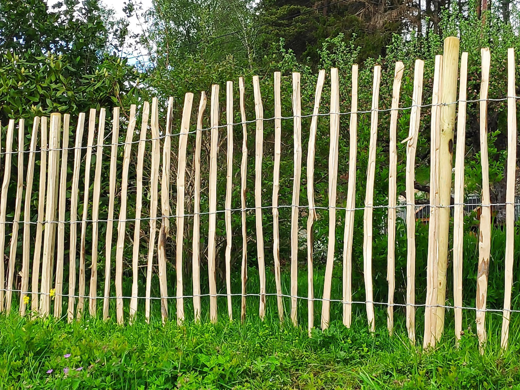
Before saws became commonplace, other techniques had to be used. One approach is to split, rather than cut, wood. Locally, one of my neighbours, Jörg Mentzen, has recently installed a fence with split pales. Here the fence effectively keeps dogs and children on one side, and larger wildlife on the other. Smaller animals, such as snails, squirrels and birds, are allowed free passage. In terms of its production, there is very little waste. This fence is totally in the spirit of Dieter Rams.
Rams’ apprenticeship as a carpenter was interrupted in 1947, with studies in architecture and interior decoration at Wiesbaden School of Art. With his apprenticeship complete, he was able to return to school in 1948, finishing his studies in 1953. Of course, there are different ways of seeing these changes. Wikipedia, for example, wants to focus on his apprenticeship interrupting more academic studies.
After graduating, Rams began working for architect Otto Apel (1906 – 1966), in Frankfurt.
Rams is best known for his work at Braun. Max Braun (1890 – 1951) founded what later became an electrical appliance company in 1921. After his death, the company was taken over by his sons Erwin (1921-1992) and Artur (1925-2013). In 1967 they sold the company to The Gillette Company, which was subsequently taken over by Procter & Gamble in 2005.
In 1955, Rams started working for Braun as an architect and an interior designer. At some point, his role transitioned to that of industrial designer. In 1961, he became the chief design officer at Braun, a position he retained until 1995.
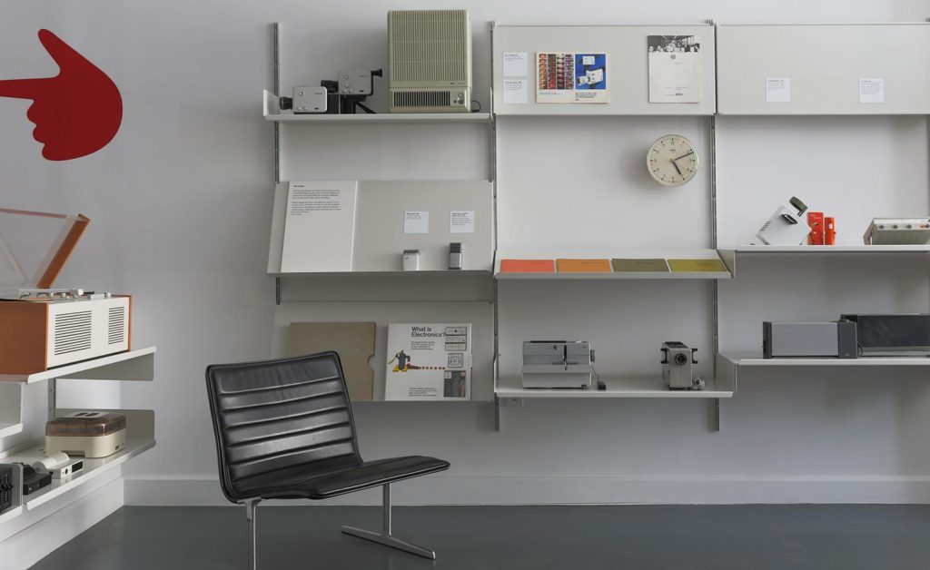
From 1957 Rams also worked as a furniture designer for the Otto Zapf (1931 – 2018) company, who joined with Danish entrepreneur Niels Vitsœ (1913 – 1995) in 1959 to form Vitsœ + Zapf. In 1969 this became Vitsœ. Rams designed the 606 Universal Shelving System, the 620 armchair and the 621 side table. They all show minimalist characteristics.
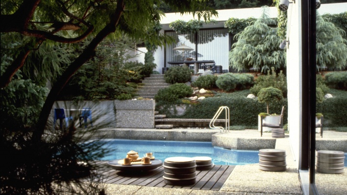
With respect to his house, Rams comments: “My house in Kronberg, bordering the Taunus woodlands, is part of a concentrated housing development that I had originally helped to plan. The house is built and furnished according to my own design and I have lived here with my wife since 1971. It goes without saying that we live with Vitsœ furniture systems. Firstly, because I have only ever designed furniture that I myself would like to have and secondly to get to know them during daily use to better recognise where they might be improved or developed further. In instances where the Vitsœ programme is not complete, I have selected furniture from other manufacturers that have been designed from a similar perspective, such as the bent wood 214 Thonet chairs around the table that we use for dining, or the Fritz Hansen stools at the breakfast bar between the kitchen and living area.”
The Rams’ house is described as an L-shaped bungalow, modest in size. A workshop is located below the main living area. Its only apparent extravagance is a small swimming pool. It is a listed property, meaning that the Hessen Office for the Preservation of Historical monuments, has decreed that the building is to be preserved in perpetuity, and cannot undergo significant changes. From my perspective, the house contains an excessive amount of white and cement, and too little wood. I find this surprising in a house designed by an architect, who first worked as a carpenter.

Thank you so much Brock for appreciating our fence. “Weniger ist besser ” could be a guiding idea for humanity with regards to the resources we are using in our daily life. Becoming good stewards and servants to each other, includes responsibility for our fellow neighbours, ourselves and nature.