I have been an encyclopedia enthusiast since 1958, when our neighbours, the Sathers acquired a set of World Book encyclopedias. We acquired our set soon afterwards. In my childhood, I used to take a volume off to bed to read. Then, twenty years later in 1978, Jane Kupfer and Mychael Gleeson gave us a copy of the single volume Random House Encyclopedia on our wedding day. It still has a prominent place on our bookshelf, but in 2025, it has effectively been replaced by Wikipedia.
This is mentioned because Wikipedia articles vary in quality, especially their clarity and ability to inform. Thus, when I wanted to incorporate some basic insights into signed languages in this weblog post, I read what Wikipedia had to say about languages, then had to simplify much of the content to make it intelligible,
Some language insights
Language is a broad term for a linguistic configuration allowing people to communicate. It employs a system of symbols used uniformly by people to communicate intelligibly with each other. Language is distinct from dialect, jargon and vernacular. It refers to a linguistic configurations of vocabulary = a stock of words, syntax = rules and patterns by which sentences and phrases are formed, phonology = distribution and patterning of speech sounds in a language and of the tacit rules governing pronunciation. Signed languages lack phonology.
Dialect is applied to certain forms or varieties of a language, often those that communities or special groups retain even after a standard has been established. They are often geographic.
I would describe my own dialect as Cascadian, although other British Columbians would describe it as West Coast, essentially identical to the Pacific Northwest dialect found in Washington and Oregon states, and with minimal differences to the California dialect found, well, in California. This is totally unsurprising given the history of the area, and American immigration, especially from California after the California Gold Rush.
Some dialects appeal more to me than others. Take for example, Toni Basil, from Los Vegas. Her dialect, on Mickey (1981) always represents my ideal English language dialect, even better than my own. Yes, I am sure that I am not influenced by her Los Vegas High School cheerleader head uniform.
Note: The California goldrush had both positive and negative effects. On the plus side, the sudden influx of gold into the money supply reinvigorated the American economy; the sudden population increase allowed California to become a state in the Compromise of 1850. The gold rush had severe effects on Native Californians and accelerated the Native American population’s decline from disease, starvation, and the California genocide.
I have noticed, but never commented on, differences between my dialect and that of my relatives in Essex County, Ontario and Detroit, Michigan. I would refer to their speech as a Great Lakes dialect. I can understand them perfectly, but there are some differences. I cannot articulate those differences before I hear them, but I notice them as they are being uttered. Undoubtedly, these same relatives will have a similar reaction to my speech.
Jargon is an artificial linguistic configuration often used by a particular occupational group for communication about occupational matters. Chinook jargon is often used as an example. It originating as a pidgin trade language in the Pacific Northwest. It spread during the 19th century from the lower Columbia River, first to other areas in modern Oregon and Washington, then to British Columbia and parts of Alaska, Northern California, Idaho and Montana.
A pidgin = a grammatically simplified means of communication that develops between two or more groups of people that do not have a language in common: typically, its vocabulary and grammar are limited and often drawn from several languages. A creole language = a stable natural language that develops from the process of different languages simplifying and mixing into a new form (often a pidgin), and then from that expanding into a fully developed language with native speakers, all within a short period.
Vernacular refers to ordinary informal speech in a given language. It is simultaneously in accord with and, in relatively small ways, distinguished from the standard language in syntax, vocabulary, usage and pronunciation. It is used by persons indigenous to a certain community, large or small.
Signed languages
Signed languages are languages that use the visual-manual modality to convey meaning, instead of spoken words. They use manual articulation in combination with non-manual markers to express thought. Signed languages are fully developed natural languages with their own grammar = language rules, and lexicon = vocabulary.
Note: Signed languages are not universal and are usually not mutually intelligible. There are similarities among different sign languages.
Linguists consider both spoken and signed communication to be types of natural language. Both emerged through an abstract, protracted aging process and evolved over time without meticulous planning. There is substantial overlap between the neural substrates of signed and spoken language processing, despite obvious differences in modality = form of sensation, here visual rather than through sound.
Interpreters
From about 1982 to 2008 (26 years) I worked with interpreters, on an almost daily basis. The interpreters I used were specially designed computer programs that translated code from a programming language into a machine code, that various types of computers could understand. In some respects these are similar to, but in other respects different from, people who interpret between two human languages.
Deaf people often need an interpreter, for basic tasks. A human or computer-based interpreter, can help deaf people communicate, but they are seldom available. So people end up writing messages, or using children that can hear to interpret. Yes, many deaf people have to rely on writing with a pen on pieces of paper, or messaging with smart phones to communicate.
I don’t understand why this should be the case. Apple’s Siri spun out from the Stanford Research Institute’s Artificial Intelligence Center and is an offshoot of the US Defense Advanced Research Projects Agency’s (DARPA)-funded CALO project. SRI International used the NABC Framework to define the value proposition for Siri. It was co-founded by Norwegian Dag Kittlaus (1967 – ), Tom Gruber (1959 – ), and Adam Cheyer (1966 – ). Kittlaus named Siri after a co-worker in Norway; the name is a short form of the name Sigrid, from Old Norse Sigríðr, composed of the elements sigr “victory” and fríðr “beautiful”.
Adam Munder (1976 – ), who presented much of the information here in a TED talk, works as a software engineer in his daily life. He uses two highly qualified interpreters to work with others who have the same degrees, educational background, job responsibilities to solve engineering problems in a competitive environment. His daily collaborations, meetings and presentations rely on his interpreters. He is thankful that his employer ensures access to the same information that his hearing enabled colleagues do.
This is not true for many deaf people throughout the world. Interpreters are expensive and scarce. Adam lives in Arizona, a state with a population of about 7.5 million people in 2024. Of these, more than 1.1 million individuals have a hearing loss. That is about 15% of the population. There are only about 400 licensed interpreters. That is a ratio of 2750 / 1. Americans work up to about 2 000 hours a year. It it were equally divided, that would be about 0.75 hours per deaf person per year.
That means there is a scarcity of tools available, and few options. Until now.
There are about 150 different signed languages throughout the world. One of them, originally called Gestuno, now International Sign, is international in its orientation. It intends to bridge the gap between member of communities who don’t hear, but use different signed languages.
American Sign Language.
American Sign Language (ASL) is the predominant sign language of Deaf communities in the United States and most of Anglophone Canada. ASL is a complete and organized visual language that is expressed by employing both manual and nonmanual features. It is often the basis for creoles used in many countries around the world, is widely learned as a second language, so that it can serve as a common language. ASL is closely related to French Sign Language (LSF).
ASL originated in the early 19th century in the American School for the Deaf (ASD) in Hartford, Connecticut. Since then, ASL use has been propagated widely by schools for the deaf and Deaf community organizations. User estimates vary from 250 000 to 500 000 persons, including children of deaf adults (CODA) and other hearing individuals.
Adam Munder, with others, is building a platform called OmniBridge. Its purpose is to join the deaf world and the hearing world, so that the details and nuances that make people human can be found in conversations.
He says that the OmniBridge team is using the power of AI to analyze thousands of signs in ASL. At one level, the goal seems to be to allow people to engage in conversations, regardless of their language. It is bringing humanity back into conversations, fusing worlds without forcing people to adapt to one other. While there are thousands of ASL signs (which may seem small) ASL is complex, filled with slight nuance and changes in body language. These can change the meaning of a sign from big to enormous.
The machines used to translate ASL to English, and vice versa are AI PCs, These are able to run ASL models locally, without relying on the internet, which dramatically increases accessibility. It is claimed that AI is changing the world. I am not convinced, although I can understand that people would prefer to have the technology they use in their devices, rather than needing an internet connection to communicate. The value of OmniBridge team is that it is using computing power to humanize, include and to level the playing field. It is an attempt to unite two languages, signed and spoken, into one seamless conversation. Let us hope that it does not become a mechanism to transfer wealth from the relatively oppressed, to those with wealth.
Laurence Peter and Raymond Hull, as they appear on a Vancouver Public Library plaque outside the Metro Theatre in Marpole, Vancouver.
British born playwright Raymond Hull (1919 – 1986) and Vancouver born hierarchiologist Laurence Peter (1919 – 1990) met in a theatre lobby during an intermission, in the early 1960s. They agreed that they were watching an atrocious production.
Discussing the reasons for this theatrical disaster, Peter told Hull that employees rise to their level of incompetence. Workers keep getting promoted until they stop performing well. Later, the two men collaborated on their 1969 best-seller, The Peter Principle: Why Things Always Go Wrong, which focused on this key insight. The book was rejected by more than a dozen publishers before being accepted, and becoming a best-seller.
Many TV mockumentaries/ sitcoms throughout the world have been called The Office, including a BBC production 2001-3, followed by an NBC one 2005 – 2013. These series were directly inspired by The Peter Principle, and showed incompetent people in action. The same is true of the comic strip Dilbert, written and illustrated by Scott Adams (1957 – ) since 1989. Adams gained inspiration from his banking career at Crocker National Bank in San Francisco between 1979 and 1986.
The Peter Principle describes organizational dysfunction. Companies frequently have the wrong person in the wrong place. Yet, Peter was uncertain about the incompetent people at the top. In a 1984 television interview on CBC Television with Carole Taylor (1945 – ), he admitted.”I’m never sure whether our world is run by idiots who are sincere or wise guys who are putting us on.”
Taylor was probably an appropriate interviewer. She has had a dubious career. She was Miss Toronto 1964; an independent member of Vancouver City Council from 1986 to 1990; Chair of the Vancouver Board of Trade from 2001 to 2002; Chair of the Canadian Broadcasting Corporation (CBC) from 2001 until 2005; British Columbia’s Minister of Finance from 2005 until 2008; Chancellor of Simon Fraser University (in Burnaby, British Columbia) from 2011 until 2014. From my perspective, her most notable achievement was the introduction of the first carbon tax in North America, introduced in 2008. It was based on Sweden’s carbon tax, that successfully reduced carbon dioxide emissions from transport by 11%.
Most people think The Peter Principle was written as satire. Yet, even satire can contain truths. Researchers have undertaken studies based on Peter and Hull’s treatise, and then written reports about remedial actions that can prevent workers from rising to their level of incompetence.
A 2009 study by Italian researchers offered a radical approach to the Peter Principle problem. It found that companies may be better served by leaving things to chance and promoting people at random.
A 2018 study looked at data from more than 50 000 sales workers at 214 firms and “found evidence consistent with the ‘Peter Principle.'” It found organizations were more likely to promote top sales staff into managerial positions even if the most productive worker wasn’t necessarily the best candidate.
Some organizations counter the Peter Principle through a dual track approach that allows for high performers to advance their careers = get income increases and/or fancy job titles, without necessarily having to climb the corporate ladder.
Some organizations have tried to tackle the Peter Principle problem by focusing less on a worker’s past performance and more on their potential. They use what’s called the nine-box method to evaluate prospective leaders, using a three-by-three grid that weighs an employee’s accomplishments and their future potential. “Women were actually getting slightly higher performance ratings within the nine-box system, but they were getting sharply lower potential ratings. So it seems like potential is something very difficult to forecast, but it’s an area where various biases can sneak in.”
Peter’s career
Peter worked as a teacher in Vancouver between 1941 and 1965, before becoming an education professor at the University of British Columbia. In 1966, Peter moved to California, where he became an Associate Professor of Education, Director of the Evelyn Frieden Centre for Prescriptive Teaching, and Coordinator of Programs for Emotionally Disturbed Children at the University of Southern California in Los Angeles.
Peter also wrote: The Peter Prescription: How to Make Things Go Right (1972), The Peter Plan: A Proposal for Survival (1976), Peter’s Quotations: Ideas for Our Times (1977), and more.
He wrote several books aimed at teachers: Prescriptive Teaching (1965); Competencies for Teaching (1975) in four volumes: 1 = Individual Instruction, 2 = Classroom Instruction, 3 = Theraputic Instruction, 4 = Teacher Education.
His insights into teaching are expressed even on the opening page of The Peter Principle, where he writes that he learned early in his career as an educator that “a fair number of teachers, school principals, and superintendents appeared to be unaware of their professional responsibilities, and incompetent in executing their duties.”
Hull’s Career
Hull was born in Shaftesbury, Dorset, England. He emigrated to Vancouver at the end of World War II, and worked as a waiter, janitor and civil servant. In 1949 he studied creative writing at the University of British Columbia and discovering he had an aptitude for it. After graduation, he eventually began writing television screenplays for the CBC. He later wrote for the stage and, in time, formed The Gastown Players.
His literary output included plays: The Drunkard (1967); Wedded to a Villain (1967); Son of the Drunkard = The Drunkard’s Revenge (1982). Other works were: Profitable Playwriting (1968); How To Get What You Want (1969); Writing for Money in Canada (1969); Effective Public Speaking (1971); Gastown’s Gassy Jack (1971) (co-authored with Olga Ruskin (nee Bruchovsky, 1931 – 2010); How to Write a Play (1983). in addition to co-authoring The Peter Principle (1969), with Laurence Peter.
Hull and Peter’s names lives on
In 2006 Vancouver Public Library installed 26 literary plaques. One of these was outside the Metro Theatre, 1370 S.W. Marine Drive, which was the location where Peter and Hull met. It reads:
“In a hierarchy every employee tends to rise to his level of incompetence.”
From The Peter Principle: Why Things Always Go Wrong
One of the most famous non-fiction books written in British Columbia, The Peter Principle (1969), was co-authored by Raymond Hull and Laurence J. Peter after the pair met as strangers while attending an amateur production at the Metro Theatre. In the lobby, during intermission, Hull mentioned the production was a failure. Laurence J. Peter, an Education professor at UBC, suggested to Hull that people invariably rise to their level of incompetence. In their international bestseller that resulted, The Peter Principle, Peter described his theme as “hierarchiology,” a term now commonly used when analyzing systems in human society. Hull described the content as, “the tragi-comic truth about incompetence, its causes and its cure.” Dr. Laurence J. Peter, who was born in Vancouver and worked for the Vancouver school system from 1941 to 1965, left B.C. and worked in the Education faculty of the University of Southern California. He wrote 11 more books and died in 1990. Raymond Hull was a writer and also an actor and playwright. He died in 1985, bequeathing most of his royalties from six plays and 18 books to the Canadian Authors Association, and most of the rest of his estate, approximately $100,000, was given to the Vancouver Public Library.
[end of inscription on plaque]
Raymond Hull Quotations:
All marriages are happy. It’s the living together afterward that causes all the trouble.
He who trims himself to suit everyone will soon whittle himself away.
The applause of a single human being is of great consequence.
Laurence Peter Quotations:
The noblest of all dogs is the hot dog; it feeds the hand that bites it.
A man doesn’t know what he knows until he knows what he doesn’t know.
Work is accomplished by those employees who have not yet reached their level of incompetence.
The problem with temptation is that you may not get another chance.
Every girl should use what Mother Nature gave her before Father Time takes it away.
An economist is an expert who will know tomorrow why the things he predicted yesterday didn’t happen today.
The reason crime doesn’t pay is that when it does, it is called a more respectable name.
Competence, like truth, beauty, and contact lenses, is in the eye of the beholder.
The purpose of my books is not to proclaim that I know all the answers, or plan to save the world; but by writing these stories, the idea is to turn people on to thinking in terms of solutions, rather than in terms of escalating problems.
Peter was fond of quoting the wisdom of American humourist James Boren (1925 – 2010): When in charge, ponder. When in trouble, delegate. And when in doubt, mumble. Boren founded the International Association of Professional Bureaucrats and, in 1992, was the official candidate for President of the United States, for the Apathy Party of America, with his campaign slogan: I have what it takes to take what you’ve got. He lost to Bill Clinton.
Homogenized Milk
Sometimes Peter explains basic concepts using analogies: “the cream that rises to the top turns sour.” If this is still too difficult, he paraphrases it: ‘The cream rises until it sours.’ Unfortunately, many of the people he was trying to explain this to, have probably drunk homogenized milk all of their lives, and have no understanding of how milk and cream start off as separate fractions.
Peter probably had no difficulty explaining his concepts to members his own generation, people who had grown up with standard milk who intuitively knew that cream is lighter than milk. In dealing with younger people there are experiential gaps, often called generation gaps. Bridging these gaps can be difficult.
Auguste Gaulin (1857 – 1922) invented an emulsifying machine, he called a homogenizer. Its three piston pump forced milk through a narrow tube under pressure. This action broke fat globules into smaller sizes to prevent separation and rising. The machine was patented in 1899, but homogenization did not become popular with the general public until the 1920s, when large quantities of homogenized milk were purchased and people began to notice the quality difference.
In North America, the use of homogenized milk began at The Torrington Creamery, Torrington, Connecticut in 1919, but did not spread. By 1927, The Laurentian Dairy, in Ottawa Ontario, started to produce homogenized milk. By 1932, milk plants in many Ontario cities and towns offered homogenized milk for sale. In the United States, enthusiasm for the product was generated by William McDonald, Flint, Michigan, in 1932, who introduced homogenized milk there. Through unique experiments and demonstrations involving regurgitation studies, attention of the public was drawn to homogenized milk. Sales by the McDonald Dairy Company, in the midst of the economic depression, stimulated much interest throughout the United States.
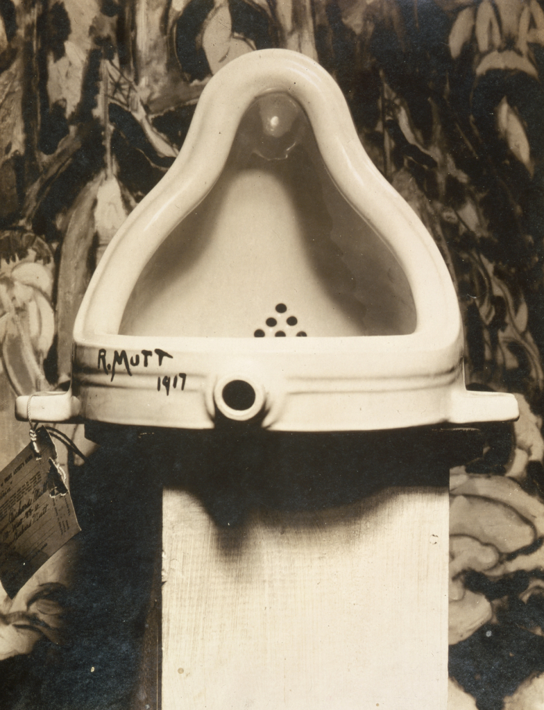
Fountain, found by R. Mutt = Marcel Duchamp (1887 – 1968) photograph by Alfred Stieglitz (1864 – 1946) at the 291 (Art Gallery) following the 1917 Society of Independent Artists exhibit, with entry tag visible. The backdrop is The Warriors by Marsden Hartley (1877 – 1943).
Industrial art began as the use of mechanical devices to create artworks. As such it is also known as mechanical art. I use it in a slightly different context to refer to industrially made objects that have an attractive appearance. Some people may enjoy watching this history of industrial design, to provide a conventional story of how it evolved.
For me, the most enlightening book about industrialism has been written by Terje Tvedt (1951 -) a professor of geography at the University of Bergen, Historiens Hjul og Vannets Makt: Da England og Europa Vant og Kina og Asia Tapte (2023). This could be translated as: The Wheel of History and the Power of Water: When England and Europe Won and China and Asia Lost. Tvedt has also written a book in Norwegian prior to that, Verdens historie: med fortiden som speil (2020), that I translate as World History: with the past as a mirror, which could have been published in English as Water and Society: Changing Perceptions of Societal and Historical Development (2021). I have not seen this English book, so there is some uncertainty.
In the 2023 book, the most important source of power was water, using a water wheel. England was able to develop this because it had stable rainfall, along with a relatively flat geography. These contributed to the use of canals to distribute industrially produced products. Later, steam became an increasingly important source of power. Now, it is electricity.
One starting point for industrial art is the Dada movement. Dada was an early 20th century art movement, arguably first at the Cabaret Voltaire in 1916 in Zürich, Switzerland, founded by Hugo Ball (1886 – 1927) and Emmy Hennings (1885 – 1948). Dada also emerged at about the same time in Berlin and New York, but later in Paris. It flourished until the mid 1920s.
Dada was primarily a reaction to the first World War, involving artists rejecting the aesthetics of modern capitalism. Instead they incorporated nonsense, irrationality and protest into their works. Performance art, was especially important, but gradually it incorporated visual, literary and sound media, including collage, sound poetry, cut-up writing and sculpture. There was a strong dislike of violence, war, nationalism and party politics.
There is a lot of speculation, but no consensus, on the origin of the name Dada. An unlikely story is that Richard Huelsenbeck (1892 – 1974) slid a paper knife randomly into a dictionary, where it landed on dada (French) = hobby horse.
Other unconventional art schools emerged at about the same time: Marcel Duchamp (1887 – 1968) around 1913 has been described as dada, avant-garde and post-impressionist. I attribute his work, Fountain (1917), photographed by Alfred Stieglitz (1864 – 1946), as one of the first pieces of industrial production, to be labelled a work of art.
Dada is important for its rejection of the correlation between words and their meaning. In much the same way, industrial art rejected the correlation of a work’s origin (as a utilitarian object) and its resurrection as a work of art.
Not all Dada movement members worked with industrial art, those who approached in other ways include: Jean Arp (1886 – 1966) known as a sculptor, painter and poet; Johannes Baader (1875 – 1955), an architect and metalworker, known as the Dada crowbar; Max Ernst (1891 – 1976), especially for frottage = pencil rubbings of textured objects and relief surfaces to create images; Elsa von Freytag-Loringhoven née Else Hildegard Plötz (1874 – 1927), especially for her anti-patriarchal activism; George Grosz, his de-Germanized name, born Georg Ehrenfried Groß (1893 – 1959), especially for his painting Eclipse of the Sun (1926), depicting headless government ministers who cannot think for themselves, but obey the commands of the capitalists and the military; Raoul Hausmann (1886 – 1971), who regarded destruction as an act of creation; John Heartfield born Helmut Herzfelt (1891 – 1968) who pioneered the use of photomontages, especially for making anti-Nazi and anti-fascist statements; Hannah Höch (1889 – 1978), especially known for co-inventing photo-montages, and for her dismantling of the fable of the New Woman: energetic, professional, androgynous, ready to take her place as man’s equal; Francis Picabia (1879–1953) avant-garde painter, writer, filmmaker, magazine publisher, poet and typographist; Man Ray = Emmanuel Radnitzky (1890 – 1976) an American in Paris, known for his photographs, especially photograms that he called rayograms = photographic images made without a camera by placing objects directly onto the surface of a light-sensitive material such as photographic paper and then exposing it to light; Hans Richter (1888 – 1976) painter, graphic artist, film producer and author of the book Dadaism (1965) about its history; Kurt Schwitters (1887 – 1948) especially noted for working as a draftsperson that influenced his later work, inspiring him to depict machines as metaphors of human activity; Sophie Taeuber-Arp (1889 – 1943) painter, sculptor, textile designer, furniture and interior designer, architect, and dancer;Tristan Tzara (1896–1963) essayist, performance artist, journalist, playwright, literary and art critic, composer and film director; and Beatrice Wood (1893 – 1998) ceramicist an sculptor.
The key to industrial art is the process of creating new forms by working with industrial materials, those that are produced at mass scale for everyday use. Many are made of metal, such as bolts and pipes. Wood is more problematic, because it is closer to nature. Cardboard, however, is one or two steps further away. Many claim that crap materials are even better, because they have completed their use as an industrial material and are freed to become an art form.
Charles Harrison Townsend (1851 – 1928) described industrial art as the use of materials and objects combined together in a way that creates new meaning. Not everyone appreciates this approach. Nikolaus Pevsner (1902 – 1983) in Pioneers of Modern Design (1949) referred to Townsend as reckless. Alastair Service (1933 – ) in Edwardian Architecture (1977) called Townsend a rogue architect.
Although it is difficult to define, many people have tried to categorize and define industrial art. In 1947, Larry Lankton created the first definition of industrial art when he referred to it as “an expression of the machine age.” While there are many different ways to interpret the term industrial art, it is generally agreed upon that it tends to incorporate aspects of modernism, specifically cubism and constructivism. According to wikipedia, in cubism, subjects are analyzed, broken up, and reassembled in an abstract form. Instead of depicting objects from a single perspective, the artist depicts the subject from multiple perspectives to represent the subject in a greater context. Similarly, constructivism was an early twentieth-century art movement founded in 1915 by Vladimir Tatlin (1885 – 1953) and Alexander Rodchenko (1891 – 1956) that is abstract and austere. Constructivist art aimed to reflect modern industrial society and urban space by rejecting decorative stylization, in favour of the industrial assemblage of materials. Constructivists were in favour of art for propaganda and social purposes. They were associated with Soviet socialism, the Bolsheviks and the Russian avant-garde.
For some time after its beginning, industrial art remained mostly an underground movement which encompassed various forms and styles from all over the world. In 1952, the Museum of Modern Art featured many works from this movement in a show called “Machine Art.” This exhibition moved from New York City to Los Angeles and San Francisco before finally closing in 1953.
Artists began using industrial materials for their work as early as the late 1800s with artists such as Marcel Duchamp who used glass as part of his ready-mades.
Today, industrial art can refer to two separate things. First, it can refer to any form of visual art that is made with found objects rather than manufactured ones. This umbrella term was coined by William Morris (1834 – 1896), for a wide variety of forms of modern art. It is closely associated with the Arts and Crafts Movement because both movements were heavily influenced by medieval craft guilds.
Some people site the major difference between industrial art and traditional fine art is the former’s focus on utilitarian products. Industrial artists work in a wide variety of media including ceramics, glass, leather, metals and textiles. Their works can be large sometimes even monumental in scale.
Louis Comfort Tiffany (1848 – 1933) is often cited as an inspiration for the movement, especially his use of stained glass in lamps, vases and windows. His designs were typically functional, yet beautiful.
Industrial art was a result of industrialization and the changes it brought. Many people, especially factory workers were profoundly unhappy with their situation. This forced artists to think about new ways to represent the world.
Industrial art was created by both amateur and professional artists. One of the first industrial art objects was designed was the door handle. These often used human, animal and plant elements in their design.
Found (or repurposed) objects were those that had been transformed from their original function into something else, preferably with an artistic element. Here, the artwork differed more in terms of its use of materials, rather than by its structure. Discarded materials were especially useful. Some cited examples include arranging tin cans in geometric patterns and repainting old tools/ machines with bright colors.
At some point, people interested in industrial art will be encouraged to reflect on the relationship between 1) the arts and crafts movement, 2) art nouveau/ jugendstil and 3) art that is created to be used in industrial settings. The focus is on objects that are to be seen by the public, usually inside a factory or store. It also includes graphics created for use as advertising and packaging. This type of art grew out of the Arts and Crafts movement of the 19th century, which was an effort to bring beauty into manufacturing. Industrial design, as an attempt to create beautiful things for use in industry, took off after World War I when many people were seeking a substitute for the ornate designs of Art Nouveau. The style became especially popular in America during the 1920s due to two trends: the rise in popularity of machines, and an emphasis on modernism.
A second perspective on industrial art = factory art = machine art, is a form of modern art that utilizes industrial materials and processes. Here, the term industrial art was coined in 1912 by the critic and artist Elie Nadelman (1882 – 1946), a sculptor and collector of folk art, used the term to describe some works by Alexander Archipenko (1887 – 1964).
Anno 2025, Industrial art is not a term that is used. Instead, the focus is on industrial design creating products that people want and, sometimes even need. It’s not just about making an object look good. It has to be easy to use, safe for the environment, affordable and durable.
Treat this post as a manuscript for a play, with a Prologue and an Epilogue. At one time it was divided into three acts, but the divisions were messy, so it has reverted to a play with an indeterminate number of acts.
Characters (in alphabetical order). Yes, some of the characters are more important than others, and one has mostly been eliminated from the play. The characters are referred to by their first names, to introduce some intimacy to them. I am not certain this is how people in the 19th century treated each other. My 20th century mother said that her mother, Jane Andison née Briggs (1880 – 1972), referred to some of her women friends by Mrs, followed by a married surname. In Norway, everybody is on a first name basis with everybody. Even the Prime Minister Jonas Gahr Støre (1960 – ) is referred to as Jonas. Before him we had Erna (Solberg, 1961 – ). Her personal, but political website is erna.no .
Anne = Julia Sarah Anne Cobden-Sanderson née Cobden (1853 – 1926), a socialist, suffragette and vegetarian. She provided the money (£ 1 600) to start Doves Press.
Bill = William Morris (1834 – 1896), a textile designer, poet, artist, writer and socialist activist, married Jane in 1859.
Ed = Edward Philip Prince (1846 – 1923) an engraver and punchcutter. Wikipedia tells us: Punchcutting is a craft used in traditional typography to cut letter punches in steel as the first stage of making metal type. Steel punches in the shape of the letter would be used to stamp matrices into copper, which were locked into a mould shape to cast type. Cutting punches and casting type was the first step of traditional typesetting. The cutting of letter punches was a highly skilled craft requiring much patience and practice.
Ed2 = Edward Burne-Jones (1833 – 1898), a frequent illustrator of Kelmscott books, based many of his drawings for the wood engravings on his own previous paintings. He valued these works for their decorative value over their illustrative properties, and reviewed them by looking at them upside-down.
Emery = Emery Walker (1851 – 1933), an engraver, photographer and printer, active in many Arts & Crafts organizations including the Art Workers Guild, the Society for the Protection of Ancient Buildings and the Arts and Crafts Exhibition Society. He was also the most experienced person in this story, when it comes to printing.
Jane = Jane Morris née Burden (1839 – 1914) an embroiderer and artists’ model/ muse. She allegedly embodied the Pre-Raphaelite ideal of beauty, and in addition to her husband, was a model/ muse for Dante Gabriel Rossetti (1828 – 1882). She suggested that Tom take up the art of book binding.
John =John Carruthers (1836 – 1914), a railway/ railroad engineer and economic theorist from a Scottish literary family in Inverness, Scotland. He learned how to construct railways in Canada, then applied that art in USA, Russia, Mauritius and Egypt before being recruited by Julius Vogel, Premier of New Zealand, for the great Public Works policy of the 1870s which emphasized railway construction and immigration. John was made Engineer-in-Chief of the new Public Works Department, responsible for railway construction throughout New Zealand.
Tom = Thomas James Sanderson (1840 – 1922), an unemployed barrister, married Anne in 1882. They both took the surname Cobden-Sanderson.
Prologue
Where to begin writing about life as a play? Perhaps with a set/ stage, knowing when people will make their entrances and exits. The details can be filled in later. Sometimes, on a stage there is something visible, larger than life, a distraction that the actors focus upon. They hope future audiences will focus upon it too, when the dialogue gets boring, as each life unfolds. The actors hope this focus will not just change, but improve, with every act.
It is reckless when two people enter into a relationship with each other. Yet, it is done every day. Often it is called marriage where the participants are so consumed with love – a euphemism for sex – that they forget to scrutinize the contract papers, until it is too late. The participation of a third person often results in folly. In business matters this might be a better course of action, because the result of a disagreement, will not be painful head-bashing, but a 2-1 decision resulting in a majority and a minority. In the emotional life of people in the 21st century, this involves separation – divorce – remarriage, or perhaps even a life free of marital constraints.
Kelmscott
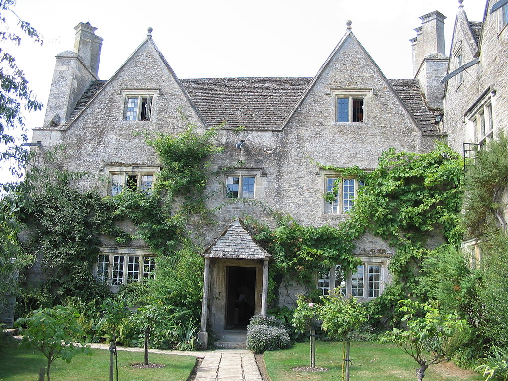
Kelmscott Manor is a Cotswold stone house, built about 1570, with a distinctive architecture and craftsmanship, integrated with its setting. In 1871, Bill bought it as a rural retreat, then used the same name for his London town house when he bought it in 1879. He then gave the same name to his printing venture when it was started in 1891.
Kelmscott Manor Photo: Boerkevitz, 2006-08-01Kelmscott House, previously known as The Retreat, originally owned by Francis Ronalds (1788 – 1873) then by George MacDonald (1824 –1905) who wrote At the Back of the North Wind (1871) and The Princess and the Goblin (1873), while living there. Bill and Anne lived there from 1878 to 1896. Photo: Bernard Burns, 2013-09-30.
In the late 1870s, Emery and Bill became friends. Both were socialists and lived near each other. Emery’s printing expertise and collection of 16th-century typefaces inspired Bill and Emery to become business partners, creating a printing business in 1891. It published 53 books in 66 volumes between its founding and 1898.
Most of the books published were unillustrated octavos, referring to the page size, from 5 by 8 inches to 6 by 9.5 inches (about 12.5 to 15 cm by 20 to 25 cm), of a book composed of printer’s sheets folded into 8 leaves, making 16 pages. Old-style types were used, with the type printed closer to the spine than the outside edge. This followed the custom of 15th-century printing. A hand press allowed the company to use wood-engraved initials and borders, and to produce a blacker type. The use of dampened handmade paper, creating indentations in the page. These indentations were an important part of the book’s design. Initially, books were sold untrimmed and unbound, assuming that buyers would rebind them. The press only started trimming pages after publishing Biblia innocentium in 1896.
For collectors, several copies of books were printed on vellum = animal skins/ membranes. Compared to paper, this is difficult to print on. Vellum is not parchment. Both use animal skins that have been de-greased and treated for use either in writing or printing or in binding. Neither parchment nor vellum is tanned, so they are not leather. Vellum is an inferior product, manufactured from the entire skin of the animal. It is not split. For this, Bill started using a thick, dark ink. The pressmen had difficulty working with it, so Bill went back to the ink he had used previously. Because of staining he then used a softer ink, that did not dry very quickly. Bill used red ink for titles and shoulder-notes. He experimented with other colors, but did not adopt them.
Emery influenced Bill’s opinions on book design: supporting a return to 15th-century aesthetics, decreasing spaces between words and after punctuation, reducing spaces between words and between lines. While the fifteenth-century books probably reduced spacing to conserve paper, Bill based his preference on the way the printed page looked. Bill said the margins closest to the binding must be the smallest, followed by the head, fore (outer) and tail margins. Medieval printing experts say the difference between the margins was usually less than 20%. Bill’s fore margins were large to accommodate the shoulder-notes recommended by Emery. The inner margins were so little that rebinding was difficult.
Fonts
After deciding to found the press, Bill collected many books printed in 15th century Europe, as well as books on printing and typography. To research typefaces, he bought examples of every fine type he could find.
Many want to attribute Golden Type to Bill. However, it was probably a joint effort between Bill and Emery, but with Bill taking the leading role. They probably started designing Golden Type in 1889. It was a Roman type inspired by a font used by Nicolas Jenson (c. 1420 – 1480) to publish Pliny’s Historicae naturalis, and a similar font that Jacobus Rubeus = Jacques le Rouge (1470 – 1550) used to publish Leonardus Brunus Aretinus’ Historiae Florentini populi. Emery’s company photographed the type at a large scale to help Bill see the shape of the letters. Bill said that designing Golden Type was the most troublesome task he had ever tried. Bill repeatedly traced the enlarged type, until he felt comfortable with his understanding of the design. After Bill drew the the type design freehand, Emery would photograph the drawings and reproduced them at the correct scale. Bill made modifications at every stage. Bill and Emery were at the leading edge of Victorian technology, pioneering photography and enlarged typefaces.
Punches
Ed cut the punches for the type in 1890. These are used to stamp the matrices used to cast metal type. Charles Reed (1819–81) and Sons = especially, Andrew Holmes Reed (1848–1892) and Talbot Baines Reed (1852 – 1893) carried out the casting. The font, in 14-point size, was completed in the winter of 1890–1891.
With Golden Type, Bill did not bother making an italic or bold version and did not include brackets or dashes. The thickness of the font went well with the wood-engravings it often accompanied. Some critics commented that its large size and width discouraged commercial application. For example, Stanley Morison (1889 – 1967) strongly disliked it and criticized its large capital letters. Bill designed three related typefaces: Golden Type, Troy and Chaucer. Troy was described as a semi-Gothic type designed […] with special regard to legibility made for the publication of the Historyes Of Troye in 1892. It was cut at 18 points by Ed. It was also used for The Tale of Beowulf in 1895. The Chaucer typeface was re-cut at 12 points for use in The Order of Chivalry (1893) and The Works of Geoffrey Chaucer (1343-1400). It was edited by Frederick Startridge Ellis (1830–1901), ornamented with pictures designed by Ed2, engraved on wood by William Harcourt Hooper (1834-1912). It was published in 1896.
Bill was influenced by books published by Shoeffer and Zainer. Peter Schöffer or Petrus Schoeffer (c. 1425 – c. 1503) was an early German printer, who studied in Paris and worked as a manuscript copyist starting in 1451, before apprenticing with Johannes Gutenberg. Zainer was active 1468 – 1478. he produced about 80 books including two German editions of the Bible and the first printed calendar. He came to Augsburg from Strassburg.
It should be noted that with the founding of the Kelmscott Press, Bill was increasingly ill and living largely as an invalid. He suffered from gout, and showed signs of epilepsy. In 1891-08, he took his daughter Jane Alice = Jenny on a tour of Northern France to visit the medieval churches and cathedrals. When they returned to England, Bill spent an increasing amount of time at Kelmscott Manor. He sought treatment from William Broadbent (1835 – 1907), a prominent doctor, who prescribed a holiday in Folkestone, a coastal town in Kent, on the English Channel.
Because of the use of wide fonts, the books themselves had to be wide too. Bill bought handmade paper from Joseph Batchelor (1831? – ?) and Son. He was obsessed with the aesthetics of early handmade paper. He used paper from the Ford Mill in Little Chart, Kent, England. The mill had been started in 1776, but was taken over by Batchelor in 1876. It was powered by a waterwheel until the end of the 1920s, when electrical power was used.
Bill had strict requirements for his paper. It had to be made of linen, made with a two piece frame consisting of a mould – essentially a screen that allowed water to leak through, and a more solid deckle. Large quantities of paper were needed for printing each book. Each piece of handmade paper had its own subtle character, that made Bill’s quest for consistency and perfection difficult to achieve. The mill used watermarks designed by Bill. In addition, the paper had to be produced in unusual sizes. Other publishers admired the paper, which lead to imitation. At Bill’s suggestion, Batchelor adopted the name Kelmscott Handmade, for the paper.
In the 1890s, photoengraving made it easy for entrepreneurs to copy Bill’s typefaces and sell pirated typefaces. When an American foundry offered to sell Bill’s typefaces in the United States, Bill refused. Joseph W. Phinney of the Dickinson Type Foundry in Boston sold a Jenson Old Style that was very similar to Golden Type. Satanick, an imitation Troy type, was available for purchase in 1896. Bill’s own typefounders, Charles Reed and Sons , started selling a Kelmscott Old Style type. Subsequently, Sydney Cockerell (1867 – 1962), the Kelmscott Press’s administrator, threatened legal action against these companies.
Decorations
Some of the Kelmscott books are heavily decorated, with motifs similar to Morris’s other designs for upholstery and wallpaper. In 1913, George Holbrook Jackson (1874-1948), journalist, publisher and Fabian socialist wrote: “The Kelmscott books look not only as if letter and decoration had grown one out of the other; they look as if they could go on growing.”
The title pages of Kelmscott books were usually decorated in a Victorian style. Bill initially designed woodblock initials that were too dark or too large for the pages they appeared on, but later became more proficient in proofing his capitals. The Kelmscott books varied greatly in ornaments. For example, The History of Godefrey of Boloyne is commonly regarded as over-decorated. However, the first few books published by Kelmscott were in the opposite direction, politely called sparsely decorated. Bill’s border and capital designs were similar to his wallpaper designs. Many regard them as inappropriate, not illustrative of their associated texts. Medieval texts had delicate illuminations covering their margins. However, the wood engravings Bill made were heavy. They created production problems. The use of the Chaucer typeface, required the hand press to be reinforced with steel because of the weight of the large ornaments. Bill preferred his wood engravers to replicate his designs exactly, even though this was at odds with John Ruskin’s (1819 – 1900) theory that craftsmen should have influence in the final aesthetic product they help produce. Kelmscott books did not have printing on the reverse side of woodblock pages until the Chaucer, despite this separation of text from illustration being precisely what Bill wanted to avoid in his book designs.
Printer’s marks
Bill designed three different printer’s marks for Kelmscott Press. One was a simple text mark in a rectangle used with octavos and small quartos. The Kelmscott mark with a large rectangle and leafy background was first published in The History of Godefrey of Bolyne and was used mostly for quartos. The last printer’s mark was only used in the Works of Geoffery Chaucer.
In July 1896, Morris went on a cruise to Norway with John, during which he visited Vadsø, one of the most northerly and easterly town in Norway, and Trondheim, 120 km south of Cliff Cottage. During the trip Bill’s physical condition deteriorated and he began experiencing hallucinations. Returning to Kelmscott House, he became a complete invalid, being visited by friends and family, before dying of tuberculosis on 1896-10-03.
Legacy
After the closing of the Kelmscott Press, leftover paper and the type fonts were given to the Chiswick Press. The Kelmscott types were sold to Cambridge University Press in 1940. Woodblocks were given to/ deposited in the British Museum. Presses and related equipment were sold to Essex House Press.
Thorstein Veblen (1857–1929), an American economist and sociologist, was a well-known critic of capitalism. In The Theory of the Leisure Class (1899), Veblen developed the concepts of conspicuous consumption and conspicuous leisure. He called Kelmscott’s books a conspicuous waste arguing that they were less convenient and more expensive than regular books, showing that the purchaser had time and money to waste.
Charles Robert Ashbee (1863 – 1942) was involved in book production and literary work, setting up Essex House Press as a Kelmscott Press imitation, and taking on many of the displaced printers and craftsmen. Between 1898 and 1910 the Essex House Press produced more than 70 titles (some sources state a total of 83). He used the same ink, paper, vellum and presses that Kelmscott used. He designed two type faces for Essex House, Endevour (1901) and Prayer Book (1903), both of which are based on Golden Type. William S. Peterson (1939 – ) called Ashbee’s typefaces “ugly and eccentric” but that the books “have a certain period charm”.
Tom worked as a binder in the Doves Bindery, which carried out the pigskin bindings for the Kelmscott Chaucer. Together with Emery, they founded Doves Press and used similar paper and vellum to Kelmscott. Tom disliked the decorative style of the Kelmscott books. Books from the Doves Press had only an occasional calligraphic initials. They created a font that copied those in Nicolas Jenson’s renaissance publications. Their 5-volume folio Bible remains an important landmark in the history of fine press, and their editions of Goethe inspired the formation of several fine presses in Germany. The most prominent of these were Bremer Press, Janus Presse, Kleukens Presse, Ernst Ludwig Presse, and Serpentis Presse.
It is difficult to assess the roles and interactions of the human participants who were responsible for that press. When I attempt to understand the past, I almost always have to refer to Leslie Poles Hartley (1895 – 1972) and a quotation from his most famous book, The Go-Between (1953): “The past is a foreign country; they do things differently there.”Dove Press refers to The Dove, a riverside pub, located in Hammersmith, London. Having avoided alcohol for half a century, I find it difficult to believe that anyone would name something after a pub. Then, I think back to the situation in London in the mid 19th century, and the belief that miasma = bad air, caused disease. John Snow (1813–1858) is important because of his work in tracing the source of the 1854 Broad Street (Soho, London) cholera outbreak, in which he identified the source as a specific public water pump. Yes, one must remember that water can be unhealthy, and beer can be a more appropriate choice, especially in times past.
The Vale Press, founded by Charles Ricketts (1866 – 1931) with Charles Shannon (1863 – 1937), based their types on 15th-century calligraphy. They published literary classics, which allowed them to focus on the design and layout of the works. Together, they also worked with theatrical costume design and production.
Esther Levi Pissarro nèe Bensusan (1870 – 1951) Pissarro née Bensusan founded the Eragny Press with her husband Lucien Pissarro (1863–1944). Thye produced books illustrated with colour wood-engravings. Esther created the wood engravings from Lucien’s designs. Eragny Press shared type with Vale for a time.
The Ashendene Press was a small private press founded by Charles Harald St John Hornby (1867–1946). It operated from 1895 to 1915 in Chelsea, London and was revived after World War I in 1920, but closed in 1935. It specialized in publishing poetry books and folio versions of classic literature.
In 1902, Elizabeth (1868 – 1940) and her sister Lily Yeats (1866 – 1949) joined Evelyn Gleeson (1855 – 1944) in establishing a craft studio at Dundrum, near Dublin, called Dun Emer. This specialized in printing and other crafts, with Elizabeth in charge of the printing press. Activities took place in Gleeson’s large house, in which a crafts group provided training and work for young women in: bookbinding, printing, weaving and embroidery. They could also live in the house. Bookbinding workshops were a later addition to the studio. Dun Emer was named after the Irish mythical Emer, a figure famous for her artistic skills and beauty. The title-page device of the Dun Emer Press was designed by Elinor Mary Darwin (née Monsell; 1879–1954) and shows Emer standing underneath a tree. The focus of the Press was on publishing literary work by Irish authors. Jack Butler Yeats (1871 – 1957) did much of the illustration work.
Epilogue
Today, using typefaces is easy. Everyone can set up their own press, especially if the product is digital. Even the McLellans did it. In the mid 1990s, we formed Fjellheim Institutt, named after the official name of our house, to produce Åndelig Dyder: En familiehåndbok = Spiritual virtues: a family handbook (literal translation), = The Virtues Guide, by Linda Kavelin Popov, Dan Popov and John Kavelin, in 1996 – a century after Kelmscott Press closed. The book was printed on paper, typically in small quantities, in Steinkjer. Its purpose was never to made a profit, but to ensure that Norwegian families could introduce ethical concepts to their children. We still have a few copies, that we give away when opportunities arise.
Even in the mid 1980s it was possible to obtain professional typesetting quality from a computer, as long as that computer was an Apple Macintosh, an Atari 1040ST or a Commodore Amiga. We owned an Amiga.
Today, it is not the computer that sets the limits, but the software. The first desktop publishing software we used was Aldus PageMaker 5.0, which was introduced in 1993. Aldus was founded by Paul Brainerd (1947 – ) and others in Seattle in 1984. It was acquired by Adobe Systems in 1994. The company was named after 15th-century Venetian printer Aldus Manutius. The program was replaced by InDesign in 2001.
Today Adobe does not sell stand alone copies of its software products, but forces people to work with its cloud environment, making it inherently unsafe. Perhaps the most accessible desktop publishing program is Scribus, a free and open source program, supported on at least 13 operating systems. It offers a vector drawing tool, supports multiple file types, and supports over 200 colors in its palette. It was also one of the world’s first software to support the PDF/X-3 format conversion.
Today, our publication efforts focus on our blogs.